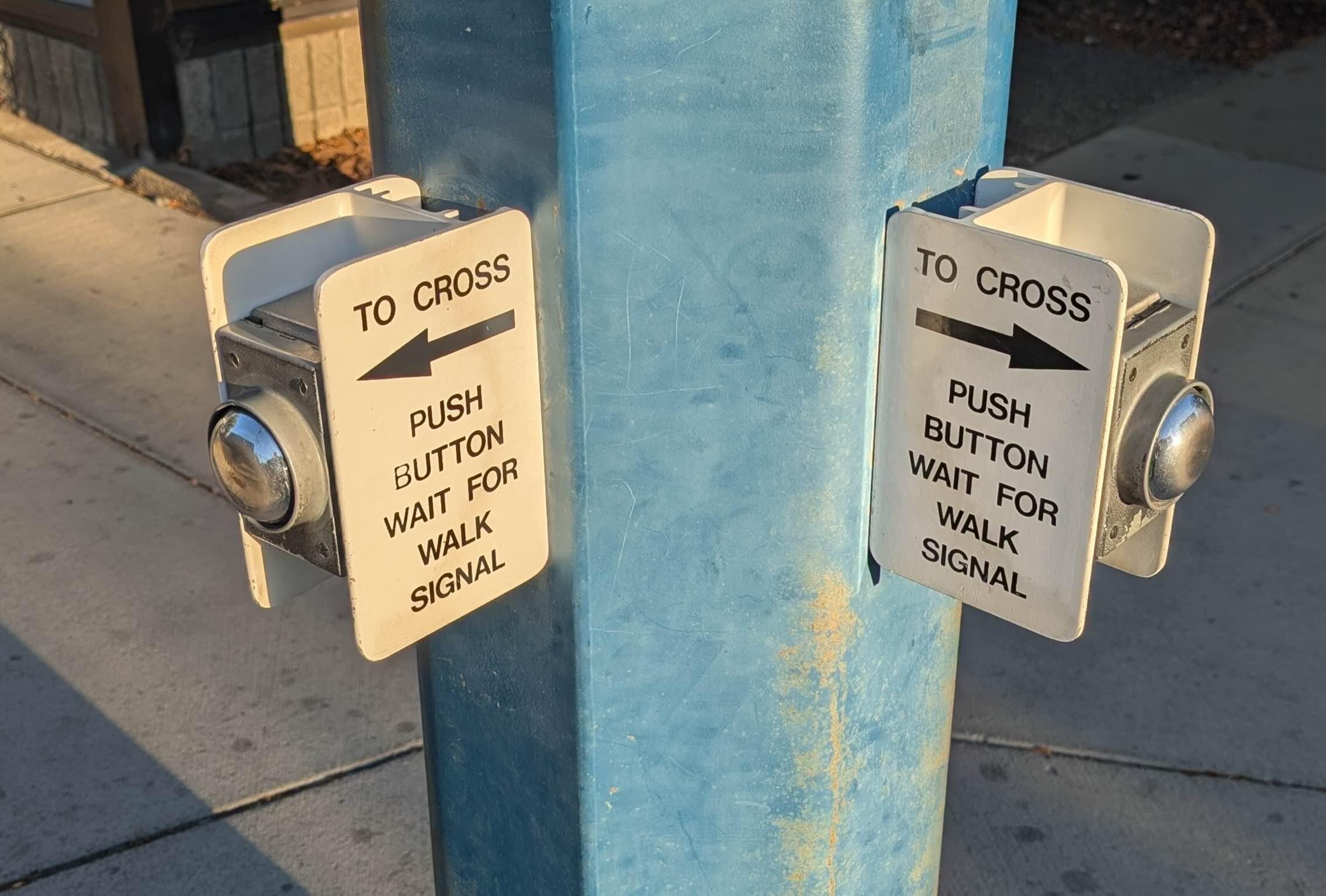
I see this type of #UX mistake all the time. People use a control in the wrong location and have to create high energy signs to 'fix it'.
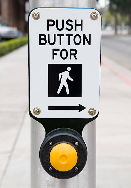
The first image has the button effectively *behind* you vs the normal placement of having it *next* to you. This one physical layout difference makes the signage so much simpler and intuitive.