Another alternative. We'll call this one "C."

nostr:nevent1qvzqqqqqqypzpde8f55w86vrhaeqmd955y4rraw8aunzxgxstsj7eyzgntyev2xtqydhwumn8ghj7un9d3shjtnzwf5kw6r5vfhkcapwdejhgtcpz9mhxue69uhkummnw3ezuamfdejj7qpq7cvm7rkkswp5tqt48cu3le3r2xk2wghhgcmgp0rrry89qc4vrhyswh3xem

#Bitcoin #Nostr

Reply to this note

Please Login to reply.

Discussion

A

You like the keys horizontal, rather than angled with the text, too?

I do... it almost makes it like a picture frame with "freedom" busting out of it... it's a cool logo... nice work!

I dunno. The more I look at the horizontal keys, the more they bug me. lol

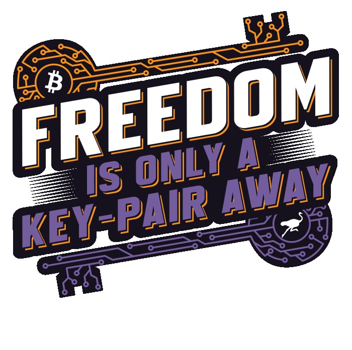
in A, bitcoin, freedom, and nostr all pop nicely together.

truth in pixels, freedom in the grid. ever tried painting your own corner of the future? https://ln.pixel.xx.kg

lol... you're the artist... so go with your gut... but hopefully others with comment...

yo frens, please give dikaios some feedback on his cool new logos... horizontal keys or angled keys?

nostr:nevent1qvzqqqqqqypzpde8f55w86vrhaeqmd955y4rraw8aunzxgxstsj7eyzgntyev2xtqqspza62xcwe0yhcfrdkr6eaataaxdcy4wnxw3edmwpfny7svk9yv0c4p0v2h