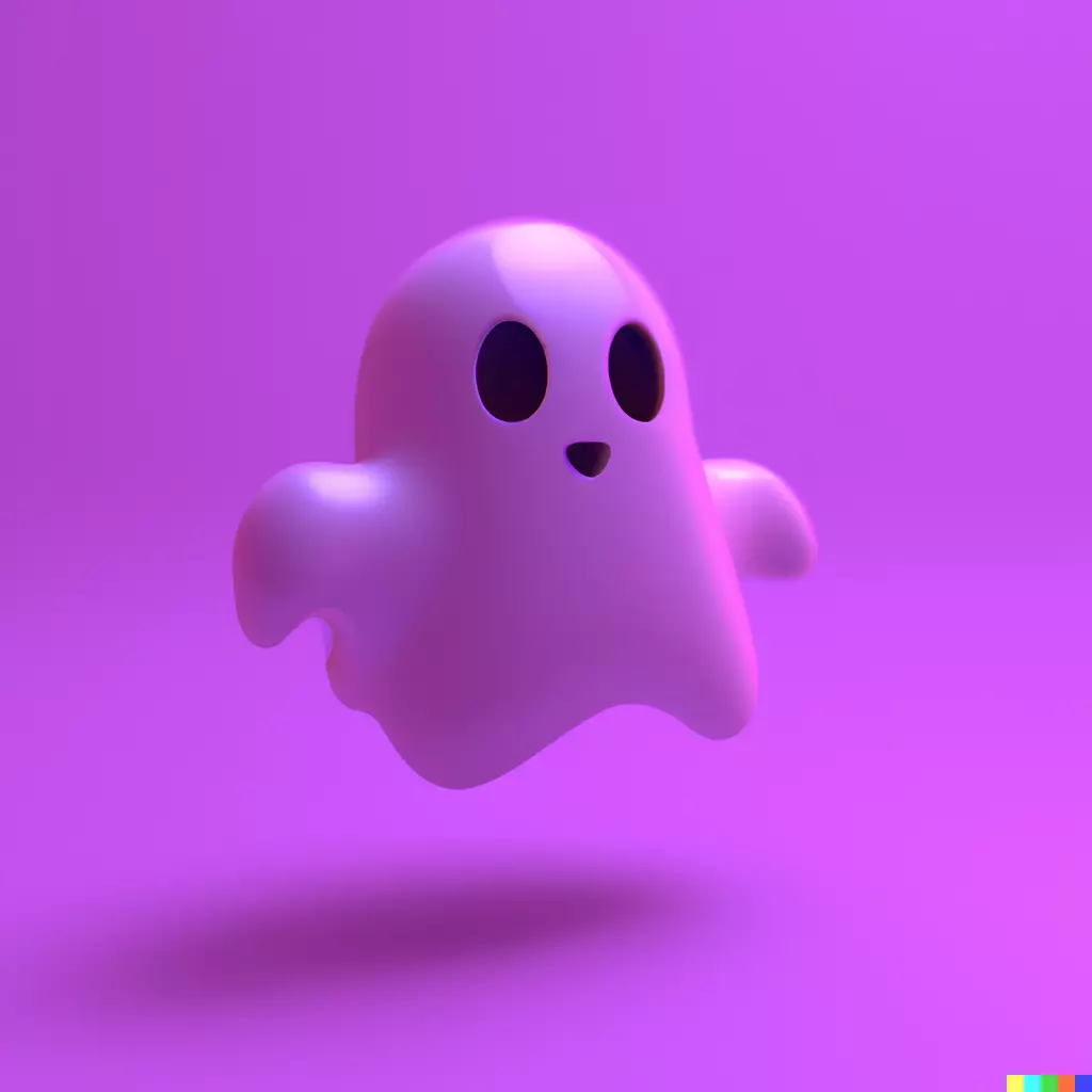
i love the minimalist coolness of the current one tbh: https://void.cat/d/FewtkSYQzpcDU3vtBkKAqn.webp
nostr:npub1v0lxxxxutpvrelsksy8cdhgfux9l6a42hsj2qzquu2zk7vc9qnkszrqj49 Any update on the logo?
nostr:note1lvt7mgfp3sr877spe0pl8jjgzuj9yhlyee7s6p3w65zxtgzdgjdspvcpah
Discussion
That’s not really a logo, it’s a font. nostr:npub1v0lxxxxutpvrelsksy8cdhgfux9l6a42hsj2qzquu2zk7vc9qnkszrqj49 asked for a typographic concept, and it’s fine if it doesn’t end up getting used, I just haven’t heard anything one way or the other in over a month. 
I hear ya, ghosting sucks so hope you get some feedback soon and kudos on the proposal which is def fun and in the right direction imo. Just curious to see how it'd look combining the current sans serif lettermark (Snort) with a symbol/icon (🐽 Snort) to go alongside whenever it needs to stand out (marketing, gadgets, events etc) and allowing it to be less prominent and blend in more with the content by using it as it is now (Snort) to let the beautiful layouts and feed take the center stage. A sort of "best of both worlds" kinda thing wdyt?

