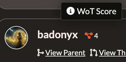
Hostile design much? The icon is incomprehensible, it lacks a tooltip to explain itself, and you can't even figure it out by inspecting it with dev tools.

This is definitely something that belongs in the details view with a clear explanation, not just randomly thrown out next to a few user profiles. (it doesn't even show for most users???)

Reply to this note

Please Login to reply.

Discussion

it's really simple: the bigger the number, the more of your follows follow them.

hostile how exactly? are you that paranoid?

Wrong, it belongs exactly where it is and users must use their brains.

but you had to ask? or was it a rhetorical poll?

I used my brain to write the question.

ok

Please remember to apply hanlon's razor. You'll be pleased to know this is already fixed on my dev branch.

Meant more like hostile architecture rather than malice. I just really loath running into web elements with those characteristics.

Anyway, thank you, it's a good improvement.