Global Feed Post Login
Replying to Avatar Vitor Pamplona

This chart is everywhere these days. My question is why is the 148 billion so much bigger than the 142B underneath it? And why doesn't the yellow 316B deficit take half of the left side, since it is about 50%? And why is the 316B yellow smaller than the 148B green? This is not how this chart is supposed to work.

Avatar
TheBitcoinBattery 6mo ago

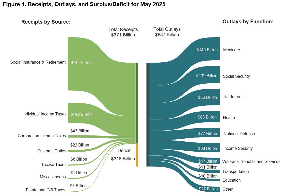
Propaganda is often subtle and in plain sight. Someone looking at this visually might think the deficit isn't that bad when it's nearly half the budget in this case.

nostr:nevent1qqs8ysh6pj6tmxrux9f7ljxdr20ahxzxanfntrt8y0na86metzxy5qqpz4mhxue69uhkg6t5w3hjuur4vghhyetvv9usygzxpsj7dqha57pjk5k37gkn6g4nzakewtmqmnwryyhd3jfwlpgxtspsgqqqqqqsyxa5ha

Reply to this note

Please Login to reply.

Discussion

No replies yet.