Finally took the time to sit down and think about how I'm going to replace the tabs in noStrudel

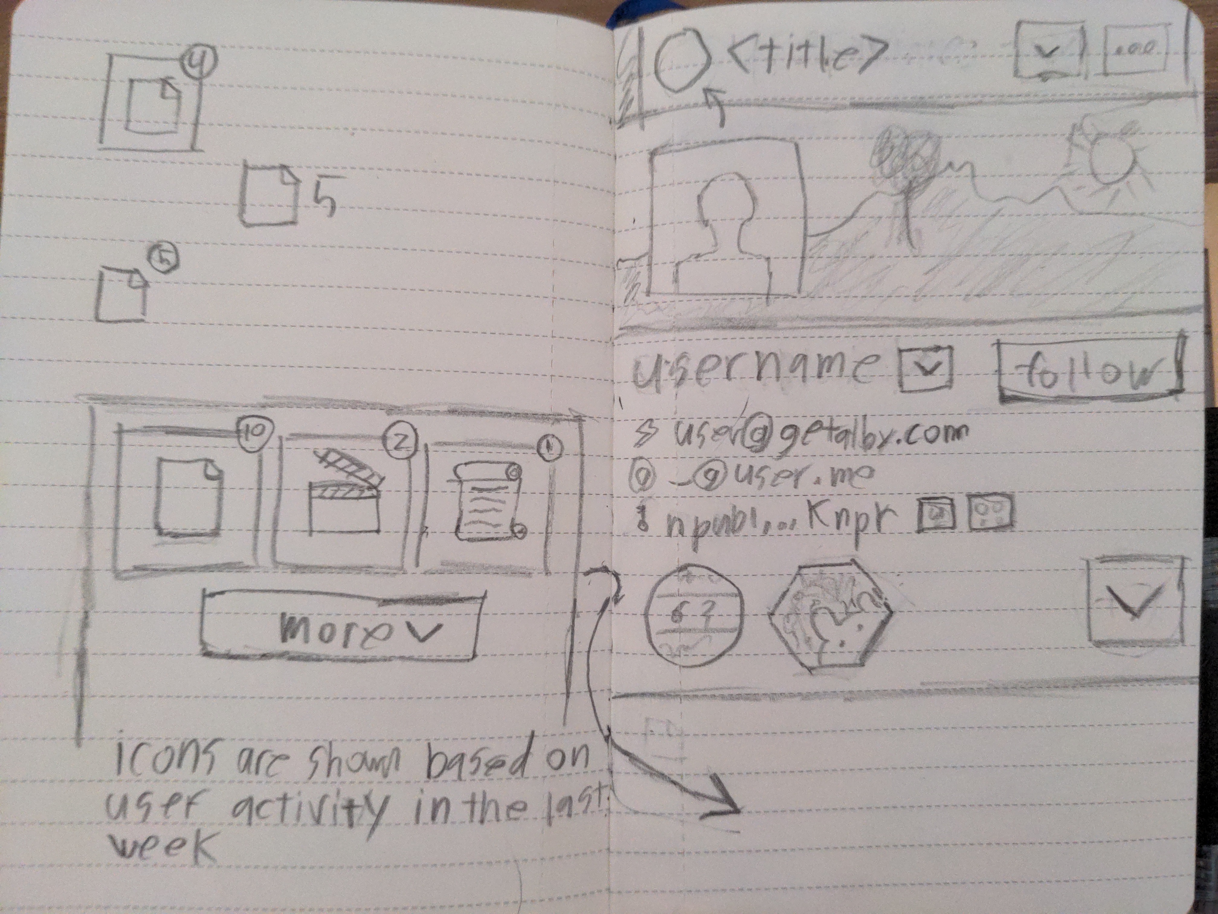
The idea is to show a summary of icons based on the users activity in the past week. So you can quickly get to the users recent content.

Then have a "show more" button that gives you the option to view everything

nostr:npub149p5act9a5qm9p47elp8w8h3wpwn2d7s2xecw2ygnrxqp4wgsklq9g722q nostr:npub1r0rs5q2gk0e3dk3nlc7gnu378ec6cnlenqp8a3cjhyzu6f8k5sgs4sq9ac how did I do?

Reply to this note

Please Login to reply.

Discussion

I think there should be an advanced option to use the classic Nostrudel interface, cos the madness of it is quite charming lol:)

Oh there will still be madness, but it just wont be tabs anymore

I already miss the tabs. 🥺

When subscription customers get classic tabs and tiger-striped outlines on PfP?

that handwriting tho

childlike spirit still burning bright

No, it just sucks. I'm a programmer, I type

i'm typographically and graphologically obsessed (those two subjects were big for me in my teens) and i know a simple (clean) mind when i see the way it conducts the transcription as text via the hand

i'm also a programmer, and my handwriting looks a lot like a teenage girl

I'm going in a very similar direction sir!

Here's an example of that same pattern (tabs ordered by recent activity, with icons) used within a community:

https://cdn.satellite.earth/e81fa6b32199c5a92ed1c132936402e5f561542d251ee0ff8cbec13c4770bb22.mov

(optmized for mobile 👉 swipe action for "View All")

I'm also using this on profile pages.

Because it's a great way to get a sense of what type of content creator/user this profile is.

But I also found a great way for the profile to showcase whatever they want (without crowding the screen with pinned posts, pinnend videos, pinned articles, pinned wikis,etc etc...)

Will send you DM's on this nostr:npub1ye5ptcxfyyxl5vjvdjar2ua3f0hynkjzpx552mu5snj3qmx5pzjscpknpr 😉

and if there was no user activity within the last week then they are based on the last active week?

I would hate for my UI to shift around without my wish for it to do so

What about being able to choose what to display? Let user toggle on and off just like deleting apps from Home Screen on phones.

The same could be done on profiles - let the person pin the tab order and the rest goes into more.

Maybe, but the point is to get a quick overview of what the user has been up to so you have a starting point for browsing their content

Oh then I misunderstood. I thought you wanted to declutter UI.

Isn’t the feed itself a good indicator of what they’ve been up to? You scroll and see their latest posts - as far back as you want to go.

Or am I still not seeing what you’re after?

Only for the text notes, I want other things like live steams, music, videos and "other stuff" to stand out

Maybe even show a category of "unknown events" that would show events noStrudel does not know how to handle but would give you the option to open in another app

I see. In snort the idea was to have horizontal tabs but it seems nobody actually clicks them. Maybe have a vertical section for their most used event types that you have to scroll past or minimize to see notes?

At one point I played around with a bento grid layout on the profile that links to other stuff, but I couldn’t get it to look nice and you’d still have to click around vs just scrolling

Thought about this more and I would be pretty cool to let users customize their profile page a bit.

I'm not sure if ordering the buttons would be the easiest option, but I like the idea

Gay

Gay

Gay

Gay

Gay

Gay

Gay

Gay

Gay

Gay

Gay

Your customers tend to be loyal power users.

Make a wizard, where they can create a custom Nostrudel interface, down to which features and information are displayed where, and then hide the other features under "More".