
News outlets do this ALL the time. People that don't read the data see what they want them to see
Discussion

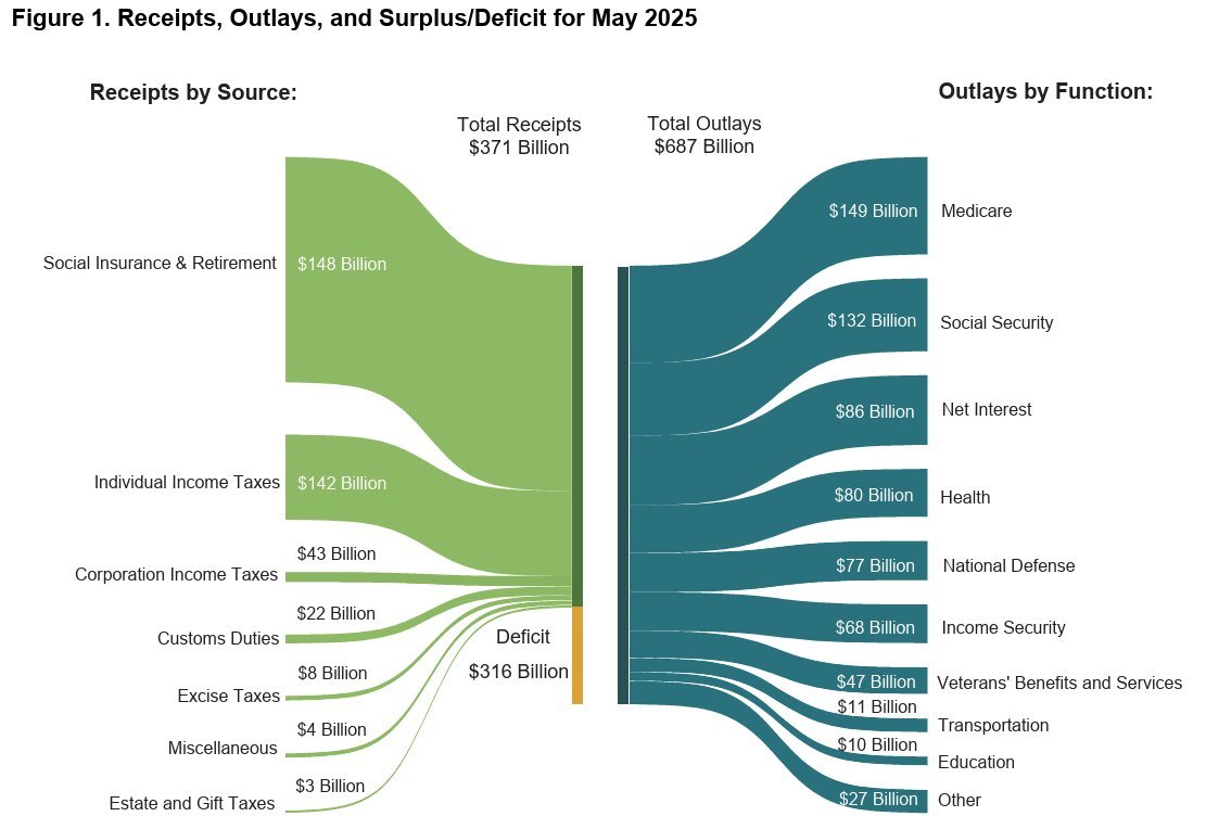
But that chart is coming from the Treasury directly, not news media
News outlets do this ALL the time. People that don't read the data see what they want them to see
But that chart is coming from the Treasury directly, not news media