
Ok, sorry boat fans, it's back to my original with some tweaks suggested by nostr:nprofile1qqs8hhhhhc3dmrje73squpz255ape7t448w86f7ltqemca7m0p99spg2pze85 and a heavier line weight.
Ok, sorry boat fans, it's back to my original with some tweaks suggested by nostr:nprofile1qqs8hhhhhc3dmrje73squpz255ape7t448w86f7ltqemca7m0p99spg2pze85 and a heavier line weight.
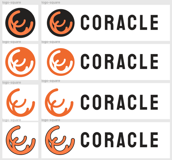
No orange shades? :) I would think a little more about this, not only do they add some richness but they help read the flow of the lines.
I don't particularly like the version inscribed in the circle, but it might be a legitimate variation for some uses, e.g. an icon. In this case I suggest that the outermost space is no less thick than the lines.
The black outlined version is a no-no, imho 😅

Forgot about the shading, I should add that back in. I agree about the circles, they're mostly for weird backgrounds
👍
I also would equilibrate the dimensional ratio between the logomark and the wordmark, and the letter-spacing (in your last version is a bit stressed).
What's that in English? Less letter spacing, and closer to the logomark? Also, played around with the colors, came up with a slightly different approach, what do you think? I think your version is probably the best still.

Far right is a nice gradient
Letter spacing: in the "Coracle" text the space between chars is too much.
The logomark (= the lines) is too big compared to the wordmark (= Coracle).
I'm usually not a fan of gradients but the last one is nice! However this way the lines merge a bit and the original coracle shape is less obvious.
This is a variation with the top circle in front of the big one but behind the bottom one, to give a more "intersection" feel:


