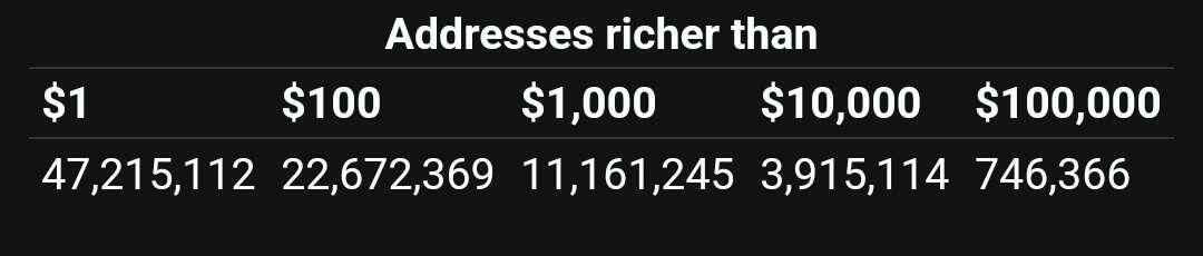

Isn’t this graphic a kind of misrepresentation? We all know multiple addresses can be generated from a single seed phrase so in reality this graphic just shows single addresses with large amounts in them (which is arguably bad practice and therefore not many do it - hence the lower number). It doesn’t really show how “rich” anyone is. I could have a 100 addresses in one cold wallet each holding $1000 equivalent of bitcoin. That’s $100,000 in total in my cold wallet but each address would be listed in the $1000 column in your graphic.
