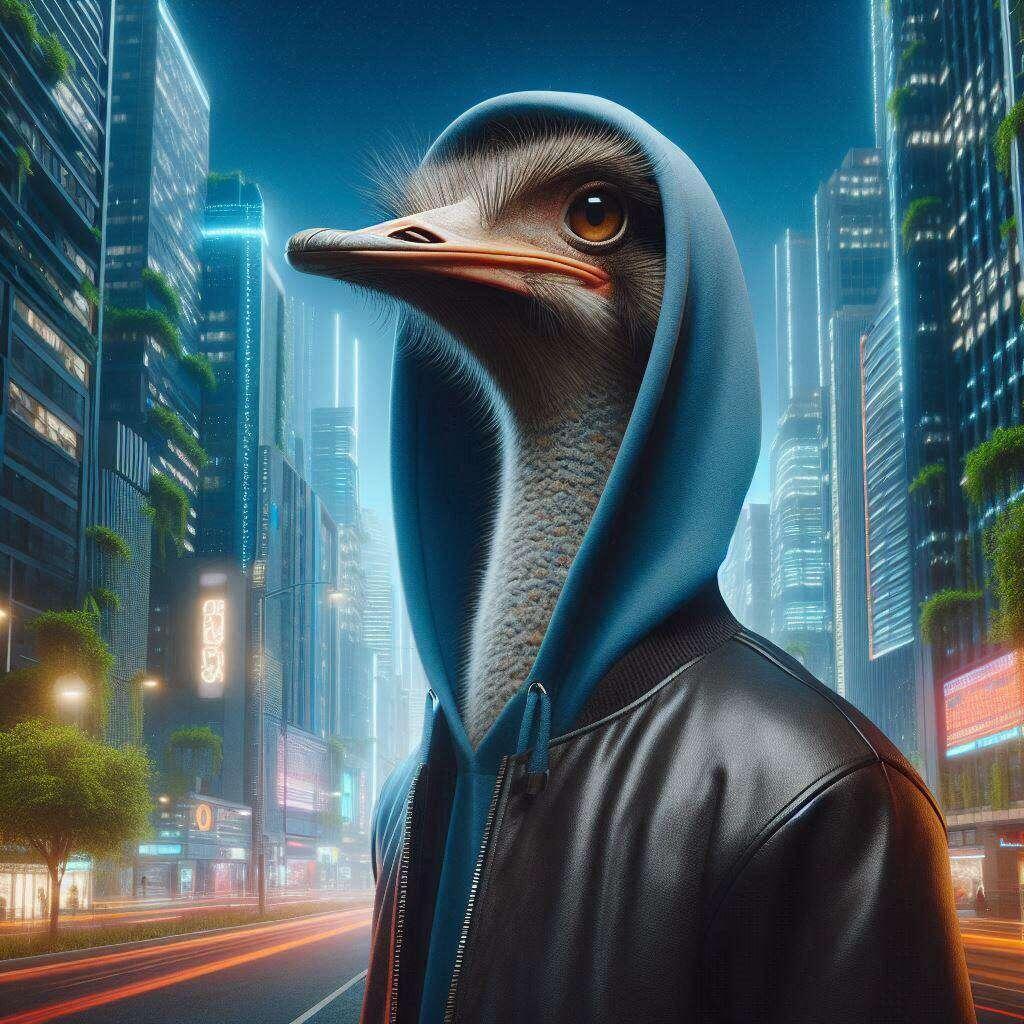
Fully agree! The new logo is cool
Nostriches adapt. If I'm being honest, I never fully loved the nostr:npub1fl7pr0azlpgk469u034lsgn46dvwguz9g339p03dpetp9cs5pq5qxzeknp Nostrich logo, because it's too thin. I felt it that it wasn't aesthetically pleasing next to other thicker social icons. The thicker bird logo that nostr:npub1k6rrkx80gkhxe9ycd5rpcjsaynf7034wvauffn928tqg5z0p2ekqhjx6lp made last year is better, IMO. It's more fun too.
Discussion
No replies yet.
