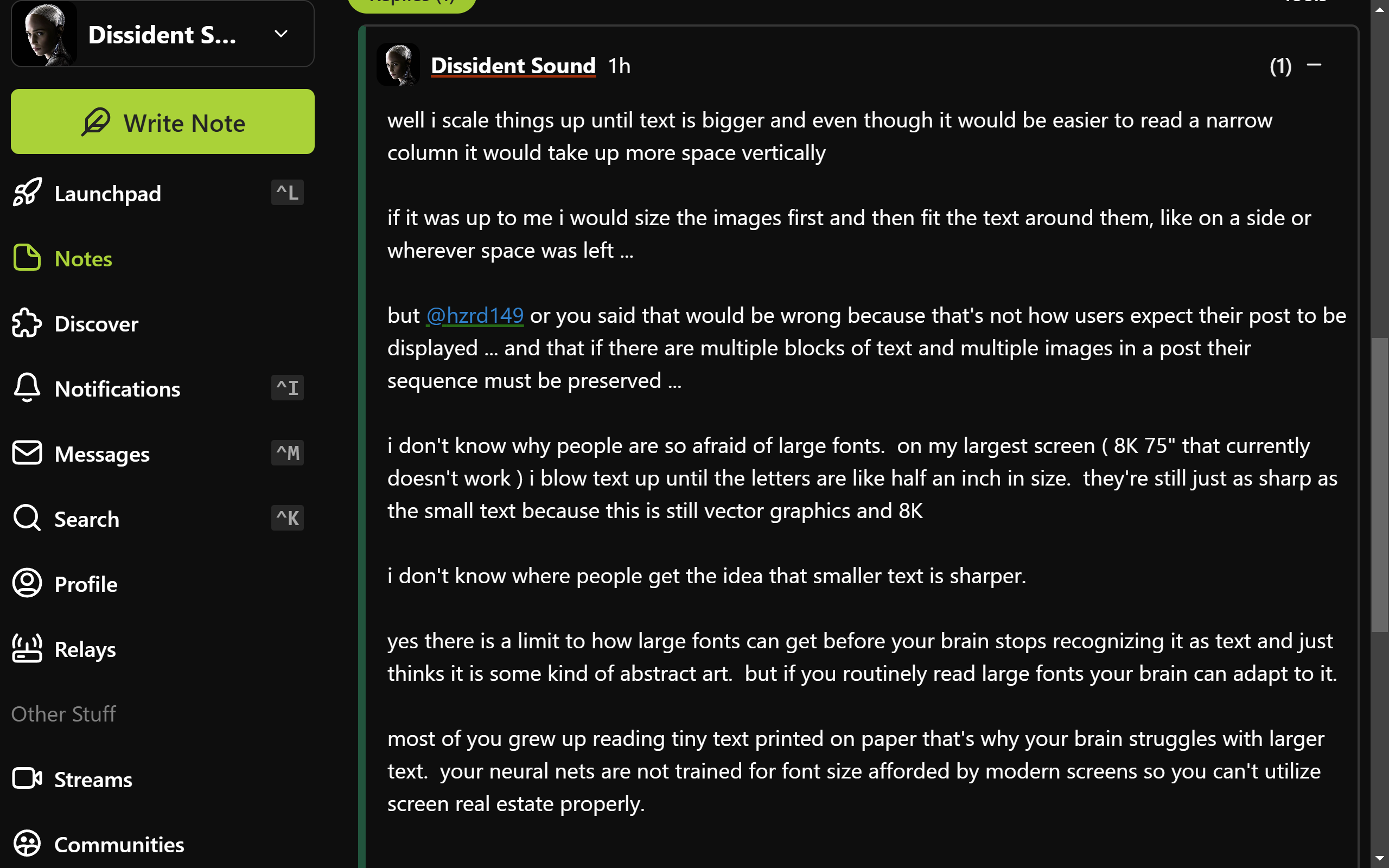
looks like this:

nostr:npub10000003zmk89narqpczy4ff6rnuht2wu05na7kpnh3mak7z2tqzsv8vwqk
actually nostr:npub10000003zmk89narqpczy4ff6rnuht2wu05na7kpnh3mak7z2tqzsv8vwqk i just realized that if you look at my above post it shows how i manage it.
that post fills my entire screen with no need to scroll
and by using widely spaced small paragraphs it's easy to not get lost in it
i just never realized that my style of writing may have adopted to my screen layout
sorry that's not 16:9 i am not home now - i'm on Asus ROG Zephyrus DUO 16 and that's the main screen ( it has two )
i never use laptop when i'm home
nostr:npub10000003zmk89narqpczy4ff6rnuht2wu05na7kpnh3mak7z2tqzsv8vwqk
This seems a quite standard view with balanced font sizes. For most people narrowing the right panel a little would make the content more readable.
So it's not a font size matter, but a characters-for-line one.
the difficulty with reading long lines is when you need to switch to the next line you can't find which line is next ...
narrow columns help with this ...
but so do paragraphs ...
the longer the line the shorter the paragraph needs to be ...
if you keep paragraphs to 3 or 4 lines max you can have lines as long as you want ...