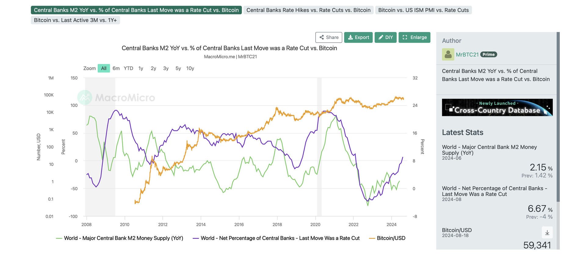
This chart I created on MacroMicro is one of my favorite’s as it shows how Bitcoin reacts to the YoY% change in global money supply and when global central bank rate cuts started to correlate with the YoY% change in global money supply.
MacroMicro is one of the most comprehensive macro tools I’ve ever come across, and has some really fascinating visuals on things like population growth and economic conditions. 
