
My two cents about nostr onboarding and UX at the very first step...
The first thing many ppl will do when they want to try Bluesky or nostr is a Google search
The first result for Bluesky is https://bsky.app/
The first thing they'll see is
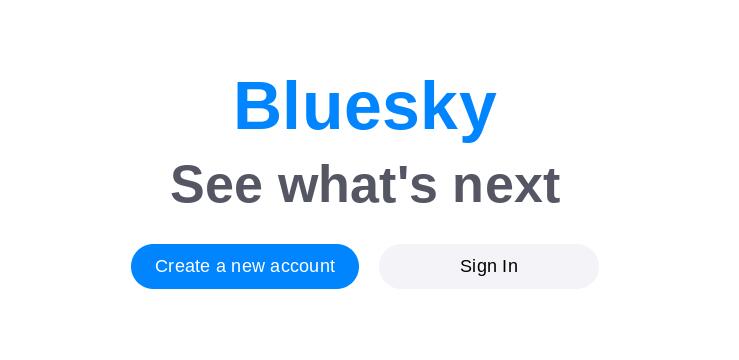
There is no explanation of what Bluesky *is*
"See what's next"
Build curiosity
"Create a new account"
Call to action
Ppl can fill in "what Bluesky is" with their own aspirations
What Bluesky *is*, is way way way down the Google results at https://blueskyweb.org/
This first result for nostr is https://nostr.com/
The first thing ppl will see is
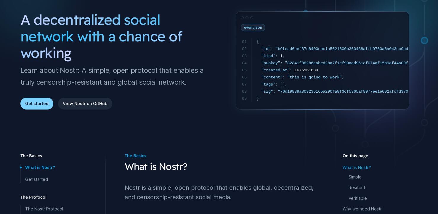
A lot of text describing what nostr is which won't mean anything to most ppl, and a small call to action
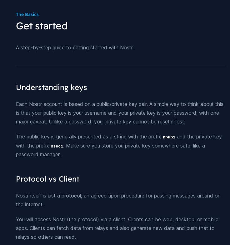
The call to action leads to another page with
... a lot more text describing what nostr is in terms that most ppl will not be interested in
The nostr approach is not wrong
For ppl who are into freedom tech it's more appealing than the Bluesky landing page
For ppl who just want an alternative to Twitter, the Bluesky approach is more appealing
For those ppl we need a landing page which is just
One link to an Android client
One link to an iOS client
One link to a web client
Smaller links to the ecosystem
The selected clients need a super simple onboarding which abstracts away the nsec/npub and doesn't delve into relay selection