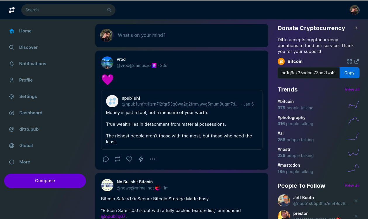
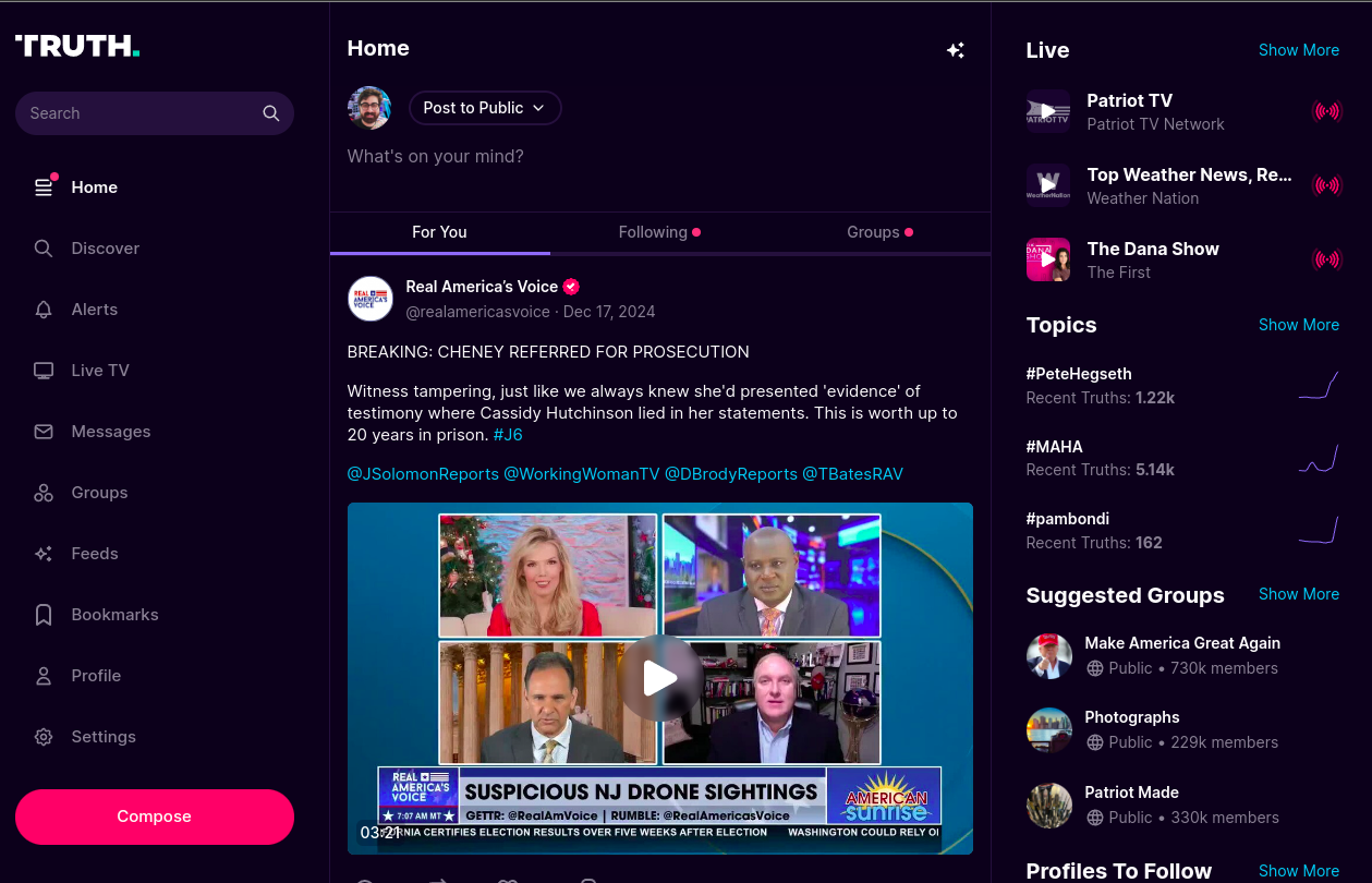
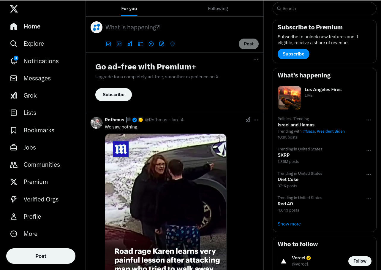
Guys, am I being stubborn in my material UI of Soapbox/Ditto? Even Truth Social (which is a fork of it) switched to the boxy square rectangles. Some UI problems are difficult to solve in the current Soapbox way. Should I switch?

Pictured: Ditto, Truth Social, X, Bluesky

Reply to this note

Please Login to reply.

Discussion

I like it tbh.

I like how the posts stand out on Ditto.

I personally think the approach on ditto looks exponentially better, but I understand the practicality of squaring off the UI too. In the end, whatever helps make the best product is really all that matters imo.

Ditto lack of straight lines makes posts look like they are "floating" above the rest of the page.

Also, not a fan of the gradient, as it distracteds me from the posts

yeah, gradient is rubbish

i prefer the simple panels though, but i'd sharpen the corners

also there should be 3 different kinds of area, document, panel and card, to be really material

and did i mention i don't like lines? yeah, i don't like lines... have a look at how Telegram's UI is laid out, that's a good one IMO

Yes, style over substance is almost always the wrong approach.

dont follow what others are doing (theyre all copying x), i like the way ditto is now

would be awesome if you can make it like the old tweetbot skeumorphic design tho