
Imagine obsessing over chart patterns when you can just look at this once every few years.
h/t nostr:npub14uhkst639zvc2trx2nlsvk4yqkjp690zk89keytnzgmq2az0qmnq58ez89
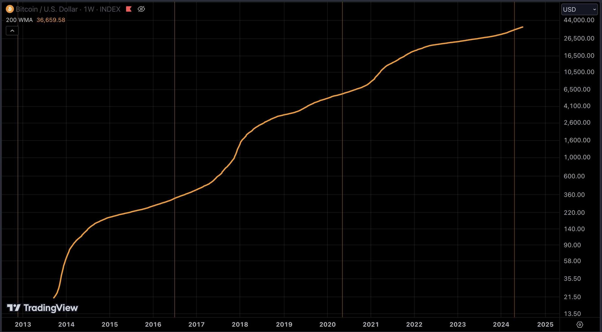
Imagine obsessing over chart patterns when you can just look at this once every few years.
h/t nostr:npub14uhkst639zvc2trx2nlsvk4yqkjp690zk89keytnzgmq2az0qmnq58ez89
Or you can basically print sats following nostr:nprofile1qqsp4udlg85fa3q3vl0vun9jzj8uv9e6qkfa9w9kzx7yw798nxpux7gppemhxue69uhkummn9ekx7mp06vzl0y
Maybe watching the Bitcoin price chart is the thing that bridges us from the old system to the new one.
What I mean by that is..one of the lessons you learn in Bitcoin is that short term price is a random walk. You learn that the most significant time scale isn't the day to day, but the month to month or even longer.
It kinda forces us to rewire how we think about news/money/our personal life because of that.
The problem with this chart is that is the 200 weeks average. 4 years is a long time and people are just not patient enough!

