Amethyst is a Swiss Army knife, packed with extremely useful features such as relay suggestions, auto-translation, likes and zaps report on each post, graphs, zap splitting in shared posts and much, much more.

And, even with all these tools, Amethyst is absurdly fluid, from loading the home screen (splash) to regular navigation.

However, the graphical user interface leaves a bit to be desired. In my opinion, the best UIs are from Primal (the most beautiful and intuitive) and FreeFrom (an honorable second place).

Primal's integration with the lightning wallet is also worthy of applause.

Of course, Primal and FreeFrom do not have the excellent features offered by Amethyst and, in the case of FreeFrom, it still has the problem of the absurdly slow loading screen.

Reply to this note

Please Login to reply.

Discussion

I'm still waiting for primal to support Amber login, I wish they would hurry up so I could try it.

Free from seems to be closed source? I can't find a GitHub link anywhere.

Very well put!

This is a shortcoming that even great clients suffer from.

This is not only the case with Primal, but also with FreeFrom.

Unfortunately, my private key has been quite promiscuous and I run risks like this by putting my key directly there.

What I can tell you is, since you have a virgin private key, stay with Amethyst and be happy until Primal becomes compatible with Amber.

After all, Amethyst is also excellent and, I can say, superior in most aspects, losing only in the UI and, in some points, in the UX.

I'm pretty used to it, 2+ years 😂

Take this beautiful, clean, and intuitive FreeFrom notification screen, for example.

It seems to me even more beautiful than the Primal notifications screen.

nostr:nprofile1qqsyvrp9u6p0mfur9dfdru3d853tx9mdjuhkphxuxgfwmryja7zsvhqpzamhxue69uhhv6t5daezumn0wd68yvfwvdhk6tcpz9mhxue69uhkummnw3ezuamfdejj7qgwwaehxw309ahx7uewd3hkctcscpyug

Low information density. One thing I like about Amethyst notification screen is that it gives me a full view of how a note is being reacted to. That screen shows very little in the way of total reactions & zaps. It doesn't even show the whole note.

It needs to be simple to be preferred by users. Look at Instagram and other successful social networks that even grandma can use.

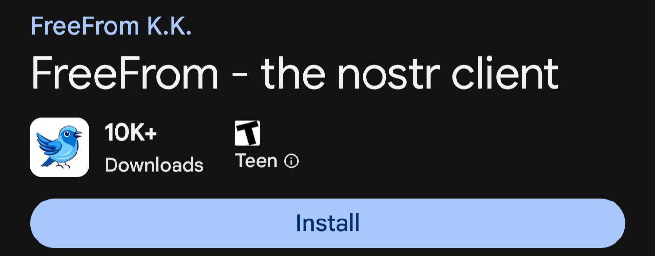
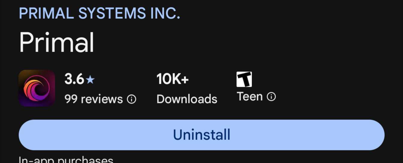
There are people coming to Nostr every day, testing different clients and sticking to the simplest and most intuitive ones (Primal and FreeFrom).

At first, sophistication comes second. I have no doubt that there are people who even give up using Nostr due to its lack of practicality, intuitiveness and beauty.

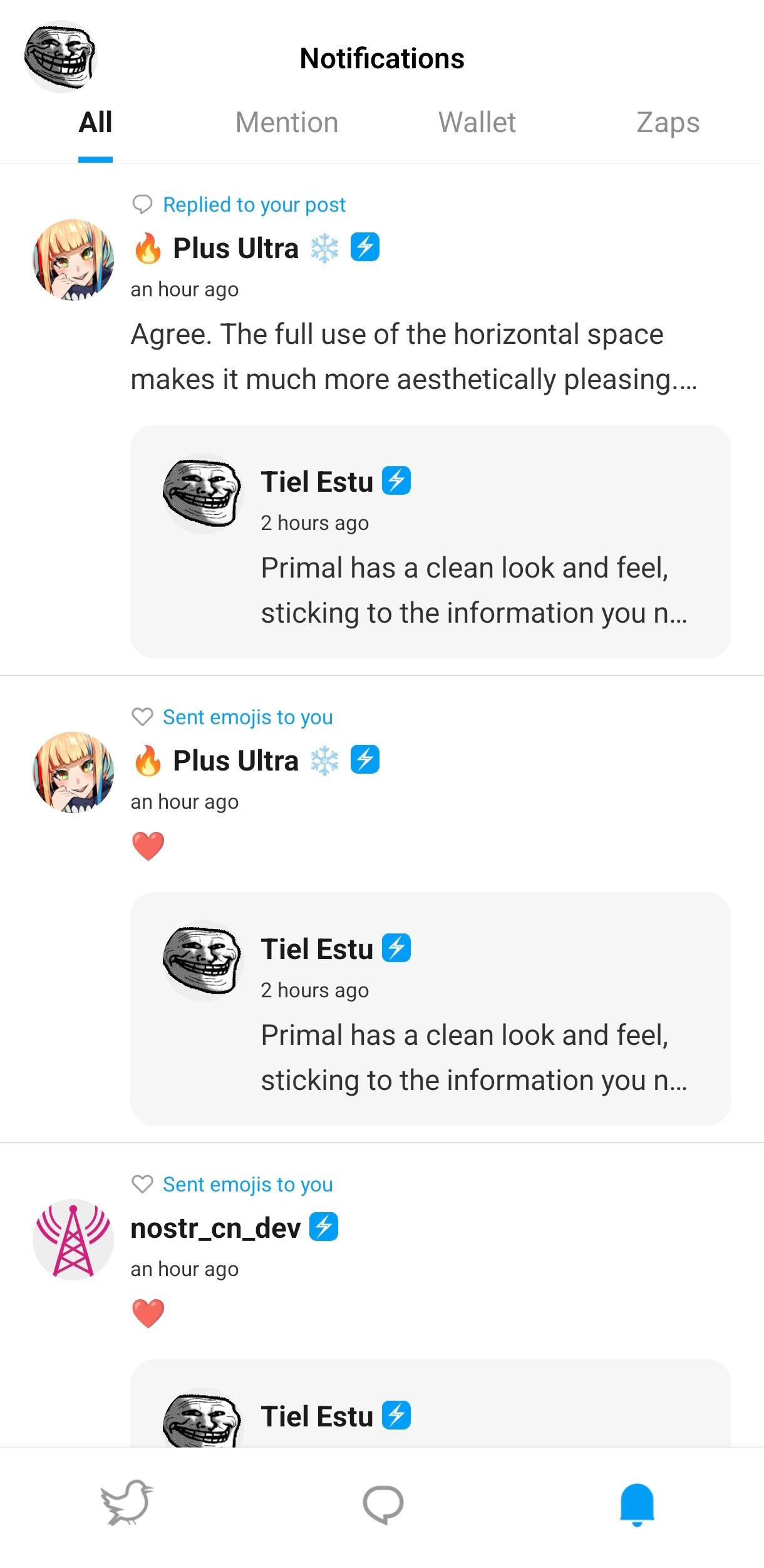
For more information, the more advanced user could tap the post report button and see details about the reactions received.

In fact, this post report could be presented, preferably in a pop-up window, as I suggested earlier, so as not to mix with the clean information on the screen.

Amethyst *is* one of the most popular apps with the most users though.

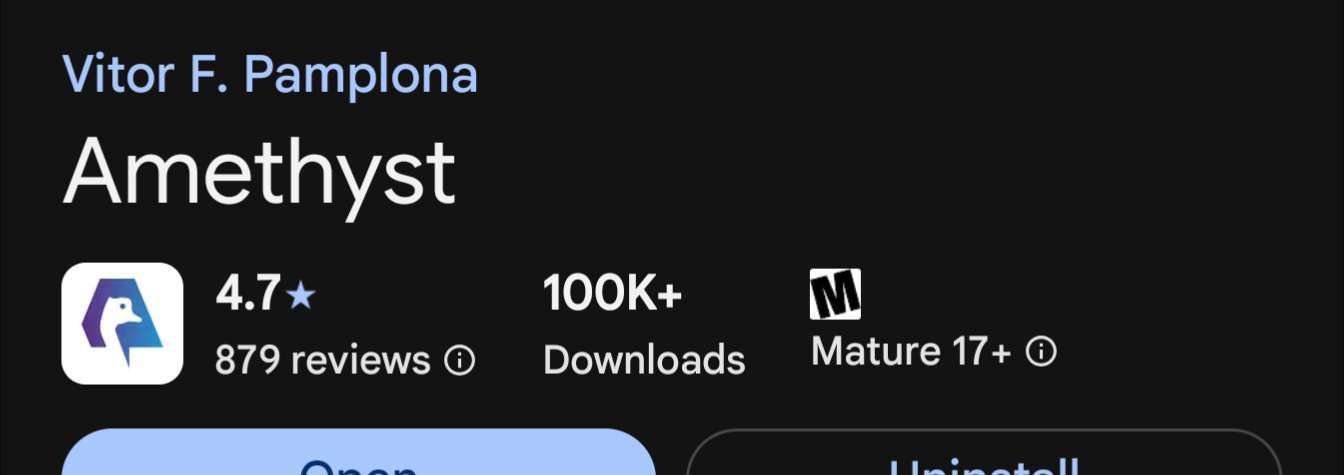
That number doesn't even include zap.store, fdroid or people installing with obtainium or straight from GitHub.

Because it is the oldest of the 3 and, therefore, the most famous.

Truthfully, I'd rather not have Amethyst become another dumbed down app with a low information density design. If a user doesn't like how it looks or works, there are so many options for them to explore. That's the beauty of Nostr. you can use whatever app you want, and all your data goes with you. Maybe FreeForm and Primal can add more features? But can they do that while maintaining their simplicity and theoretical ease of use?

I think Vitor has a pretty good handle on making a great Nostr client. The number of users, the review scores, and the amount of people who post notes saying what a great client speak to this. 🤙