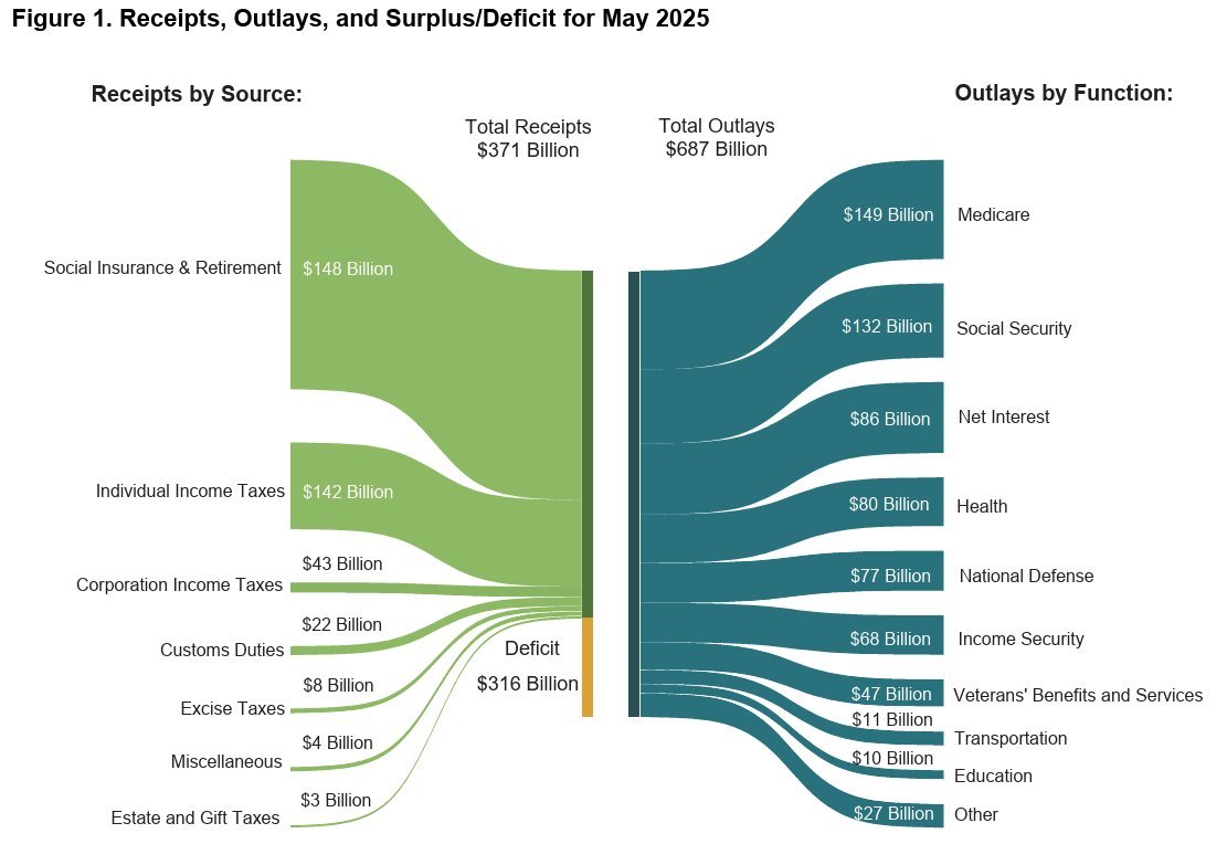
This chart is everywhere these days. My question is why is the 148 billion so much bigger than the 142B underneath it? And why doesn't the yellow 316B deficit take half of the left side, since it is about 50%? And why is the 316B yellow smaller than the 148B green? This is not how this chart is supposed to work.
Cool! Thank you for sharing. This goes directly into my bullshit graph collection.
Do you have a source I can attach?
Please Login to reply.
It would perhaps look like this. Please verify the numbers, I am still a human after all...