
Its literally two buttons, and I've been losing my mind.
The best user interface is often one that gives you only what you need and nothing more.
Kudos to nostr:npub1getal6ykt05fsz5nqu4uld09nfj3y3qxmv8crys4aeut53unfvlqr80nfm for passing my Drunk User Test™ by giving me a wallet app with two enormous buttons that just do what you expect.
This is solid UX design. 🙌🐝⚡️ 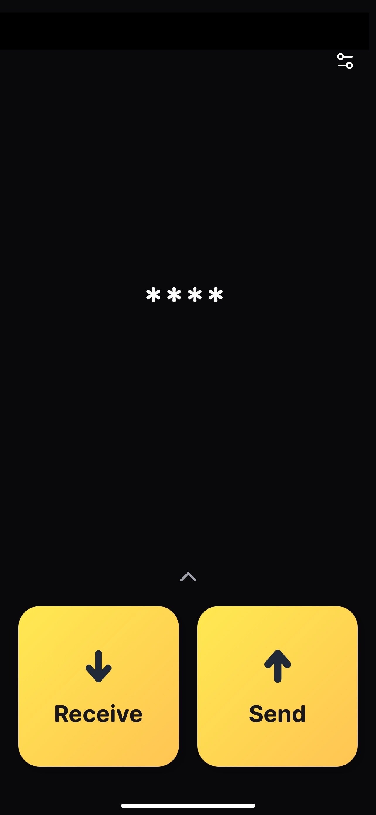
Discussion
No replies yet.