If it looks better and cleaner than a childish N ostrich logo....
I'm for it.
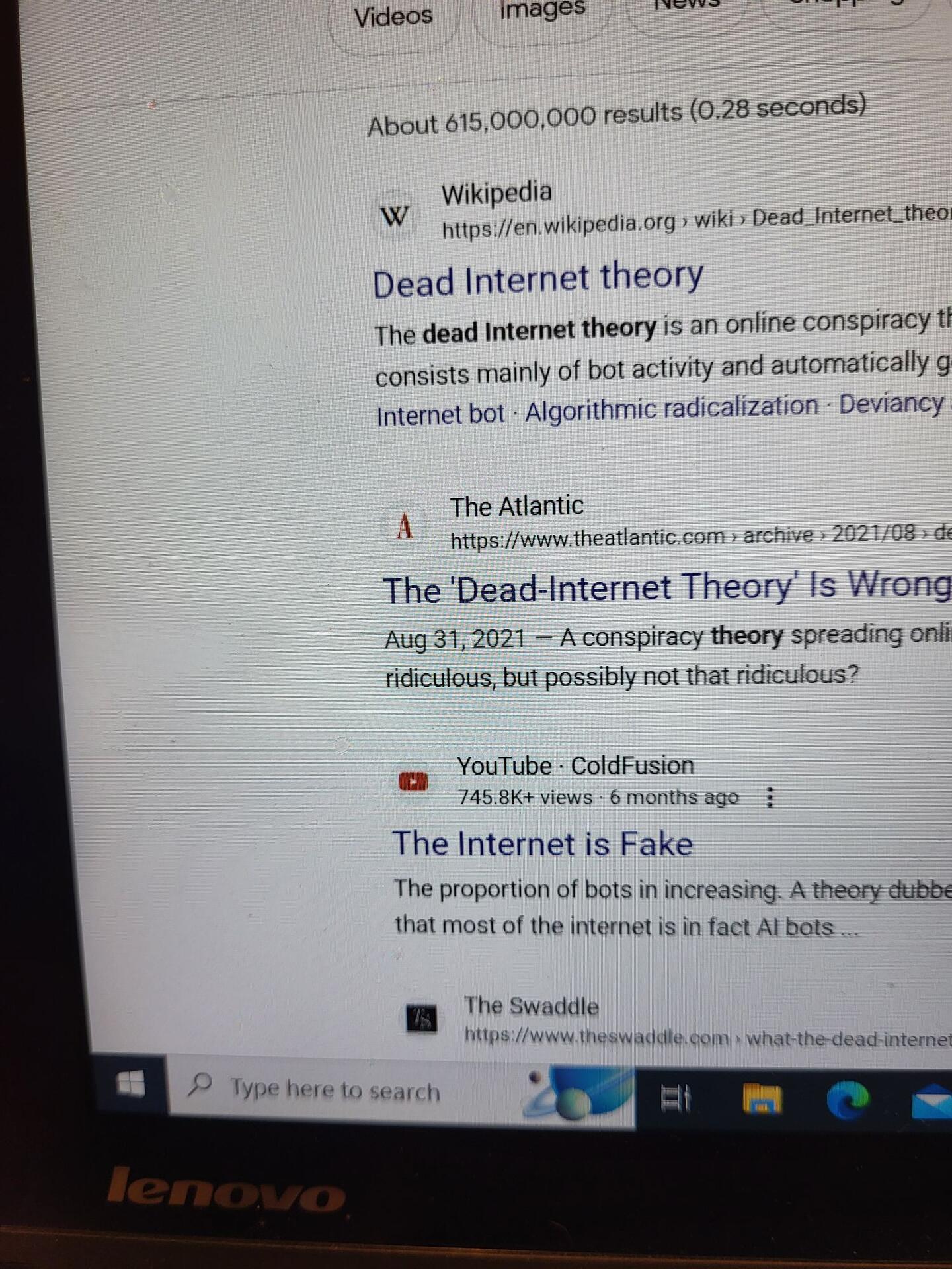
Google search.
And you'll see no icons/logos seen, are animals.
There is a reason for this.
It's CHILDISH!
The N logo for adults and the N ostrich logo for nostr kids.
Choose wisely! 🤣
 #m=image%2Fjpeg&dim=1440x1920&blurhash=_MIF0pIUDiIUIUM%7BM%7B%7EpR*j%5BoMafa%23ay4Tt7ozoyt7ofof%25MafV%5BWBWUayayITj%5Bofofj%5Dj%5Boft7ayWBayfPayayRjayofofj%5Bj%5BayWBj%5Bayayj%5BjsfQayj%5Dj%5DfQaxayj%40&x=a853672e922cbd5a6e50d0d68545d8062159aa2c19c889d0a044b10903ff3b1b
 #m=image%2Fjpeg&dim=1024x1024&blurhash=U6B%23bc%3Fb00D%25HDRjU%5EWB00Io%5DPxu%5EPogW%3D%25L&x=3e467bbe207f40b2cade3d6c2576f5d6aea0f2684c80be330533f9b8ad6154da