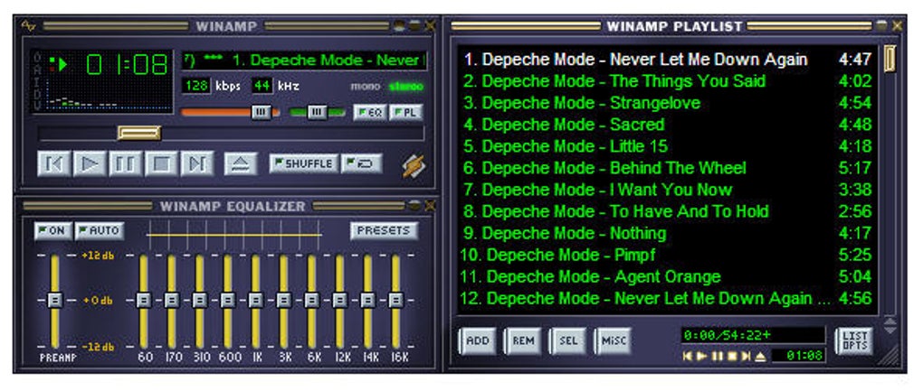
I used to think that a "Corporate UI" is an ugly ass login screen from Microsoft and some font and color choices that look like a pack of Skittles got sick in a blender.

Turns out "Corporate UI" is just your average big tech mobile app.

It's the Monotonous Modern architecture of software development.

Reply to this note

Please Login to reply.

Discussion

I miss when software had a soul instead of squircles and empty space 😢

Fuck i want that album

Scoop the mids!!

Its really just shadcn defaults

I generally like modern React UI styling, particularly the more minimal ones like Shadcn. Material is solid, but too normie and played out for my taste.

They've evolved to their current forms through billions of user feedback loops, so it's hard to argue against survival of the fittest.

I also like some of the retro / minimalist UIs, but I doubt they have as much potential for mass appeal.

I think DHH did a great job with Omarchy. It's a fresh mashup of retro and modern UI aesthetics. I could see this catching on.