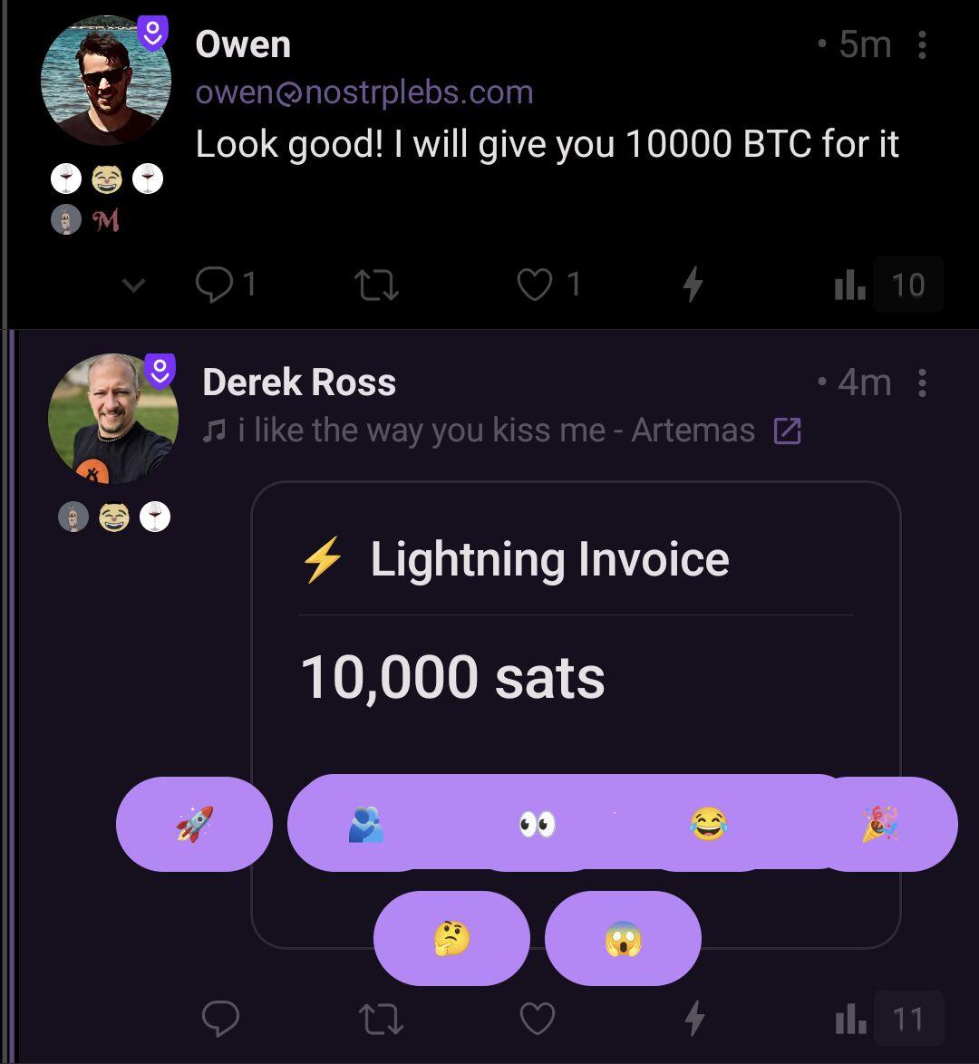
lnbc100u1pnyu7wkpp5eg8njcg2qlw4t9tz45wu95qkgzcfep8rvlw5qse7pf7fn2ykg8gshp5f725tylf7us6a72t4qqj5qxfxfjts7m49rtscv94m9v5v6jeuluqcqzzsxqyz5vqsp5ykv8660x700ppq5n809w4fhgj4v8g9c660g832p4v0t43645fujs9qyyssqmgns4c4z3hkg3uuy9r5vfh66xpyk0ex98e36ulvhanlj6ml6zvm4n2ccytk3hhavprl6pvv6mj0lkctzx09thcepc40dmr288qx4upgq2nmntj
Discussion
Thanks! I found Amethyst UI bug 😂

Hah. I see it too when I try to react.
Omg Im so dumb its just because the button is the same colour
Maybe they should have a 1 pixel strike around the buttons? nostr:npub1r0rs5q2gk0e3dk3nlc7gnu378ec6cnlenqp8a3cjhyzu6f8k5sgs4sq9ac plz halp.


