Do you have a graph for income (all sources) / salary?
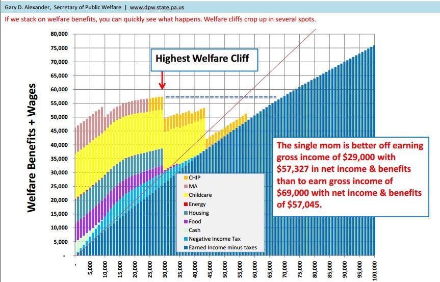
Remember seeing that for UK about 15 years ago and there were a series of inverted cliffs, where you earn £1 over some threshold and lose a state benefit.
Was quite revealing to see it laid out graphically.
Like this?
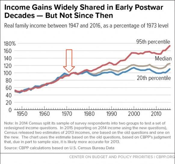
Check this site, lots of 1971 charts
https://wtfhappenedin1971.com
Please Login to reply.
Like this…
Ah, no sorry. But I am also interested in charts like this. Great visualization