
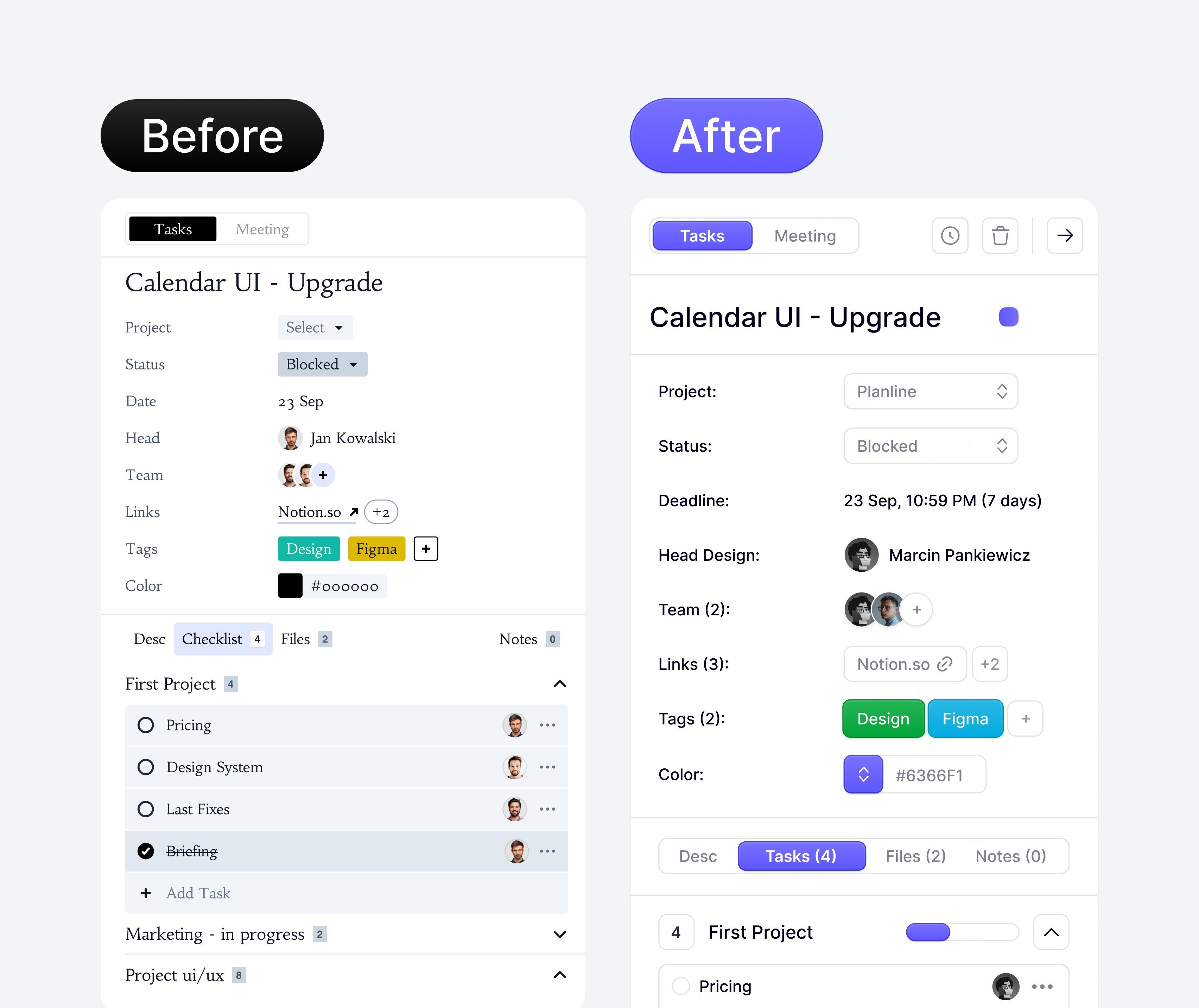
Designers never tire of trends. What was old is now new ... AGAIN.
Gradient buttons, beveled edges, button borders, inner shadows.
I refuse to go back to this trend.
Designers never tire of trends. What was old is now new ... AGAIN.
Gradient buttons, beveled edges, button borders, inner shadows.
I refuse to go back to this trend.
I’m not a designer but looks cleaner the second one
Of course it does. They used the worst possible font and spacing for the 1st
Yes almost anything would be an improvement to the former!
Cleanness is good but it often comes at the expense of personality. The "after" option is nice in the same way a minimalist house is nice: Looks good on Pinterest but it is lacks life. Leaning too much into trends has an interesting way of making a thing visually stale.
To further Karnage's iriginal point, some design is constantly recycled and some design never goes out of style in the first place.
theyre_the_same_picture.gif


