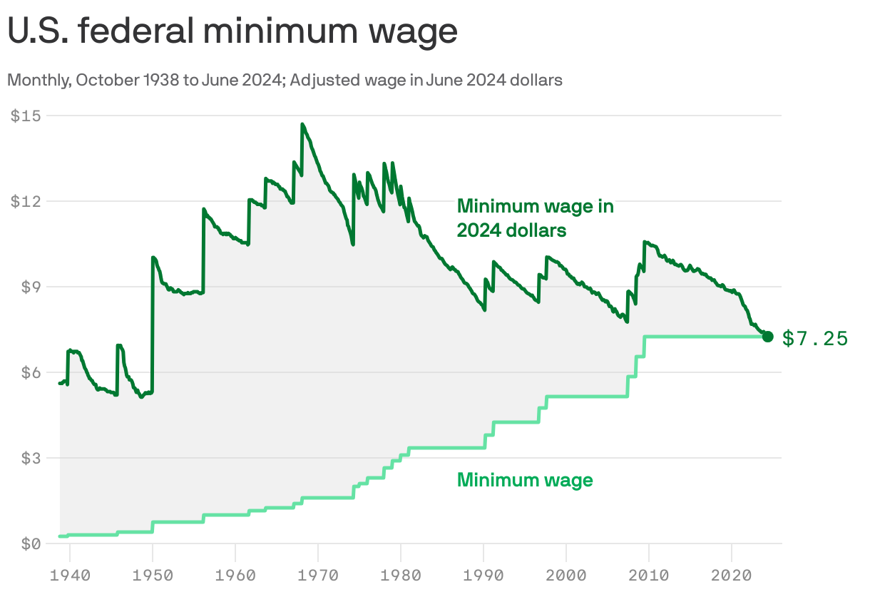

Ok, so I think the bottom line is what minimum wage was at a give time nominally.
The top one is for that year, what that wage was but adjusted backwards for inflation in 2024. So it has to converge at 2024. Pretty much it just shows that Minimum wage in 2024 is almost the same as it was in 2024 as it was when the chart starts..
Its a dumb chart because I don't even think its right, nor is minimum wage actually a descriptive number. The better chart is minimum wage for a year, and then then number of hours you'd have to work to afford the median house for that year. Another one is how many hours you'd have to work to buy an oz of gold, lb of beef, lb of pork, etc with the minimum wage for that year.