
Variation on the new timeline based on feedback. Restored the old text style while keeping full bleed images. better?
Discussion

Don’t know about the picture formatting.
Breaks symmetry
🤔
Not sure that I have an opinion
Also not sure if this has been mentioned but can’t seem to close images after opening them with the x, only swipe away
Keep up the good work jb

What about starting the left alignment centered to the middle of the profile picture../ curious how that would look.

Beautiful 🤜🤛🙏🧡

Yes!

Text is easier to scan with eyes now. I like it.

Noice.
Still the best iOS client hands down and you’re going to hold that title for awhile. Give it all a beat and choose what you feel is best. 🌊🏄🏻♂️

I would left align pfp, text, and images for all cases. I think a little margin looks good.

Your post is getting a lot of traction.
Added to the https://member.cash/hot feed

Full width text, this is the way.

Looks weird. I like the OG format

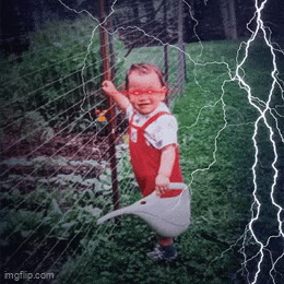
Nice! Awesome meme from 3ffr4c on your video 🤣 Can someone share his profile? It’s so hard to search for users by name. I would like to follow, but can’t find him.

Not quite sure how everyone feels, but the presentation of the images seems too big and disproportionate. Looking forward to some optimization, thank you very much. note1jkkxxqz9lvgjqd85zppqnq6cmcq5l0jxgk48uezy5rlg4syzfgzqnj2w4v
Not quite sure how everyone feels, but the presentation of the images seems too big and disproportionate. Looking forward to some optimization, thank you very much. #[0]

⚡️🙌

Better yes
probably some margin and alignment with the text instead of full bleed. otoh, the scrolling when loading a post thread is much smoother now, much better experience on smaller screen.

Much