
Way different feel to any other Nostr client out there, love it 🧡
Interested why you chose to have “Replies” and “Reply” as two different buttons? Left one is the indicator and the other is the button for replying?
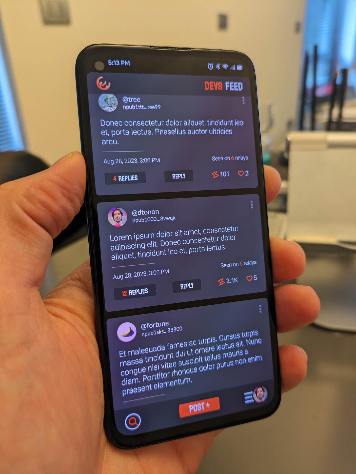
Toward multi feeds. Make sense?
(for reference, it's a 5.8" screen)
https://video.nostr.build/e783b5d60f9d9cf78448aa544491c9fa0238740fda3054e85f8b5d702ecc8b26.mp4
#coracle
#nostrdesign
Way different feel to any other Nostr client out there, love it 🧡
Interested why you chose to have “Replies” and “Reply” as two different buttons? Left one is the indicator and the other is the button for replying?
Thanks tanel!
I know that "X replies" / "Reply" buttons seems a bit strage / repetitive, but I never felt right the single reply icon with next the replies number that fires the compose window (Twitter introduced it), I would expect to see the replies clicking it; now clients that use this patterne ask you to click elsewhere in the note, minus the reply counter, to view the replies; I feel this counter intuitive. And it also creates some repercussions, e.g. weird interactions with links or image-only posts, difficulty to select/copy the text, etc.
So I'm experimenting something different, idk if can be wrong, but doesn't seem too bad. It is a work in progress.
There is also an "incentive" consideration to take in account: do we prefer if the user to read the replies before posting, to enter the discussion in a more consciously? If so, the reply button should be moved inside the thread.
Really interesting thought process, love to see this how this is gonna turn out 💜
Keep it up Daniele 🤗
