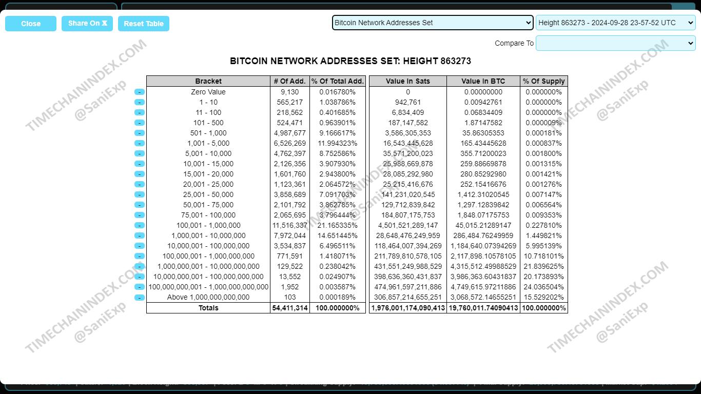
As of the latest data, there are 54,411,314 positive Bitcoin addresses holding a total of 19,760,011 BTC.
Of these, 12,423,601 addresses hold more than 1,000,000 Satoshis, collectively representing 19,709,087 BTC.
According to data from timechainindex.com, approximately 155k addresses belong to non-individual entities such as exchanges, corporations, over-the-counter (OTC) traders, governments, ETFs/ETPs, custodians, and dormant Coinbase rewards from before 2014, holding a combined total of approximately 8.1 million BTC.
This leaves approximately 12.27 million addresses, likely held by individuals, collectively accounting for approximately 11.6 million BTC.
Assuming each address represents one individual, this suggests that only 0.15% of the global population holds a significant amount of Bitcoin.
This highlights how early we are in the broader adoption of Bitcoin, with current levels still falling short of many expectations. Despite increasing awareness and institutional interest, only a small fraction of the global population currently holds a meaningful amount of bitcoin, showing that widespread adoption is still in its early stages.
Note: Individuals with balances held on exchanges or in ETFs are excluded from this statistic, as they do not directly own Bitcoin but instead hold Bitcoin IOUs.