One easy way to design decent looking apps is to use the same color but different shades all throughout the UI.
Step 1: pick a neutral color of your preference that’s not too dark.
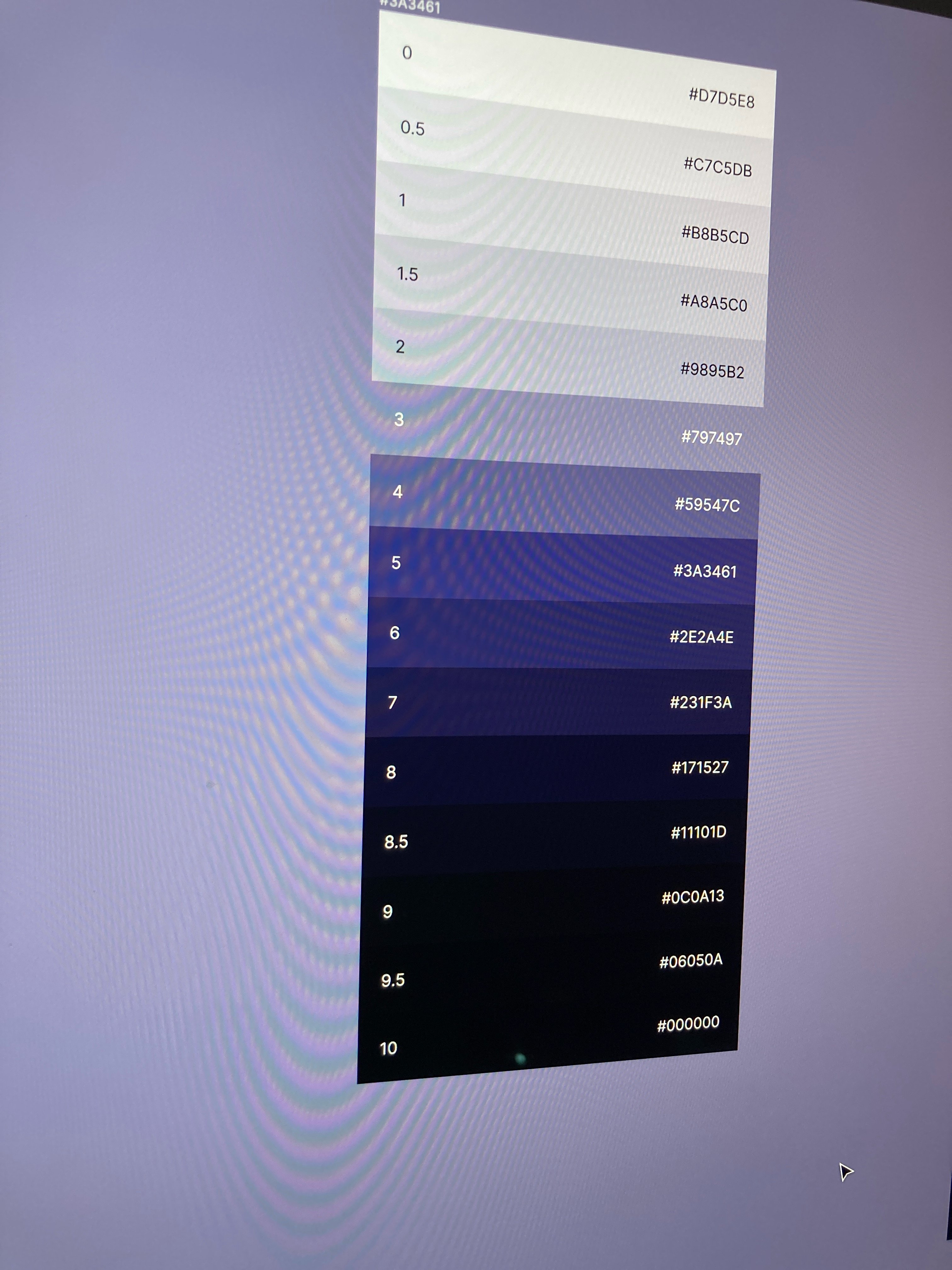
Step 2: run the Color Shades plugin in figma.
If the color you picked is too dark you’ll see a warning message. Try again.
You should have a nice uniform shade selection eventually.
Furthest to closest -> darker to lighter. The same as nature. Modals are closer in depth = lightest color.
Pick 1 accent color. This will be your primary color. Can also be a gradient.
That’s it. Works every time. You’ll have to play around a little to get the shades you like.
#design #nostrdesign