
Because the current one was created by these automated icon generation websites.... So..
I like simple but recognizable designs. Few strokes, dual colors, etc. Twitter and Discord logos come to mind.
Because the current one was created by these automated icon generation websites.... So..
I like simple but recognizable designs. Few strokes, dual colors, etc. Twitter and Discord logos come to mind.
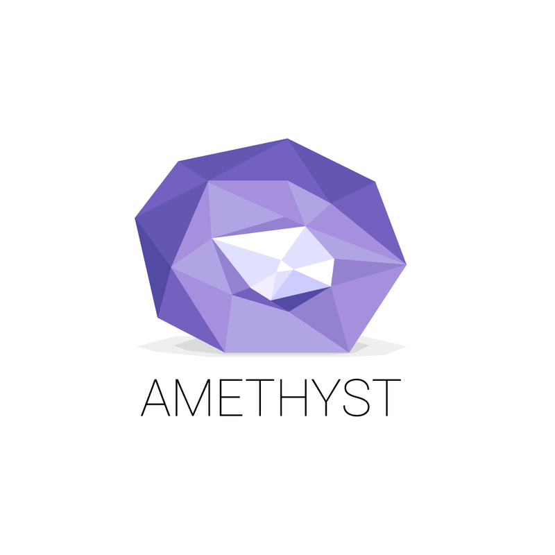
I don't know why you chose Amethyst as name, but is a fashinating one!
Perhaps because is a complex gem, with a lot of facets, as Nostr, isn't? You asked for a simple strokes but perhaps the logo could reflect this.
The icon should be a semplified version, of course.
Just a first and quick idea :)
Nice! The name was a combination of several factors. People's cultural attachment to the stone was an angle: The fact that this is the most popular gem, known to bring tranquility to the holder, and quirky stories (for instance, the greeks thought it protected them from getting drunk) was a fitting symbol for a social network app. I also did part of my PhD in ab-initio light simulations through crystalline systems to find out that Amethyst's color comes from impurities and not from the dominant compounds of an otherwise relatively simple quartz structure (silica and oxygen), which was also fitting for a social network. The impurities are the people, the structure is Nostr.
