Which #nostr design needs to be on a T-shirt? #asknostr 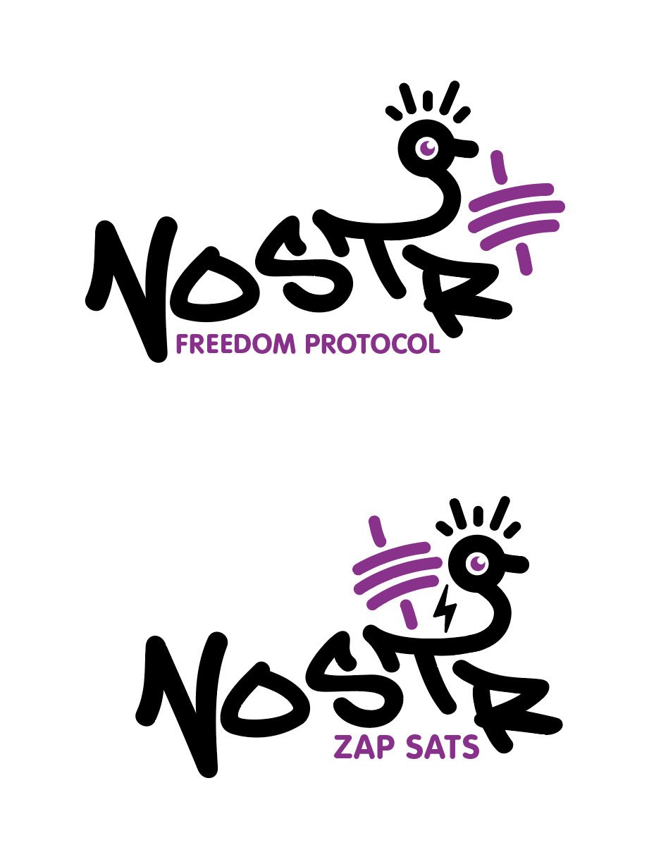
Discussion

zap sats obviously
Yeah I was leaning towards it to. But always ask, always #asknostr 🤣

I like the first one better
Ah ok maybe need to make them both😅

Do front back use them both
First one, make it about the protocol. Zapping sats is a feature 🤷
But very important feature. 🤙 Thanks for your feedback

Top one. Nobody cares about bitcoin.


2md but without extra words

2nd one. Zap sats

zap sats 👏

I like the second design better, but "freedom protocol" is a better gotcha. "zap sats" is cool, but probably says nothing to the larger portion of people. Might still be a good conversation starter though.

2nd is def more zappy

The bottom design with Freedom Protocol instead.