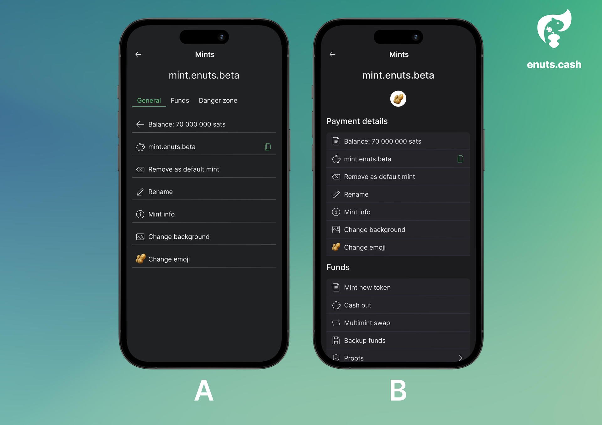
Tinkering on the eNuts settings UI. Trying to improve visual contrast between background & content groups. I changed from tabbed design to large headings for clear separation, I think this makes it easier for the user to locate specific fields. What do you think?