
Some alternative app icon designs, needs color, black and white is too corpoborin'
Some alternative app icon designs, needs color, black and white is too corpoborin'
nostr:npub12tyk735v52ju032qahe3k2r520jlsujaem6xr8n0ex6u7eqj0anq59vnqc personaly i would like to se it as the webite logo
It pops up when you launch the app so it would make sence
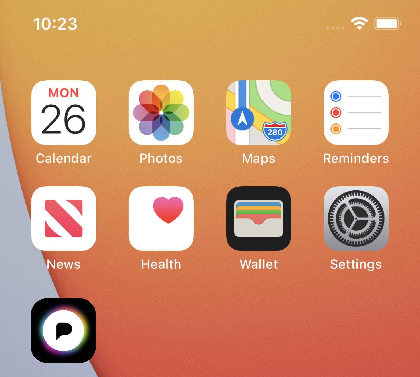
nostr:npub12tyk735v52ju032qahe3k2r520jlsujaem6xr8n0ex6u7eqj0anq59vnqc news, calendar, photos maps, wallet, social, messages, bank, all will eventually come from a single company called "company" and the logo would be just a black money sign $
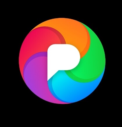
nostr:npub12tyk735v52ju032qahe3k2r520jlsujaem6xr8n0ex6u7eqj0anq59vnqc I prefer the first one's corona as its irregularities give it a softer, more light-like feel IMO. But I would suggest filling the P, either like the way the second alternative does, or with some solid color other than black. The black fill matching the black background suggests that the P is a cutout, in which case we should see the light below; or a different solid color so it no longer looks like a cutout. (But also it feels like a lot of black for an app which is about light.)