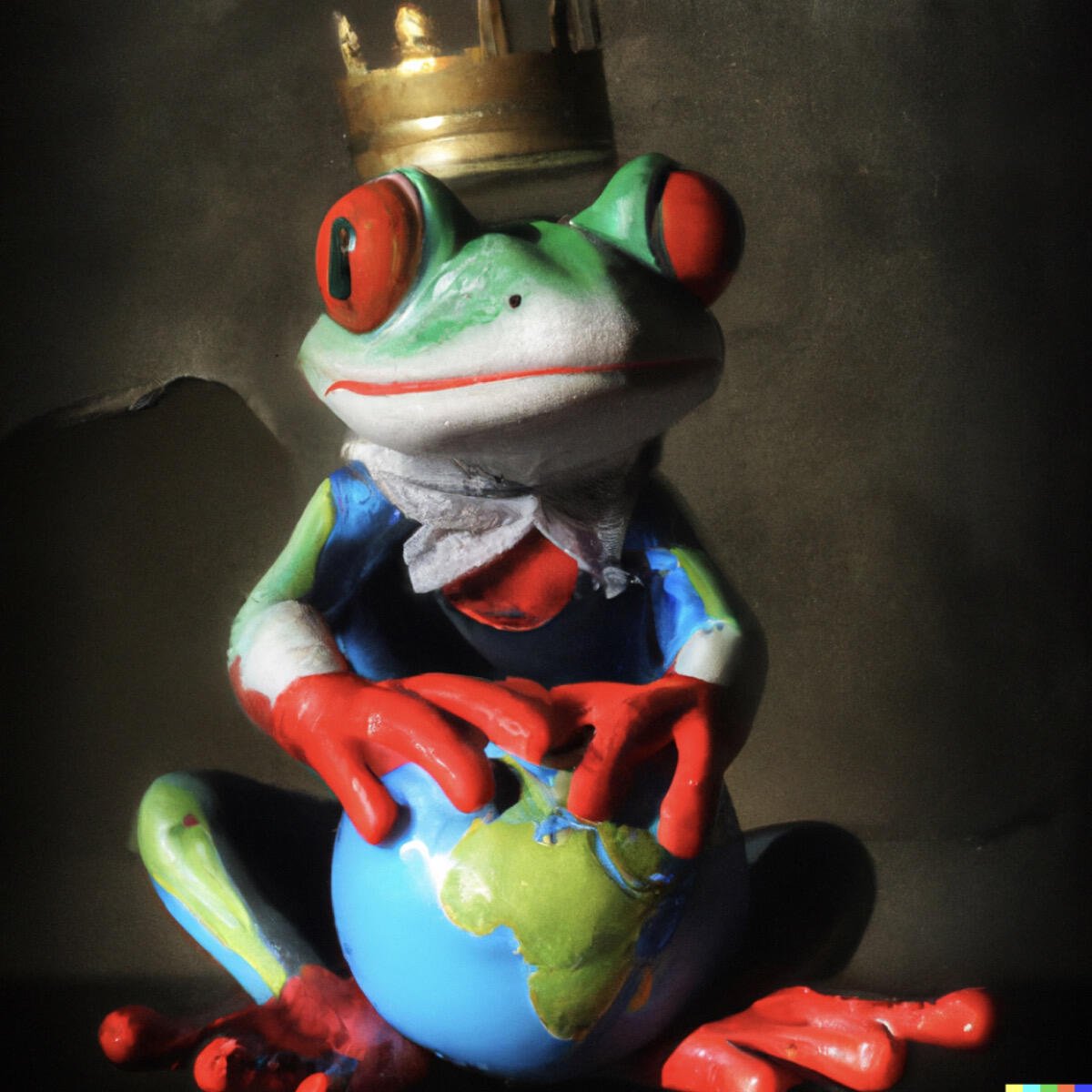
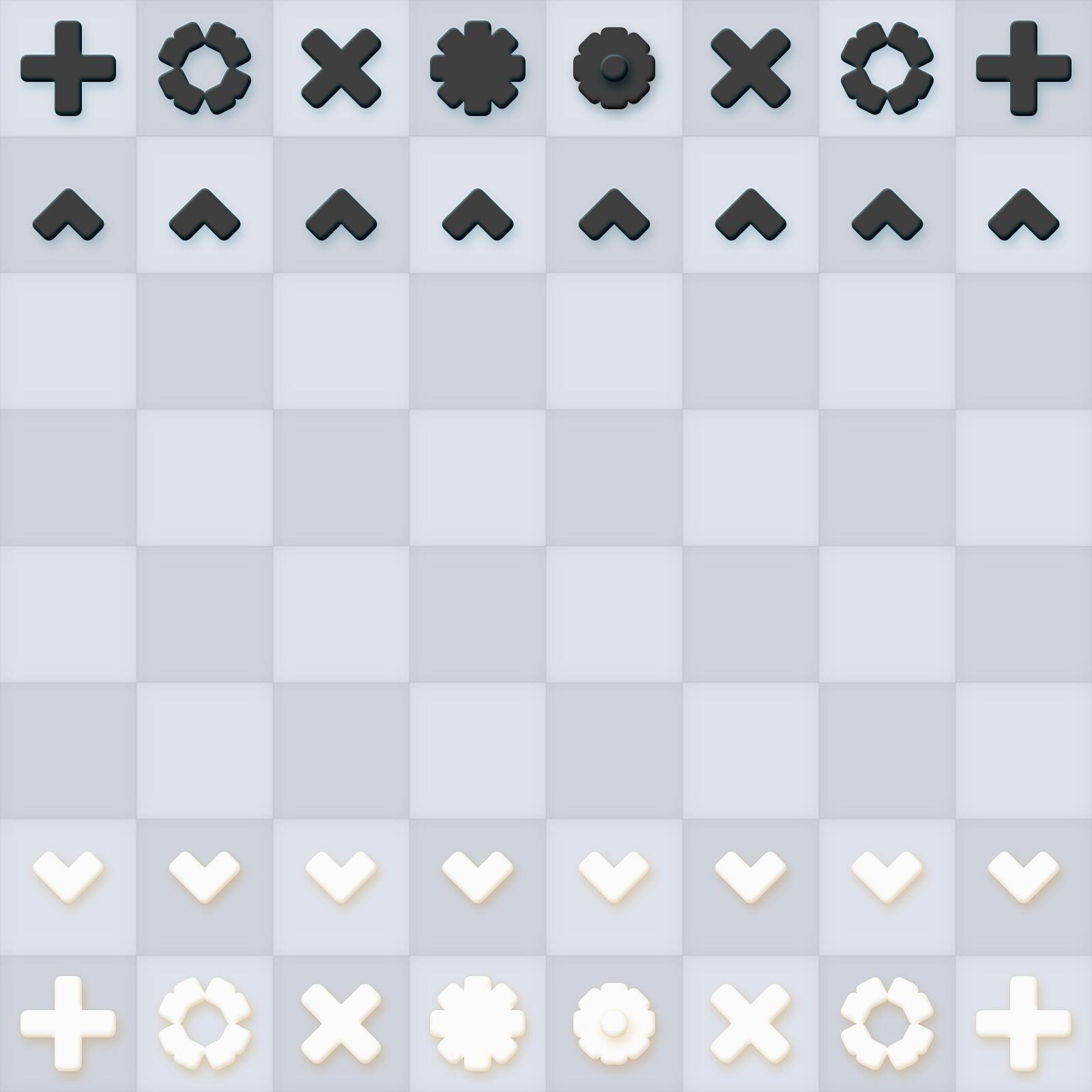
Interesting chess piece redesign with its simple geometric designs makes it look very minimalist.
 #m=image%2Fjpeg&dim=1600x1600&blurhash=U0ONLOtRx%5Dxv00xu%3Fb%25M00bHxvog00xu-%3B%25M&x=ada34cea98c0c285af01c989936c349d7383615bf216b3a624d15399cb952f0b
 #m=image%2Fjpeg&dim=1600x1600&blurhash=U1Op%7Djx%5EA1K54%3D%7EW%3FuT1nB9Z9ERN%7Dl%25g%253-%3F&x=557134ccf67cbb031b441cf171643fd6c7ca697b325c7bb50b6945949c9cad77

 #m=image%2Fjpeg&dim=1000x1000&blurhash=U1OzfBt7N%7Et7t7fQayfPN%7Eay_1j%5Bt6fQj%5DfQ&x=a4a653b2582de0afaf0bb59d4714e728fb9ec4be76d0787f4490411f7b3cfd21