Global Feed Post Login
Replying to Avatar Vitor Pamplona

This chart is everywhere these days. My question is why is the 148 billion so much bigger than the 142B underneath it? And why doesn't the yellow 316B deficit take half of the left side, since it is about 50%? And why is the 316B yellow smaller than the 148B green? This is not how this chart is supposed to work.

60
Vendetta 6mo ago

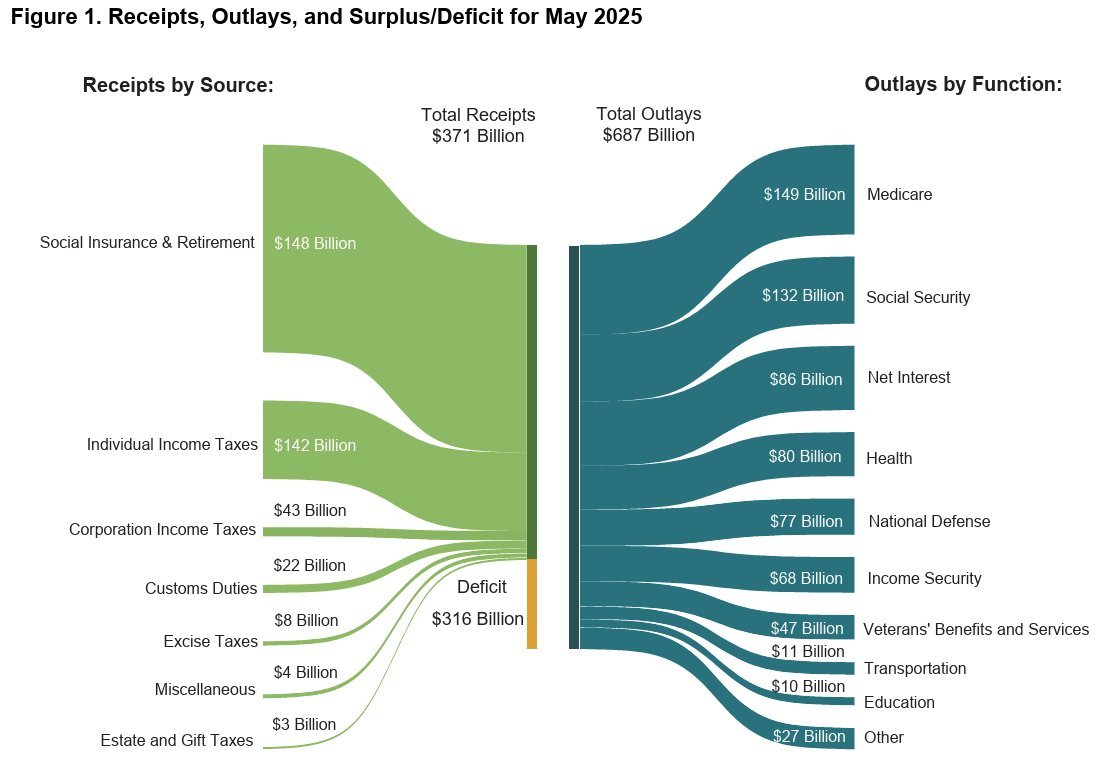
Here is an updated version. Looks like citizens shell pay double the amount of taxes just to keep the budget neutral.

Reply to this note

Please Login to reply.

Discussion

No replies yet.