this is not the way to go.
just alternate black background and gray background notes - no outlines. outlines add clutter and look like a design from the 90s or something.
also there should be no color anywhere in the app. everything should be white, black or gray.
the average color of the page ( including text and graphics ) should be 18% or so gray, corresponding to the reflectivity of caucasian skin as well as the paint color that graphics studios are supposed to use on the walls and basically everything else.
if background is dark-ish gray like this any photos posted will look correct with highlights that pop, shadows that look deep and colors that aren't washed out.
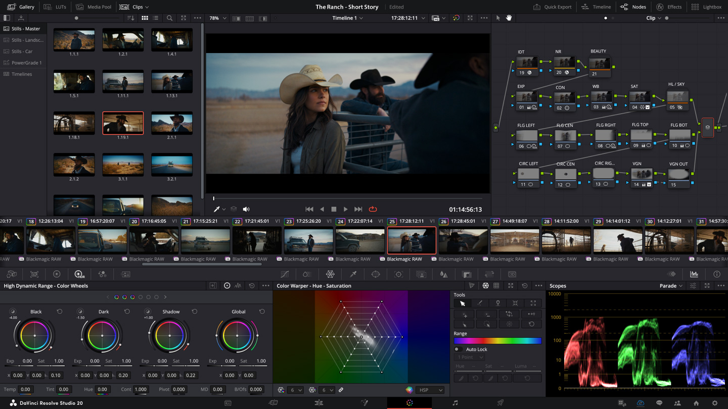
if you are unsure just google screen shots of any high end photo or video editing software and see what color scheme they use for the interface. for example here is DaVinci Resolve
and here is Adobe Premire Pro
 .img.jpg
different companies - same color scheme. not a coincidence.
