
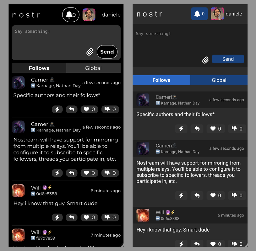
One thing I don't like about Snort's current look is that the word colors are too bright.
#[0] what do you think about this snort.social restyling?
This is the ready to go inline css that apply the restyle:
https://gist.github.com/dtonon/d7d5597d7f45cf35ab0caebae3277af6
If you like the design idea I can open a pull request (https://github.com/v0l/snort ?)
One thing I don't like about Snort's current look is that the word colors are too bright.
