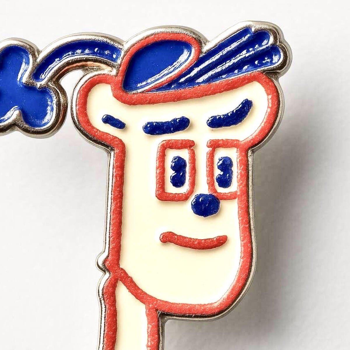
Needs to be bolder. Figuratively and maybe literally. Fill more space? I dunno, but maybe thicker lines and dots?
Needs to NOT remind us of Netscape, which died a slow death of strangulation by big tech monopoly. (Ironic) So maybe a big N is not for nostr? I dunno.


