They look all the same. I wonder what happened.
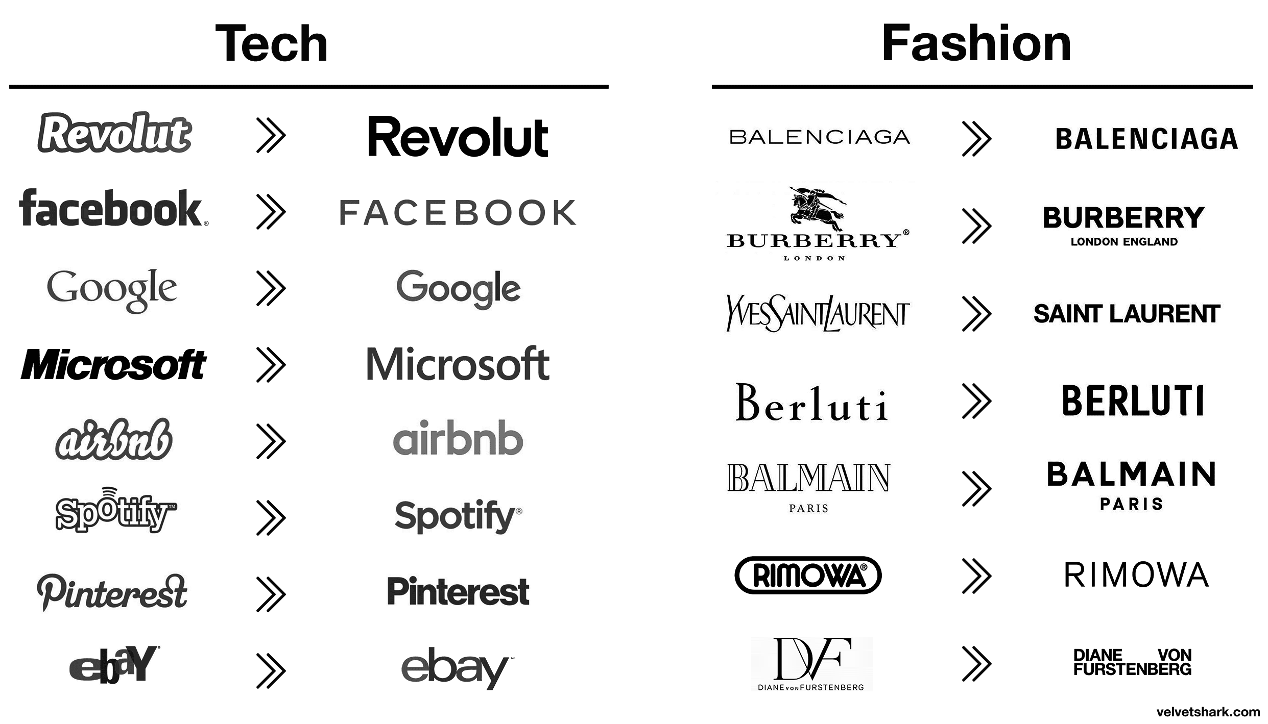
They look all the same. I wonder what happened.
I've heard a lot of people say this, it's sad. Also it's sad that all the logos are just black and white, no color of depth
Brand trends happy like this all the time. Design is always driven by trends, you know this. The minimalism look has taken off with the typefaces.
Yeah. It's just a bit depressing. It feels like we went from unique to sameness in the last 15 years or so. Everything is becoming sanitized and devoid of spark.
"Simplification is the ultimate sophistication."
- Leonardo da Vinci
ThEy NeEd To LoOk GoOd On SmOl ScReEns AnD aPp IcOnS
The all write with a blue pen.
Information intoxication has reached such proportions that minimalism rules the ball
brb rebranding coracle using airbnb's old logo as a template
it'll reverse back probs at some point