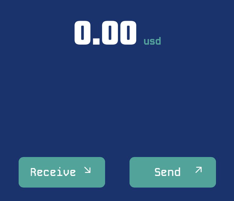
UX thoughts:

Arrows are common in wallets. Yes, "Receive" means money is coming down to me. However, down arrow can also mean balance is going down. And where the button sits on the page, Receive is pointing away from my balance.

I wonder if arrows are the right design pattern.

Reply to this note

Please Login to reply.

Discussion

I think the UX on boardwalk is first class super intuitive and clean! I would like for them to add support for regular lightning aswell

Definitely not trying to throw shade at Boardwalk and nostr:npub1cd0l3s6qgj0s6690rtkys39mgj5upwxpm4856nhmce0pyqu6xj9qh7xlvx

This is a pattern I’ve seen in many apps and I just used them as an example.

Arrows are unnecessary in my opinion.

I agree. They are a distraction.

Maybe a hand receiving a coin, and a hand throwing a coin would help. Agree on arrows being confusing.