Today in Coding With Covid, I bring you a long overdue UI rendering tweak to properly display the lower-right registration box in a 25x25 or 29x29 SeedQR.

Got it fixed fairly quickly but had to push through some harder debugging at the end while feeling my energy level draining out fast. Bottom just fell out suddenly on me. Feeling pretty sick again. Whee!

Anyhoo, before / after:

(the red is just a temporary debugging thing so I can see my changes more easily)

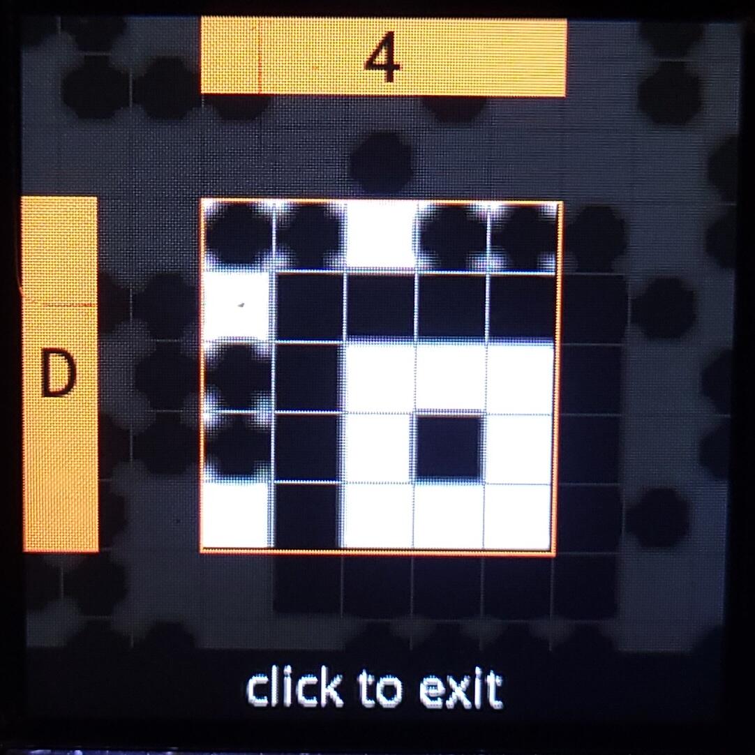
The errant dot rendering makes it confusing when creating your SeedQR; it looks like boxes you should be marking but the templates already have it filled in. It just makes you a little unsure of where you're at.

The corrected squares-not-dots rendering also applies to the zoomed-in transcription UI, fixing the aforementioned confusion:

Got it all working and submitted the PR:

https://github.com/SeedSigner/seedsigner/pull/484

Now it's bedtime for me, y'all.

Reply to this note

Please Login to reply.

Discussion

To a fast recovery and pizza box laptop screens with better advertising. 😉

Awesome stuff!! And now importantly: did your pizza have pineapple or not?🤣

Def not! I wouldn't be allowed back into Chicago if I did!

That means if you where not going back to Chicago you would get pineapple pizza? :V

Never!!!

Keep a different shape is ok, but why not leave the marker squares with a different color, as in the debugging session? I think it is really clear and usable this way. Maybe a 50% gray may already be fine.

Have a fast recovery!

That's not a bad idea. I'll try to do some tests today.

Fail! Changing the color somehow introduced a new ~12sec rendering delay!

Have no idea why. Shelving this idea for now.

Wow

Monochrome is better :)

Well, technically by "color" I just meant a shade of gray, but yeah, I'd have to dig into the QR rendering library we're using to understand why changing the defaults hit the rendering performance so hard.

⚡️

Search for The ONLY Solution to Long COVID from Dr. Eric Berg DC on Youtube