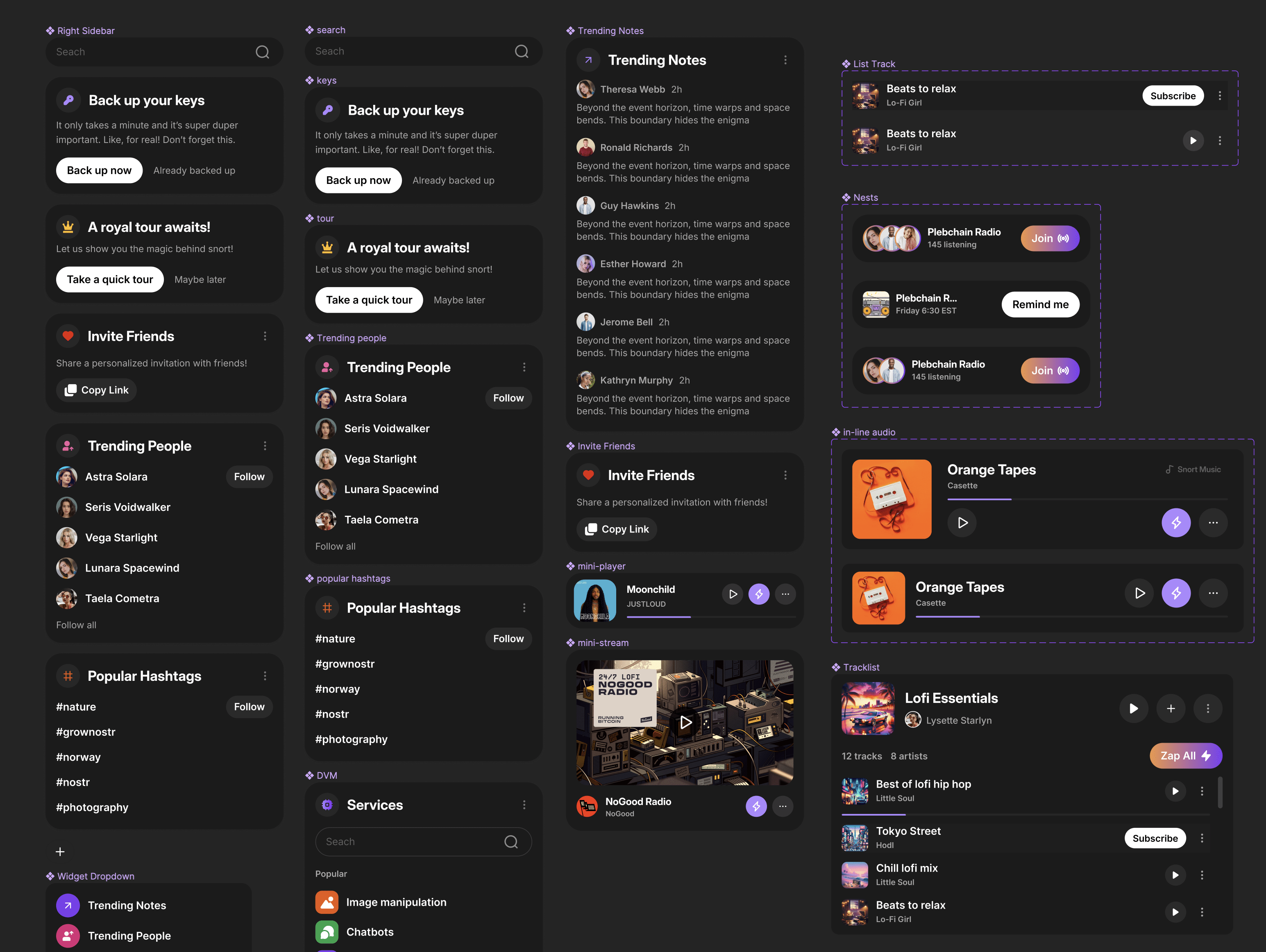
My vision for snort is to have a collection of widgets to be added or removed at will so people can customize their experiences.

Besides the obviously insane amount of work for developers, the current challenge is to stick to the vision without deviating much (of course I'd prefer we don't deviate at all).

But, besides that, there are other monumental challenges such as better discovery of content and people. That has technical limits - the design itself is not that difficult.
Reply to this note

Please Login to reply.

Discussion

Developers have their own visions so it’s a game of finding the right balance πŸ˜‰

so one thing i am DYING for any Nostr client to do is to minimise vertical real estate by NOT repeating the four buttons (re-post, zap, etc.) UNDERNEATH every note. In total it wastes inches / cms of vertical space.

Either make it mouseover-only or shift those icons to the side...

The issue with hover is that you have to then repeat this element on mobile and hide the desktop version on mobile (since there's no hover). And vertical may not work because you could have a note that is one line, leaving little to no space for vertical reactions. Besides, vertical is not an accustomed pattern in social networking usage. You typically want to re-use known patterns so the user doesn't need to relearn anything.

must say that looks an amazing dashboard... maybe time to try out yet another client...

Cocaine on the brain

So cool!

🀫