Nostr Nests needs a new minimalistic logo for the new version that's launching soon.
Discussion
Put up a bounty!
And ask vor eps and svg files to not have to deal with the Ai artists. Midjourney can give inspiration but I haven't seen a decent logo yet ready to be implemented. There is always a glitch
oh this isn't too bad. nostr:npub1r0rs5q2gk0e3dk3nlc7gnu378ec6cnlenqp8a3cjhyzu6f8k5sgs4sq9ac
Thanks, DALL-E. Could maybe be a bit more stripped down?
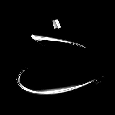
Nest or razor wire? 😅 https://i.nostr.build/qQvZ.webp
I think is pretty good
🤷♂️
this, but more minimal perhaps. https://void.cat/d/S3Q687cxiqmDqHxreG5ptB.webp
This is my favourite, it needs some form of text maybe tho I’m not sure.
nostr:npub1xzeq653ms8wkekfnr49kgnzwrq7ykeljkrsf7fyh7ham9t6sl72q7v4dhh care to take a shot at it?
Yes! I would love it, i can try it, sure! Is there any location/repository or guidelines!? Or is everything completely Open to criativity!? nostr:npub18ams6ewn5aj2n3wt2qawzglx9mr4nzksxhvrdc4gzrecw7n5tvjqctp424
It's open to your creativity and Karnage's scrutiny 😂
Ok, sure ⚡😁⚡
Another great challenge that I agreed to accept in the future for the optimization of another nostr client, a logo that can certainly elevate this good project by nostr:npub18ams6ewn5aj2n3wt2qawzglx9mr4nzksxhvrdc4gzrecw7n5tvjqctp424 . nostr:npub1r0rs5q2gk0e3dk3nlc7gnu378ec6cnlenqp8a3cjhyzu6f8k5sgs4sq9ac I leave my humble proposal here for the scrutiny of the community. I'm not going to explain the creative terms I had to create this logo, probably later... I hope you like it!!!! Thank you very much and I hope you all have a great weekend!!!! nostr:npub1xpuz4qerklyck9evtg40wgrthq5rce2mumwuuygnxcg6q02lz9ms275ams
.


Sure!
is this done by hand or generated?
The minimalist prompt didn't take but thought I might as well post :D
LOL sorry bro had to
"There are no active nests. Maybe start a new one"

Wen embroidered nest caps?
once we get a sweet logo, i would totally make this.
Ok… I’m done… too early for this. 🤣
Back to work. 
What about that ? 
Maybe something like this:

Might fuck around and take a crack at it this weekend.
 #m=image%2Fjpeg&dim=1080x1097&blurhash=%7C6Cidd5I4T%7B%7BHuTD5h%25ZE0IJ%7DtzFBpQ3D%7EtdRPRRnfV%231PSsNWtRIWbWt8%5E4ESB%24%3DXR7x%5BihNZx%5D00xlwII%5D.PNF%5E8r%23xrx%5DEdGSo%5Bzrv%3Bv%3Ano%24yQks%25tkO%40rg%2BNtSn%2CbdOqTBOrMg%2BLS8td%3D%7DM%7CiebuFrsF-DxFs*NEEO&x=c51a054b8a162495d7ad7c72f30000994170e04d8b29e3a0f2977e43289da0c6
This is too minimal (and too lonely of an egg 😉) but the mic icon you guys are using already kinda looks like an egg in a nest. A direction worth exploring imo. Don't have much time myself but if inspiration hits I'll let you know.
Also looks like a joyful egg-headed fellow with his hands in the air haha
Hmm. My first thought was a butt plug. I probably need help.
😂
Hahaha, you've got your clickbait right there
stop it, get some help
i did not see a butt plug - this one is really good imo
🥳
Cant go more minimalistic 😉 I second this design. Love it. nostr:npub18ams6ewn5aj2n3wt2qawzglx9mr4nzksxhvrdc4gzrecw7n5tvjqctp424
Will they launch an app, Derek ???
when my man nostr:npub1v0lxxxxutpvrelsksy8cdhgfux9l6a42hsj2qzquu2zk7vc9qnkszrqj49 finishes it. i'm hoping by the end of the month.
Yea... you should have clarified "no machine creations allowed"
 #m=image%2Fjpeg&dim=1080x1191&blurhash=%7B78%7CVJ9%3D0c%3Dkn-EJx1ot%5ESS0NqaPNHxan%2CNF0cxcs%40O6M%7E%253boaQEIxbV%7DXM%24%2BIVSc%253NWxIxJI-%25Fajo3RjXAWAr%40V%7Cbp%251xbIVIuNYs*%24%2Ct6NFN1xuITRn%253xojYRVIoxZE4jZ%25JRnRjtPbIR%25&x=db2e72a9a7f5fbbc7fb4dfcea39a0fcb1615406beacd3a2ead104119d183729b
I started this… but ran out of time to finish. If you like the concept… I will put in more effort.
V4V: I’d really appreciate your feedback on my draft “social onboarding” algo flow…

Final draft for review.
With transparent background, looks nice on light or dark.
Colors can be tweaked to suit your theme.
(Traced from actual ostrich chick 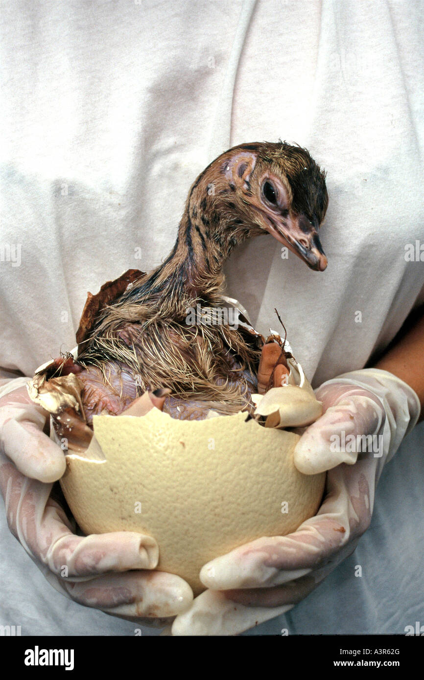 )
)


what would you do? to borrow a term from nostr:npub1rq9x6sk86e8ccw2cm8gsm4dyz9l24t823elespupaxjnzdk026fsca2r93 I’m no logobiologist
hmm i think no; too complex for a logo, both text and symbols layered like this
must also be think ab how this would look on merch and at different sizes; braided on hat would become messy
good points!
Like the font very much. nostr:npub1l4wcl62u30xpk9307c7ls70tm20a4pyre92g6rztfhlp07hw2v4qs3e0xc. Tried some handmade variations, maybe someone wants to digitalise and play with colours and scale ?Think nostr:npub149p5act9a5qm9p47elp8w8h3wpwn2d7s2xecw2ygnrxqp4wgsklq9g722q nailed it nearly. Miss something that hints to sound like ((.. 


