Well, this change must have been quite the challenge.
What made you decide on using basic tools/libraries like bootstrap instead of the more "modern" alternatives??
🍃 Design inspired by Japan
Have a read and join the conversation 👇
Read story: https://bolt.fun/story/design-inspired-by-japan--1235
The UI is looking very nice & "natural" 😁with this palette.
Also, I like the logo.
Looks very nice man!!
Very seamless & the UI is good 👌
Nice!! 🤩
NIP-46 Remote Signer Successful Test!
Have a read and join the conversation 👇
Read story: https://bolt.fun/story/nip-46-remote-signer-successful-test--1138
I'm very looking forward to this one!!
In the last hackathon, I tried adding 'nostr-connect' to my workshop project, but unfortunately, I wasn't able to get it to work reliably, so I had to omit it. (Maybe my usage of it was wrong 😅)
But if it works nicely now, this could help a lot with some nostr features on websites that are currently not very UX friendly.
Please keep us in the loop of this project's progress.
I LOVE the new website! Looks very cool👌🤩
& thanks for sharing the video, will definitely watch it soon.
Well....
I think I'll change the rendering method again to the old one because I discovered that the image above broke for a very specific case, which is that the image tag was immediately after a link, & there was no space between them, so any markdown renderer wouldn't consider the image as an image, but a part of the link. (& that's the right way), so I had to revert this part which means the image above will break again now...
But uploading the images is now working properly, so @SF feel free to re-upload the image & make sure there's a space or a new line after the link, & it should work.
Thanks for bringing our attention to this issue 🙏.
Testing Image 1:

Testing Image 2:

Hello World!
Here are a bunch of images:
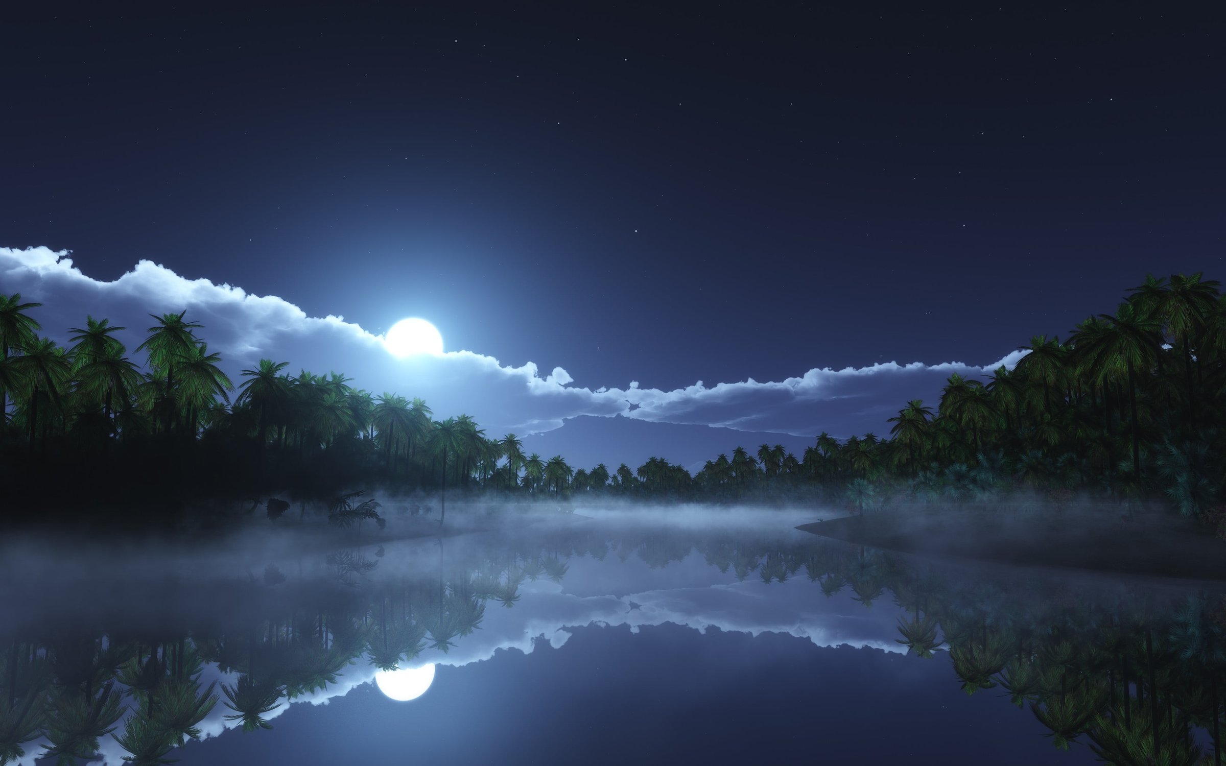
Image 2: 
Hope you like them
Technically, rendering images in comments was working previously, however, in the case of the comment above, there was not space between the text & the image text, so it ended up being not parsed.
Well....
Now it is!! 🎉🎉
The nostr client is only front-end. (So it's mainly javascript).
What you have on the back-end is totally up to you.
Hey there!
The stack that you should go with of course depends on your projects' requirements.
But if you don't have any previous experience with web technologies, then just proceed at first with the bare basics that is enough to get you an MVP.
So for example, on the front-end, just learn the basics of HTML, CSS, & JavaScript. (Probably not a framework cause that will take some time). & you could also use some ready templates or use one of the apps that allows you to build a web page using no-code or low-code. (But since you need some nostr features, I think you will have to go with an option that allows you to write your own javascript)
For the back-end, nodejs in my opinion can be learned quickly & used to build small apis in no time.
If you have a good python knowledge though, you could also look into backend frameworks for Python like Django & Flask. Flask in particular is very easy to get started with.
And yeah, that is my opinion.
If you have any other questions, just shoot.
I like this use case 😆😆
Hey Lana
I'm going to start developing the front-end components for this feature next week.
So I had a couple of thoughts on the UI of the badges components that I wanted to share with you.
\- We should consider that the badges description will in most cases be longer than 1 sentence. Since we will be using the badges to educate people about some parts of the platform that they might not have used.
So I think the description for some badges will be multiple lines.
\- The images are nice & neat. But I feel that they are a bit too "abstract" or "generic".
I saw the images at the top of the figma file (the ones that seem to be generated using mid-journey) & I think they look more "interesting".
\- The progress bar should be bigger so that in the case of badges that require a lot of progress steps (e.g. write 50 stories), the progress is kind of visible.
\- I think it would also be a good idea to have a progress count close to the progress bar somewhere (saying something like: "14/30")
For most of the points above, I think making the layout of the badges component list-like instead of grid-like would fix them.
So the items list would look something like:
\\\\\\\\\\\\\\\\\\\\\\\\ TITLE
\\\\ IMAGE \\\\ PROGRESS BAR
\\\\\\\\\\\\\\\\\\\\\\\\\\ DESCRIPTION
\_\_\_\_\_\_\_\_\_\_\_\_\_\_\_\_\_\_\_\_\_\_\_\_\_\_\_\_\_\_\_\_\_\_\_\_\_\_\_\_\_\_\_\_\_\_\_\_\_\_\_\_
\\\\\\\\\\\\\\\\\\\\\\\\\\ TITLE
\\\\ IMAGE \\\\ PROGRESS BAR
\\\\\\\\\\\\\\\\\\\\\\\\\\ DESCRIPTION
\_\_\_\_\_\_\_\_\_\_\_\_\_\_\_\_\_\_\_\_\_\_\_\_\_\_\_\_\_\_\_\_\_\_\_\_\_\_\_\_\_\_\_\_\_\_\_\_\_\_\_\_
\\\\\\\\\\\\\\\\\\\\\\\\\\ TITLE
\\\\ IMAGE \\\\ PROGRESS BAR
\\\\\\\\\\\\\\\\\\\\\\\\\\ DESCRIPTION
Let me know your thoughts on my thoughts 😄