DOODAD.dev :: Reduce the file size of an image… but in a stylish old-school way
Use this tool to reduce the file size of an image… but in a stylish old-school way.
It uses dithering to reduce the colors in an image, and places dots to emulate the missing shades.
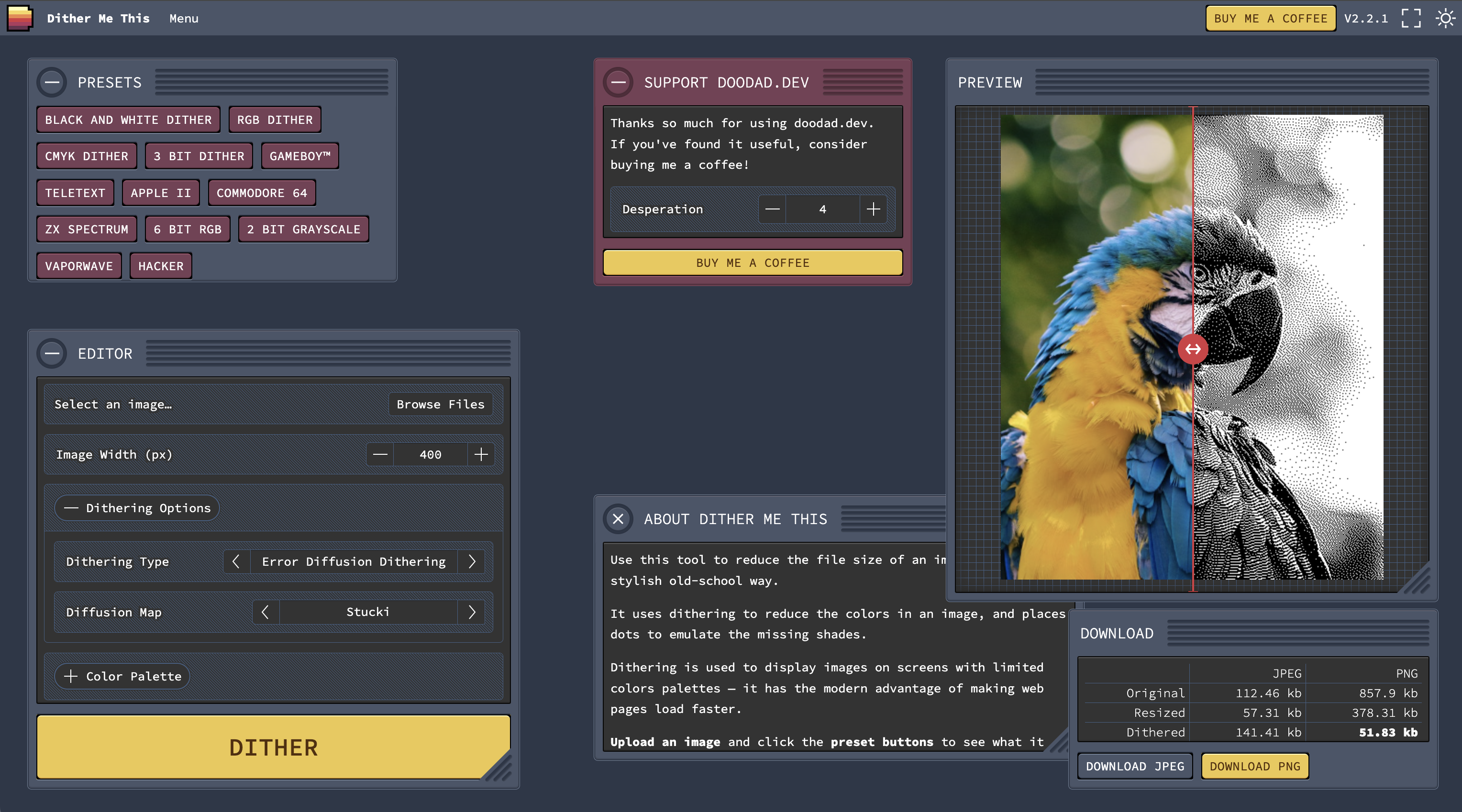
Dithering is used to display images on screens with limited colors palettes — it has the modern advantage of making web pages load faster.
Upload an image and click the preset buttons to see what it can do.
Learn more about [how dithering works and why your website should use dithered images](https://endtimes.dev/why-you-should-dither-images/).
Gorgeous minimalistic web design from the Nordics and their neighbors
Stack overflow is almost dead... lack of Creativity?
https://newsletter.pragmaticengineer.com/p/the-pulse-134
Today, Stack overflow has almost as few questions asked per month, as when it launched back in 2009. A recap of its slow, then rapid, downfall. Guess why!
Good Design Comes from Looking, Great Design Comes from Looking Away
https://www.chrbutler.com/good-design-comes-from-looking-great-design-comes-from-looking-away
> Great design comes from seeing — seeing something for what it truly is, what it needs, and what it can be — both up close and at a distance. A great designer can focus intently on the smallest of details while still keeping the big picture in view, perceiving both the thing itself and its surrounding context. Designers who move most fluidly between these perspectives create work that endures and inspires.
Read the full article https://www.chrbutler.com/good-design-comes-from-looking-great-design-comes-from-looking-away
32 Bits That Changed Microprocessor Design
https://spectrum.ieee.org/bellmac-32-ieee-milestone
Bell Labs’ Bellmac-32 paved the way for today’s smartphone chips Willie D. Jones22 May 20256 min read
Willie Jones covers transportation for IEEE Spectrum and the history of technology for The Institute.
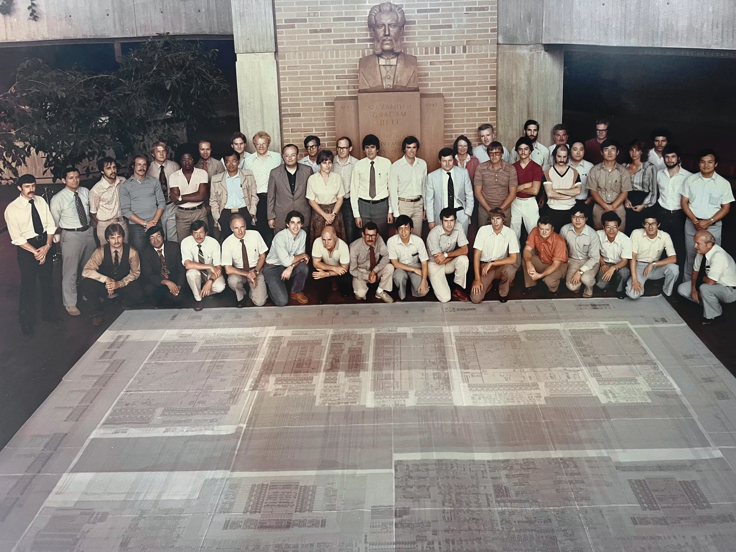
## Designing the architecture
The architecture group led by Condry, an IEEE Life Fellow who would later become Intel’s CTO, focused on building a system that would natively support the Unix operating system and the C programming language. Both were in their infancy but destined for dominance. To cope with the era’s memory limitations—kilobytes were precious—they introduced a complex instruction set that required fewer steps to carry out and could be executed in a single clock cycle.
The engineers also built the chip to support the VersaModule Eurocard (VME) parallel bus, enabling distributed computing so several nodes could handle data processing in parallel. Making the chip VME-enabled also allowed it to be used for real-time control.
The group wrote its own version of Unix, with real-time capabilities to ensure that the new chip design was compatible with industrial automation and similar applications. The Bell Labs engineers also invented domino logic, which ramped up processing speed by reducing delays in complex logic gates.
Additional testing and verification techniques were developed and introduced via the Bellmac-32 Module, a sophisticated multi-chipset verification and testing project led by Huang that allowed the complex chip fabrication to have zero or near-zero errors. This was the first of its kind in VLSI testing. The Bell Labs engineers’ systematic plan for double- and triple-checking their colleagues’ work ultimately made the total design of the multiple chipset family work together seamlessly as a complete microcomputer system.
Then came the hardest part: actually building the chip.
Why design goes wrong and how to set it right, part 1
https://productpicnic.beehiiv.com/p/why-design-goes-wrong-and-how-to-set-it-right-part-1
> At the root of design's crisis is an incentives crisis throughout tech. But we have tools that let us cut through the magical thinking of feature factories - if we're willing to use them.
`—Pavel Samsonov`
Steering a Design Career | why design goes wrong & how to set it right
> The work of design starts long before you open Figma. We must first seek out – or create – conditions in which good design is even possible, by building our own relational power.
—Pavel Samsonov
Design is a Leadership Skill | why design goes wrong & how to set it right
> A seat at the table is no good unless design is part of the strategy. To find the right place to apply leverage, designers need to embrace systems thinking.
—Pavel Samsonov
Design without Feedback is Theater | why design goes wrong & how to set it right
> The building blocks of feedback loops are learn, design, build – in that order. It's Design's job to create these loops, because no one else will do it for you.
—Pavel Samsonov
Design without Feedback is Theater | Why design goes wrong & how to set it right
> The building blocks of feedback loops are learn, design, build – in that order. It's Design's job to create these loops, because no one else will do it for you.
—Pavel Samsonov
Design without Feedback is Theater | Why design goes wrong & how to set it right
Happy Mempool Bitcoin Pizza Day Template by MARA for Gemini
Happy Mempool Bitcoin Pizza Day Template by Gemini
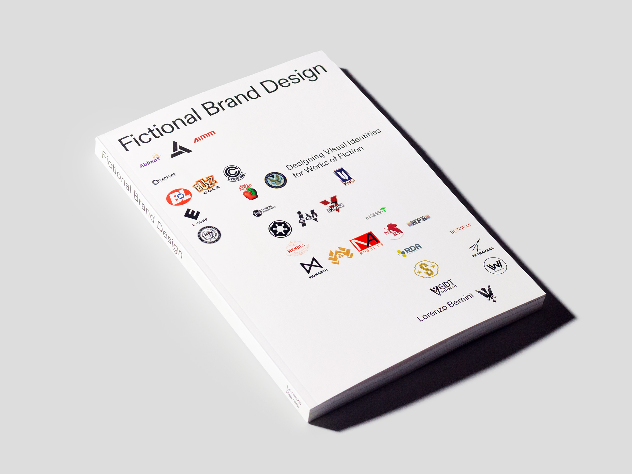
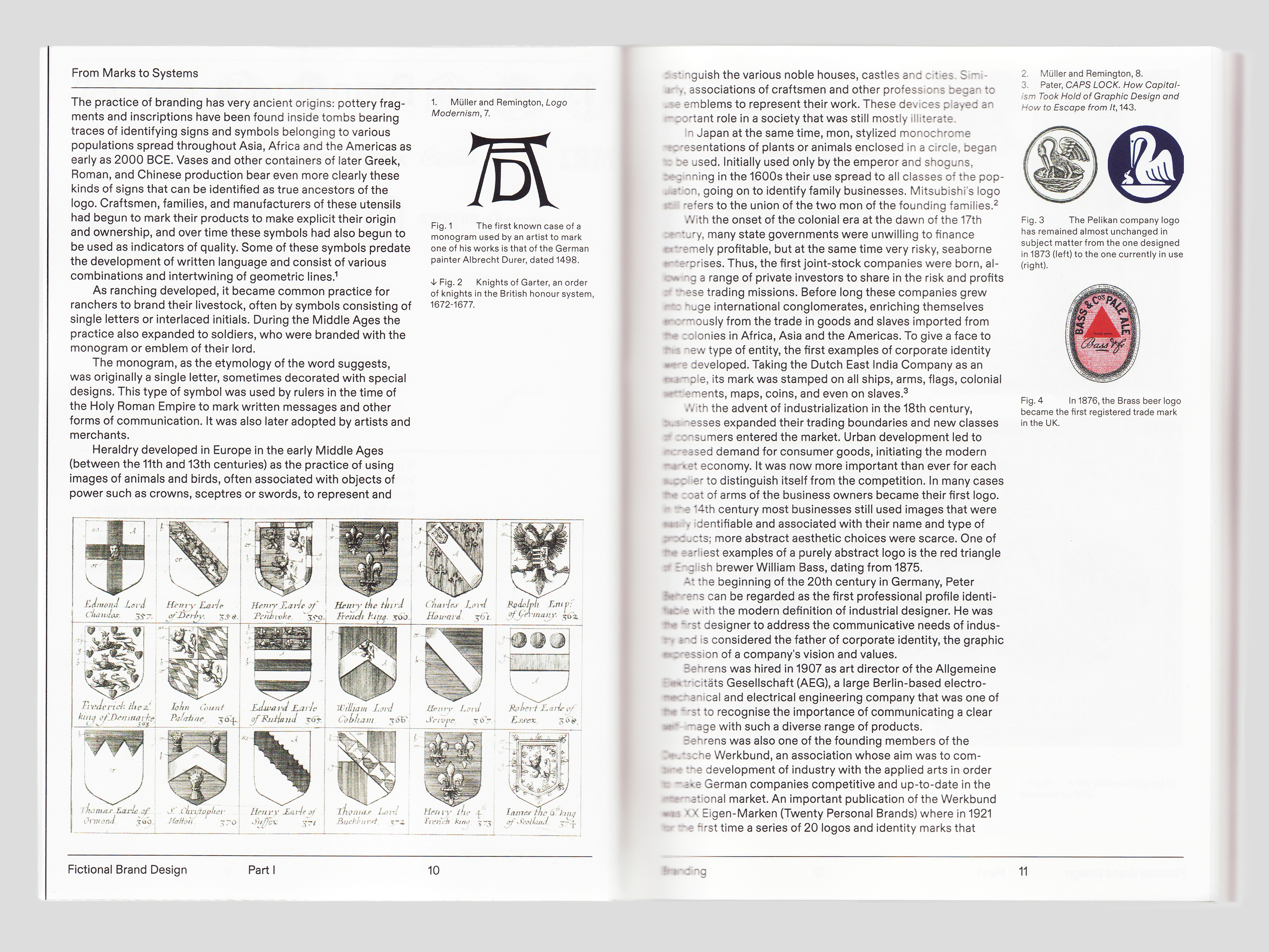
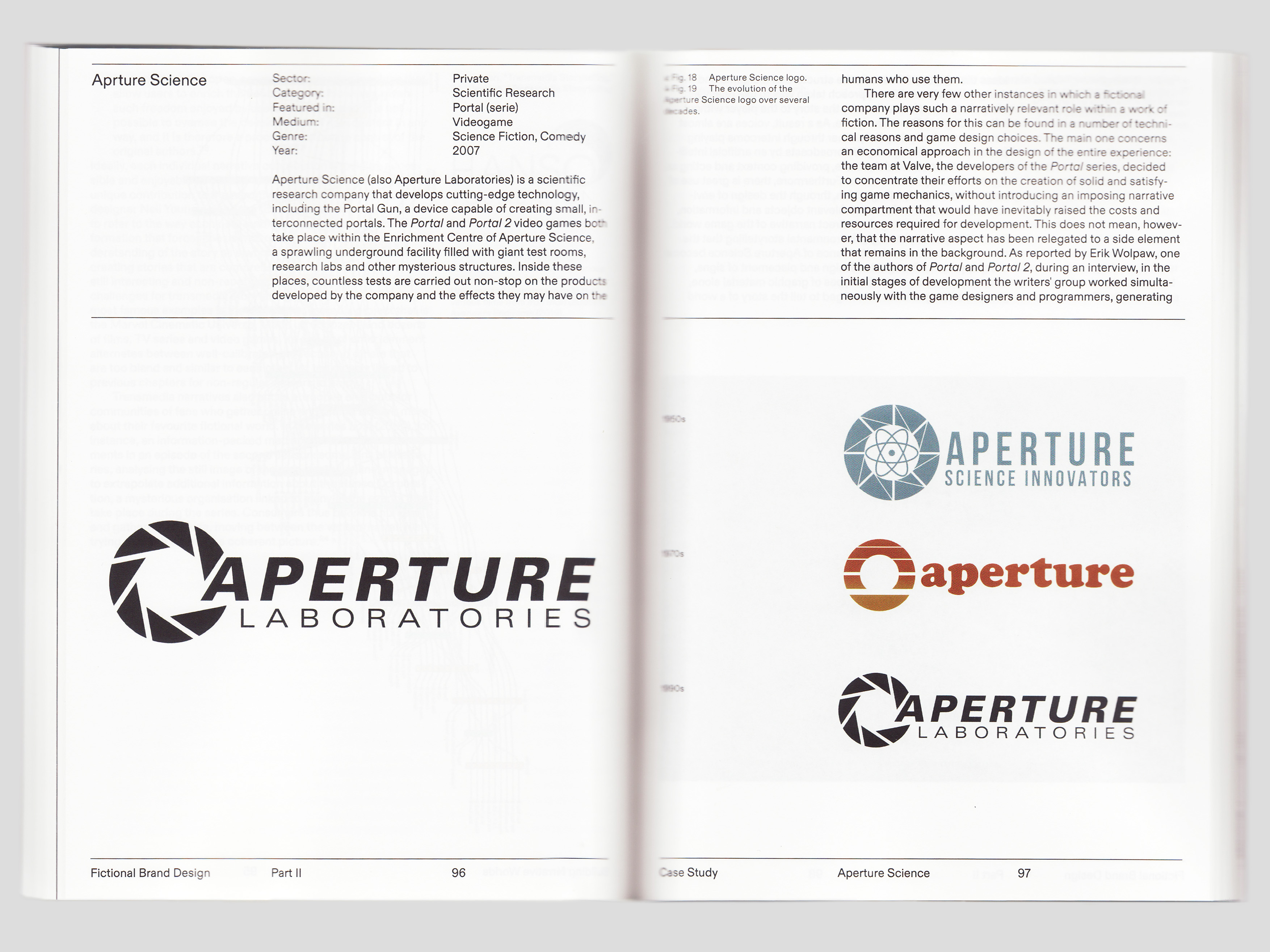
The Fictional Brands Archive
https://fictionalbrandsarchive.com/
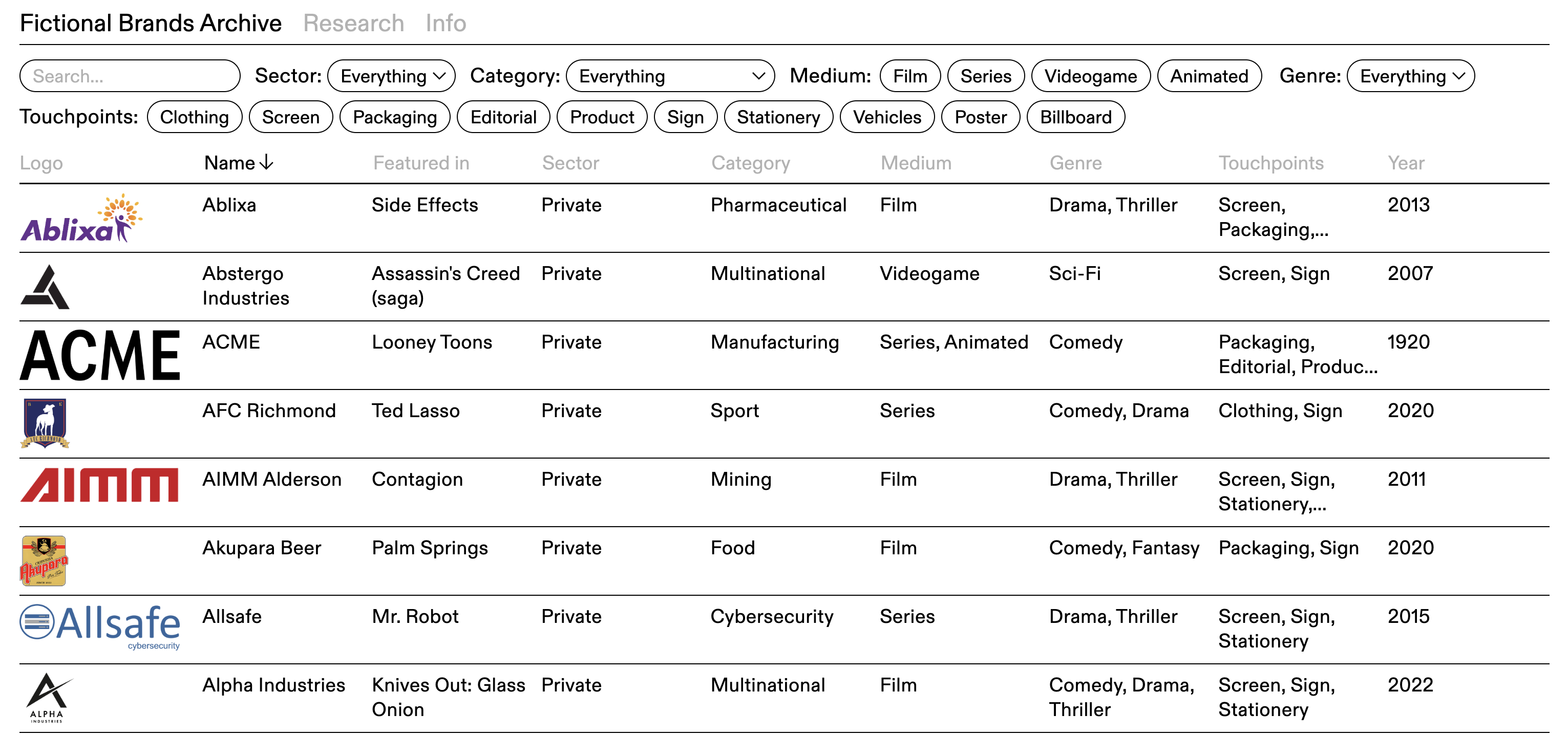
A collection of many fictional brands found in films, series and video games. It is structured according to the principles of brand design and aims to provide a comprehensive view of each fictional brand, framing them in their own fictional context and documenting their use and execution in the source work.
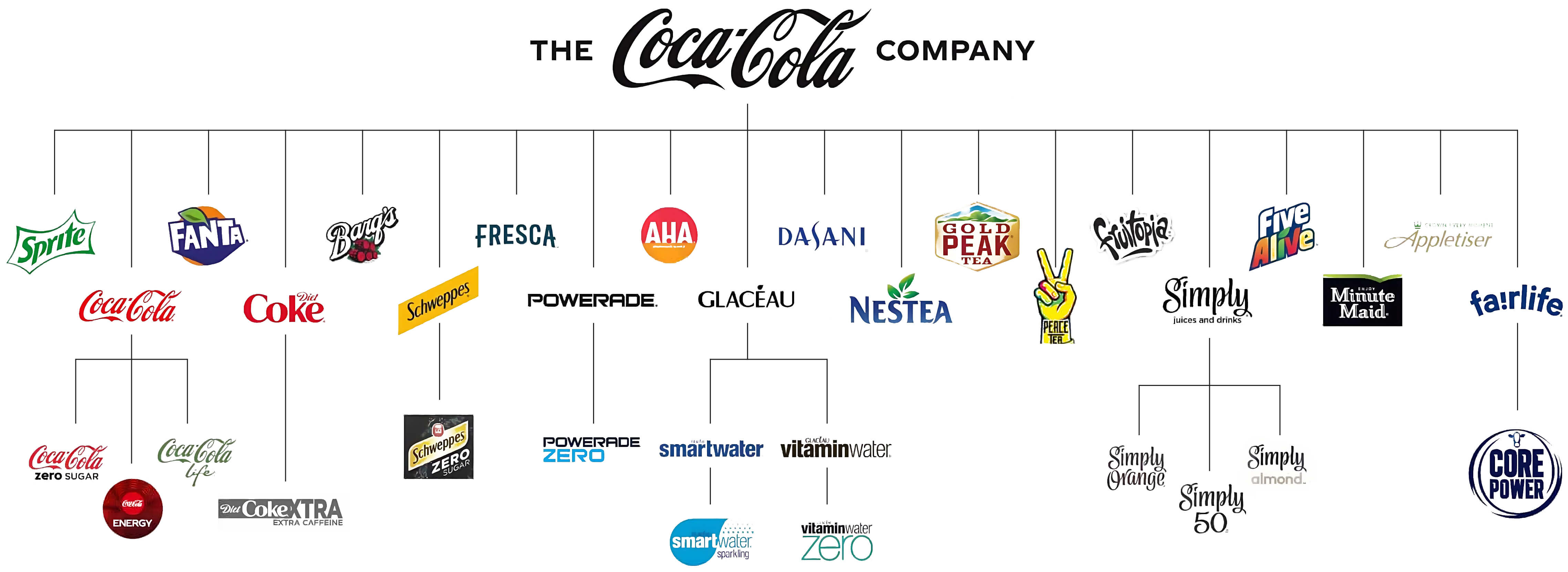
The [Research](https://fictionalbrandsarchive.com/research.html) section provides a summary of several chapters of the thesis and is intended to serve as an informative compendium for anyone interested in learning more about fictional branding.
The website was developed as part of a Master's thesis in Communication Design at Politecnico di Milano, titled Fictional Brand Design, a book that was once available for purchase.
Accessibility beyond compliance: a driver for innovation and UX
Some insights on how accessibility can become a driver for innovation and user experience improvement—going beyond mere regulatory compliance.
Integrating accessibility into design processes isn’t just about following the rules; it’s about redefining the user experience to make it simpler, more intuitive, and more meaningful for everyone.
Integrating accessibility doesn’t mean adding complexity to processes — it means discovering new opportunities to simplify, innovate, and improve. Companies that embrace this challenge can go beyond compliance, becoming leaders in a transformation that is both cultural and design-driven.
If you want to explore how accessibility and UX can drive innovation, start with small steps: a guided evaluation of your digital product, a workshop, or simply a conversation. Because change starts with listening and the willingness to make a difference.
💰This week #Comics & #Memes #Design #bounty #37 is about #Bitcoin nostr:npub1ex7mdykw786qxvmtuls208uyxmn0hse95rfwsarvfde5yg6wy7jq6qvyt9 founder nostr:npub1cn4t4cd78nm900qc2hhqte5aa8c9njm6qkfzw95tszufwcwtcnsq7g3vle

Check it out here https://stacker.news/items/985412/r/DeSign_r
#HereComesBitcoin #bitcoinDesig #NostrDesign #creative #GM #grownostr #bolt12 #bolt11 #meme #asknostr #zap #btc
The Age of the Double Sell-Out
https://culture.ghost.io/the-age-of-the-double-sell-out/
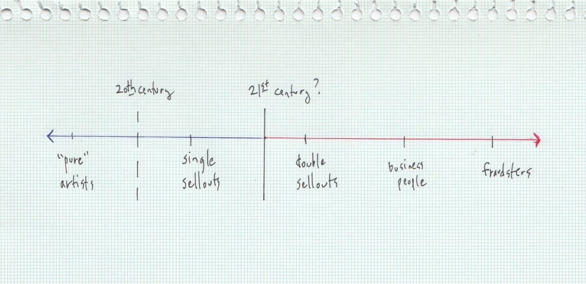
In the last three decades, youth culture has moved from a deep suspicion of commerce to a passionate defense of anti-anti-commerce to an entire generation of "creatives” who leverage the commercial market… to do even more commerce
The Bitcoin Symbol and its Logo Origins
https://vu.hn/bitcoin-symbol-and-logo-origin.html#the-orange-circle-with-images
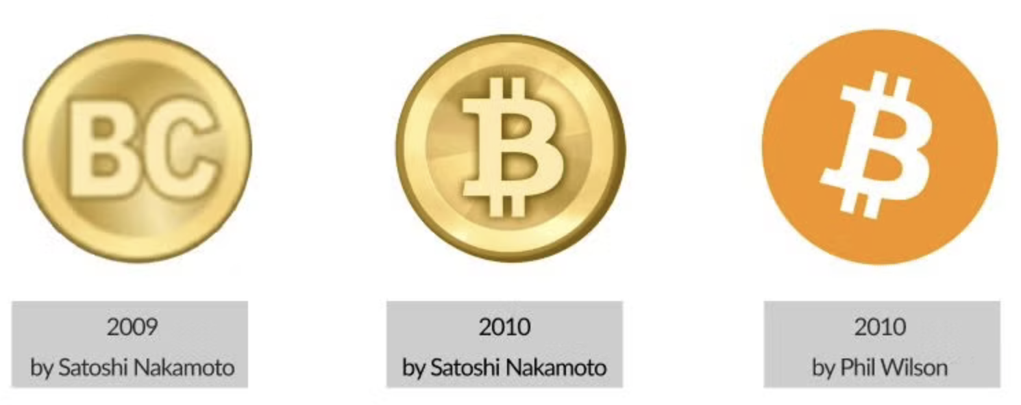
An interesting discussion yesterday, trying to figure out [What Color is Bitcoin](https://stacker.news/items/984049/r/DeSign_r). Thanks @jakoyoh629 for sharing this piece.
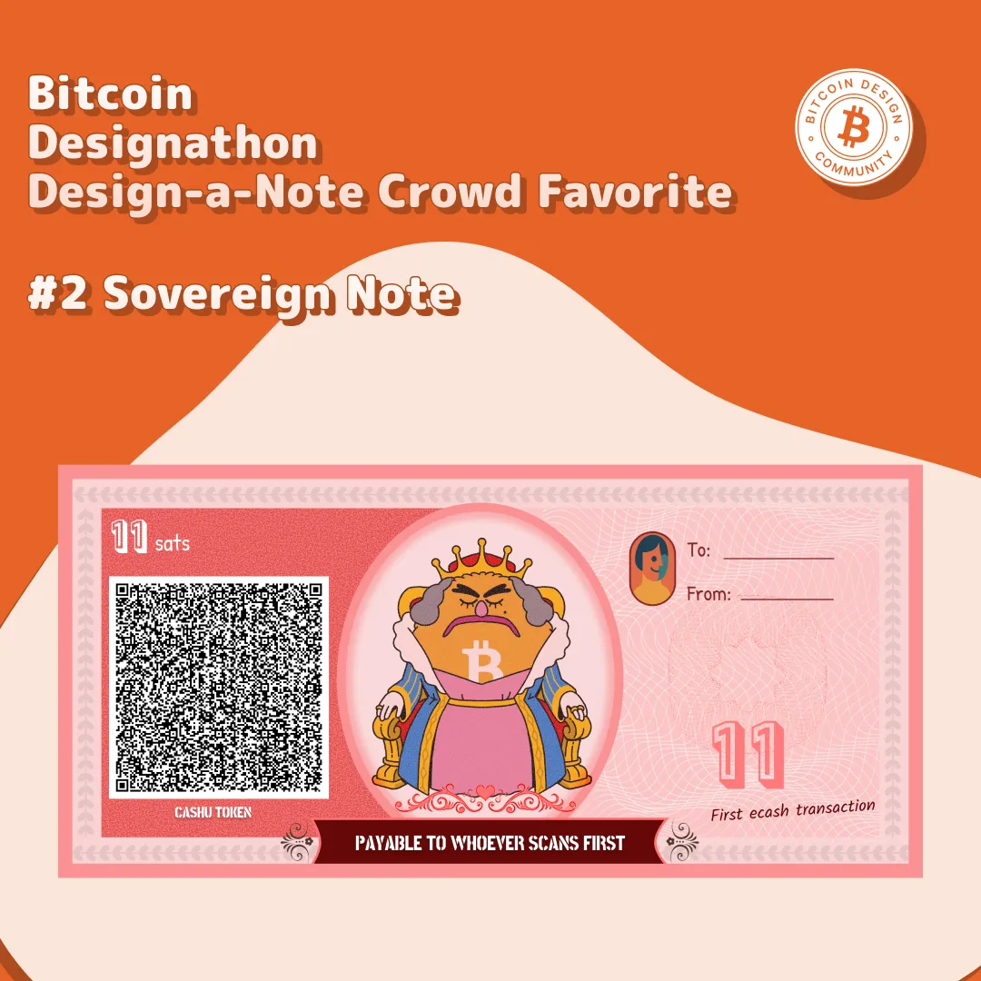
Which Ecash note design you like more?
Below are all the physical Ecash note mockups created for the Bitcoin Design Community challenge part of the latest Designathon event concluded Sunday. Eventually, you'll find all these new designs available at [brrr.gandlaf.com](https://brrr.gandlaf.com), an online tool that allow you to fund and print your own notes.
Vote for the design that stands out to you.

