@supratic captures life with "S02E11 Stephen DeLorme – Bitcoin and Freedom by Design" - where words becomes sculpture, framing responsibly with #design & #creativity: https://stacker.news/items/1407557/r/deSign_r
@Car captures life with "How to Select Rugs Like a Designer - Veranda post" - where words becomes sculpture, framing responsibly with #design & #creativity: https://stacker.news/items/1406125/r/deSign_r
@NeonVoltage symbolizes "Designing Culture Through Living" - taming #ideas for perfect marks. Identify #design #thinking: https://stacker.news/items/1404922/r/deSign_r
"Intuitive Equals Familiar by Jef Raskin" by @k00b - because authentic #creativity isn't negotiable, that's the true #art of #design. https://stacker.news/items/1402786/r/deSign_r
New vision from @Scoresby: "Impact Initiatives 2026 - Bitcoin Design Community". Building unforgettable #experiences, one #design at a time with #creativity. https://stacker.news/items/1370308/r/deSign_r
@beyond_turbulence posted "Deep Space | Intentional Topology" - where #consistency meets scalable #creativity. Organized beauty for #designThinking. https://stacker.news/items/1300496/r/deSign_r
@beyond_turbulence codes "String Theory Inspires a Brilliant, Baffling New Math Proof | Hacker News" - digital #alchemy in browser windows. #design & #creativity at work: https://stacker.news/items/1333998/r/deSign_r
@deSign_r craft "Beyond Aesthetics - The Biological Need for Biophilic Environments" - respecting every #function with purpose, improving #designtips & #creativity. https://stacker.news/items/1360694/r/deSign_r
Beyond Aesthetics - The Biological Need for Biophilic Environments
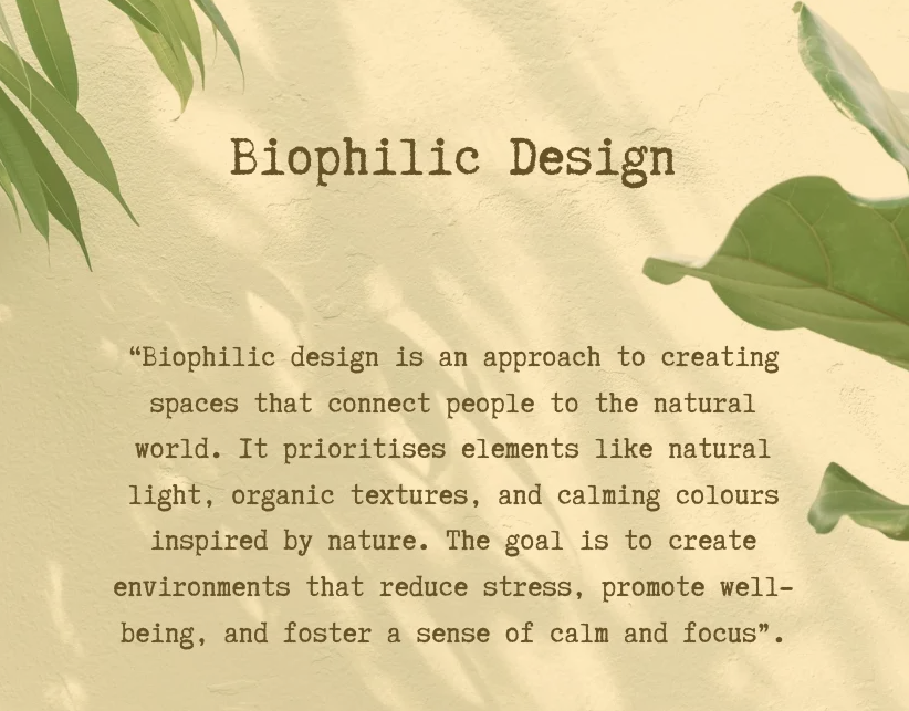
[Biophilia](https://en.wikipedia.org/wiki/Biophilia_hypothesis), the term popularized by biologist E.O. Wilson, describes our genetically hardwired need for natural environments. Since humans evolved in nature, our bodies and minds only function optimally when immersed in it. This isn't abstract theory—Roger Ulrich's 1984 clinical study proved hospital patients viewing trees healed faster and needed less pain medication than those facing brick walls.
Modern buildings often sever this essential connection, compromising our wellbeing. Biophilic design bridges this gap by embedding nature's patterns, natural material complexity, "prospect and refuge" in spatial arrangements.
I remember @plebpoet did something similar for a SNZ edition, it was [#30](https://stacker.news/items/1264575/r/deSign_r)
Bitcoin Keeper is Moving to a Community-Led Model
https://medium.com/bitbees/bitcoin-keeper-is-moving-to-a-community-led-model-69becccf7b00
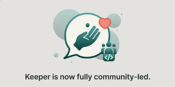
All features are now free. Development will be led by individual contributors. Optional tips introduced in the app.
Bitcoin Keeper was designed to help people hold bitcoin securely, independently, and for the long term. As the product has matured, it’s become clear that the way Keeper is built matters just as much as the features it offers.
"Are we stuck with the same Desktop UX forever?" fused by @sox. Disciplines collide, creating #innovation magic in #pixels. Boundary breaking #design & #creativity. https://stacker.news/items/1348109/r/deSign_r
@Wumbo explores "Adam Savage Reacts to Transforming Chess Pieces" - chasing the perfect #aesthetic through depths. Visual secrets for #design & #creativity. https://stacker.news/items/1343745/r/deSign_r
New vision from @deSign_r: "MERRY SATSCARD & HAPPY NFC Bitcoin - A Printable Tri-Fold". Building unforgettable #experiences, one #design at a time with #creativity. https://stacker.news/items/1339714/r/deSign_r
@Scoresby colors the world with "BBQr - Better Bitcoin QR" - with passion. See the magic of #design & #creativity. https://stacker.news/items/1333725/r/deSign_r
Curious to know about "Stacker News - Lightning Font" by @Wumbo in #Design, triggeting #creativity. Learn more https://stacker.news/items/1333346/r/deSign_r
@Scoresby shares "Bitcoin for Signal: A Campaign Retrospective - Cashu Blog" - bringing beauty to life. Dynamic #design & #creativity. https://stacker.news/items/1326456/r/deSign_r
@Jimmyhoneyalchemist shares "Logo design." - bringing beauty to life. Dynamic #design & #creativity. https://stacker.news/items/1318156/r/deSign_r
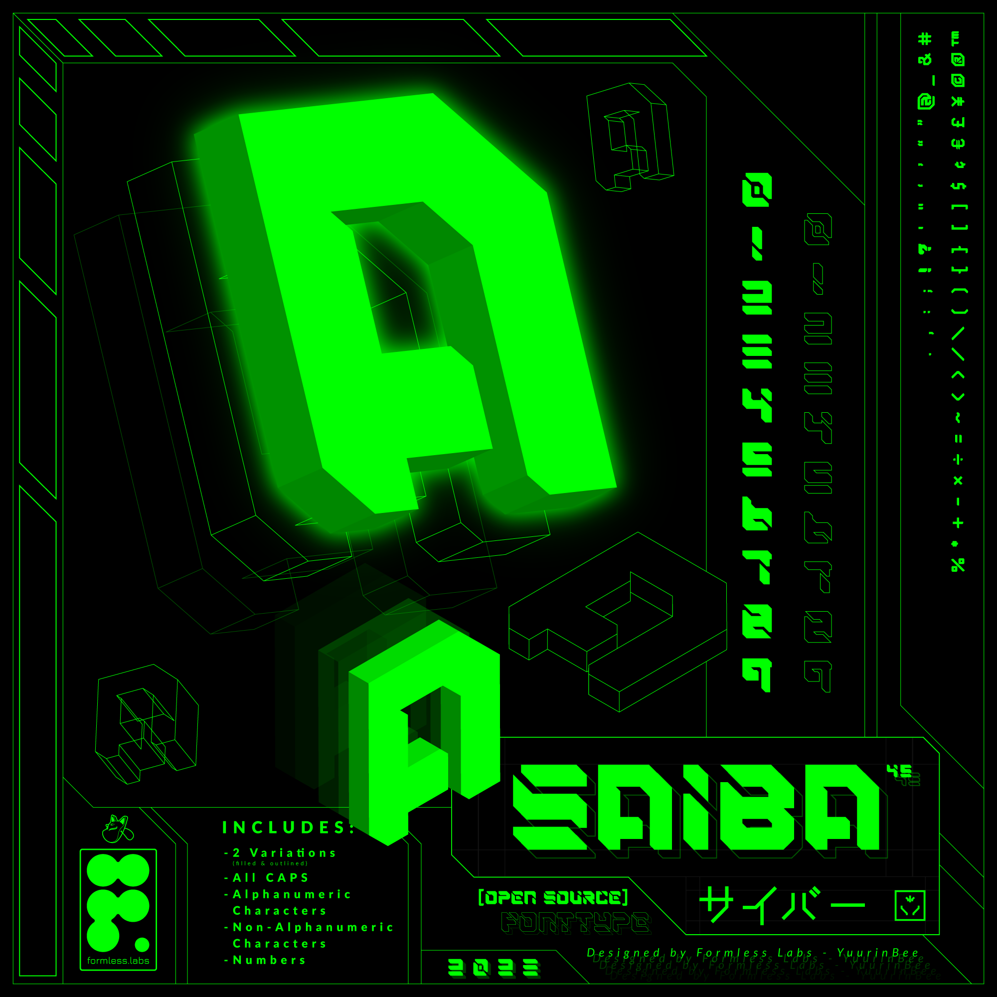
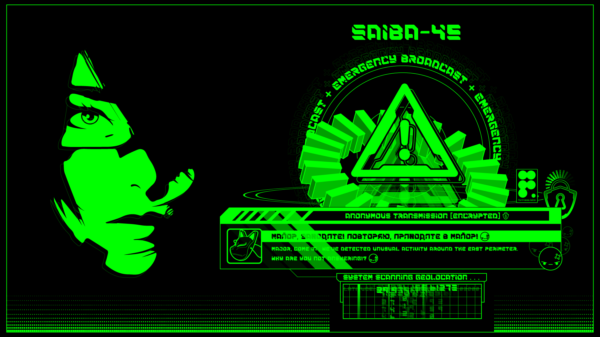
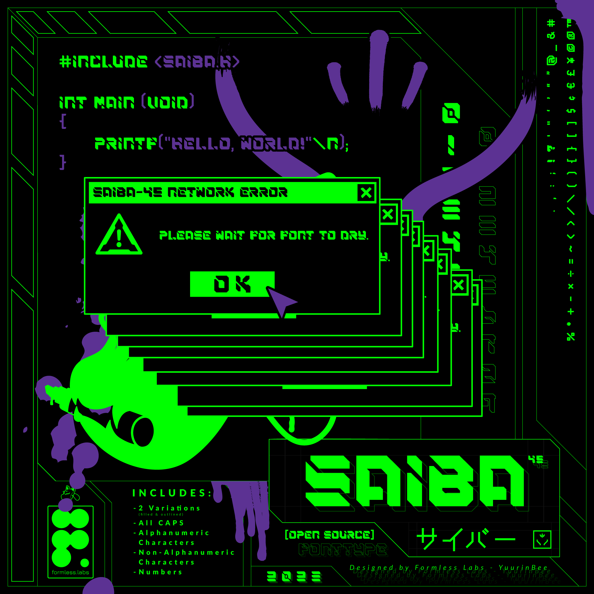
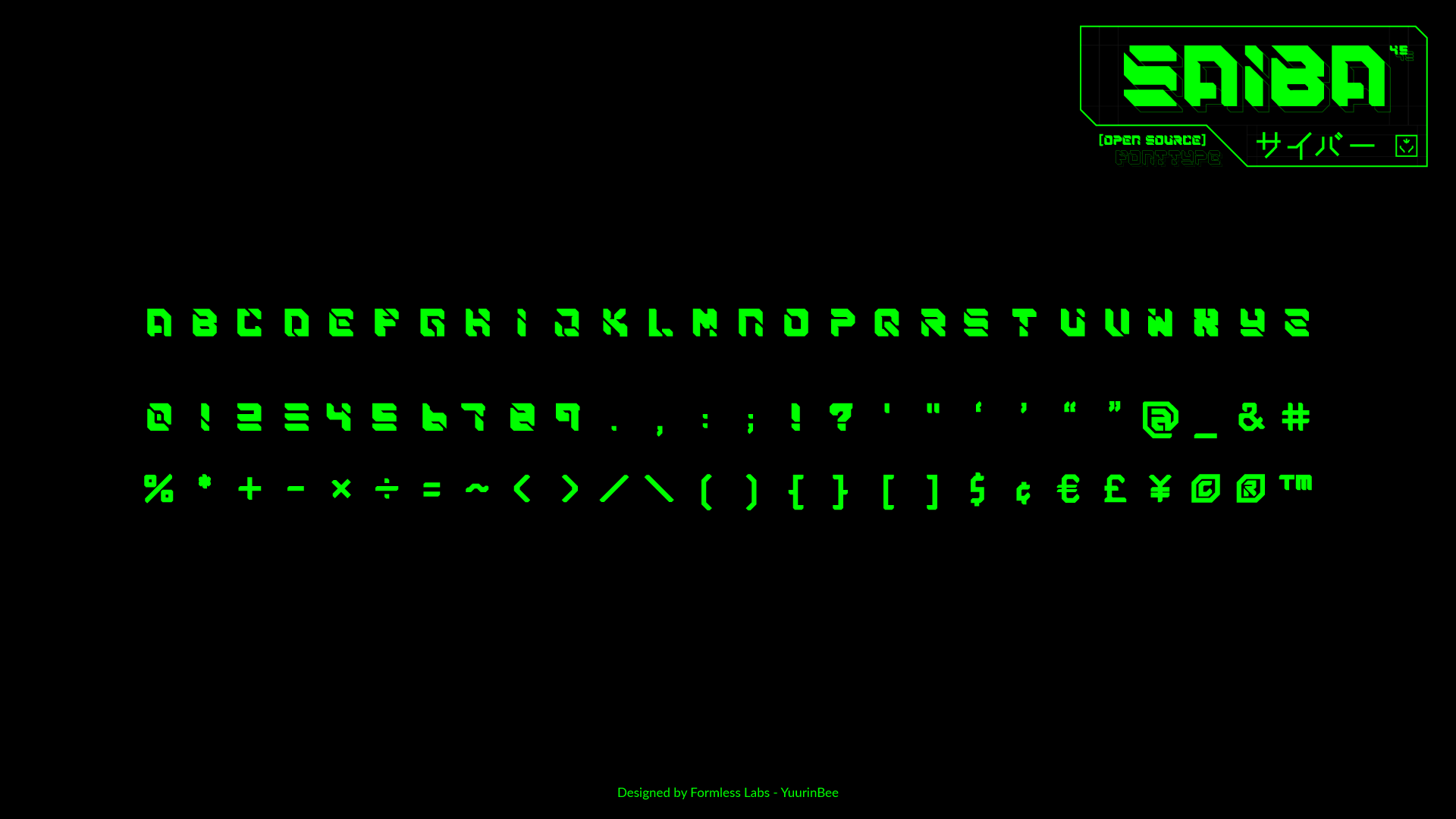
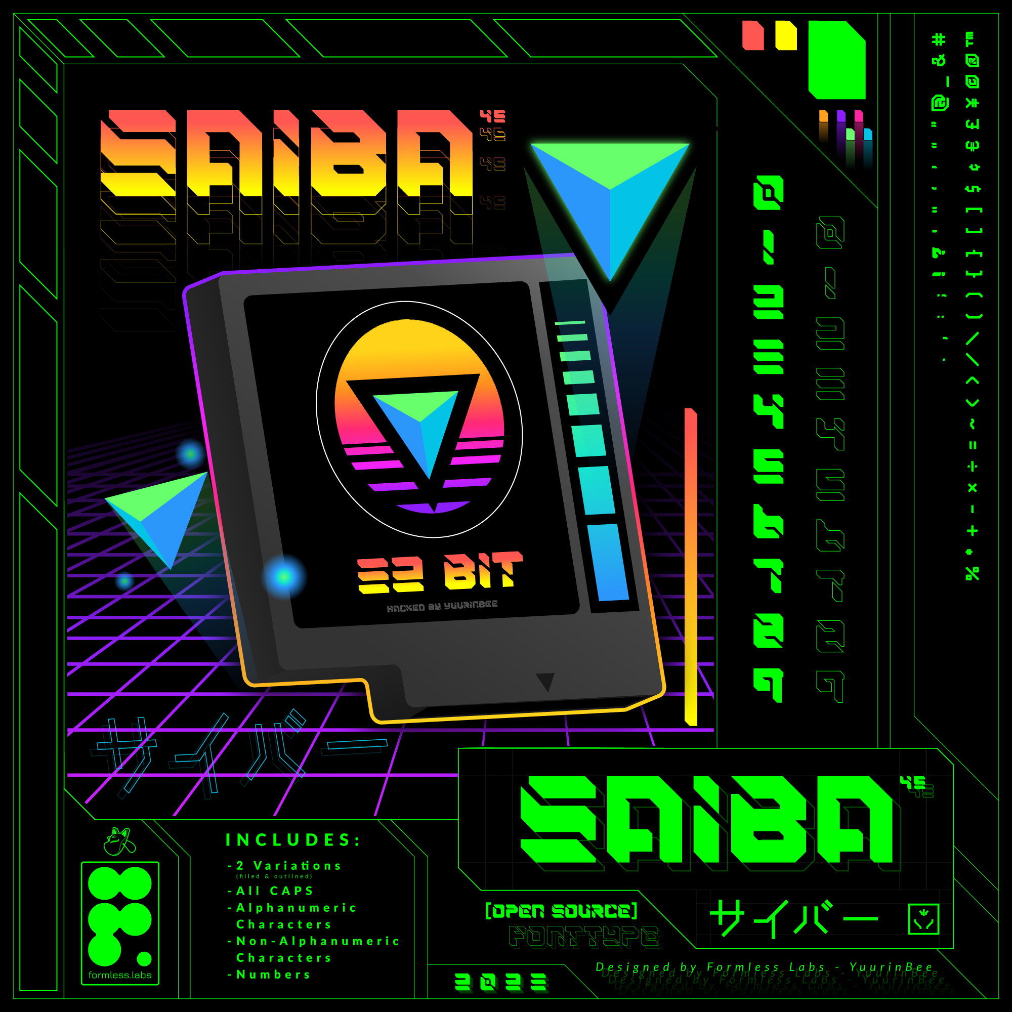
Inspiring work from @deSign_r: "Meet SAIBA-45: a CyberPunk, free, open-source font". #Inspiration connects minds across centuries with #creative #design. https://stacker.news/items/1315869/r/deSign_r
The Chores of Ordinary Life
https://rickrubin.substack.com/p/the-chores-of-ordinary-life
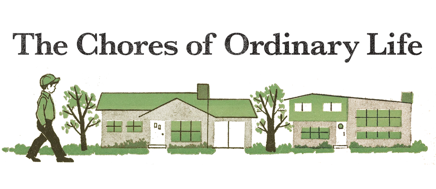
_Creative is something you are, not only something you do. It’s a way of moving through the world, every minute, every day. The artist is always on call._
There’s no right or wrong time to do this work. It’s always happening. If we’re committed to the artistic or creative life, there are no “off hours.” You exist in a constant state of receptivity. Even if you’re washing the dishes or going for a walk, you’re still engaged on some level.
This practice is about noticing where your thoughts and attention go when you’re not directly engaged in your craft. It’s about remaining open and receptive to creative inspiration, even when you’re involved in the chores of ordinary life.
# ⊙
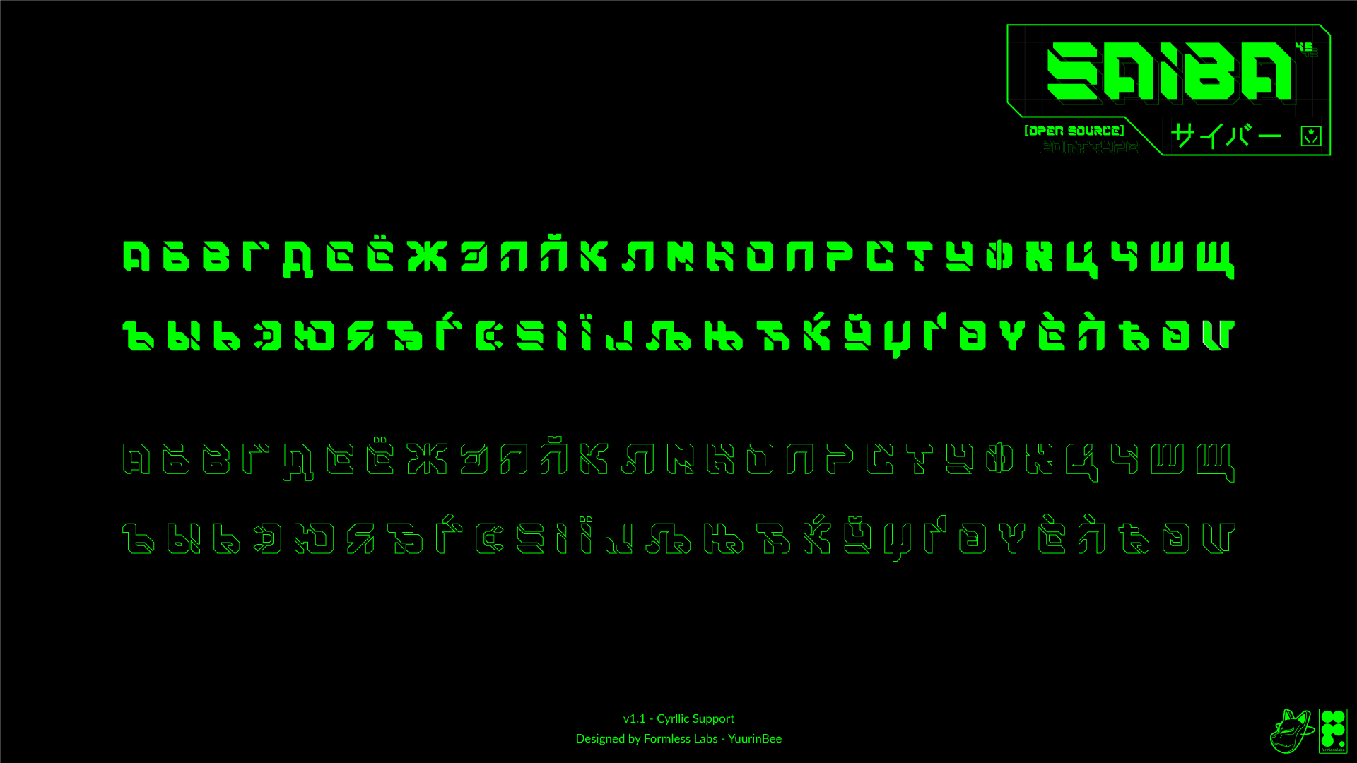
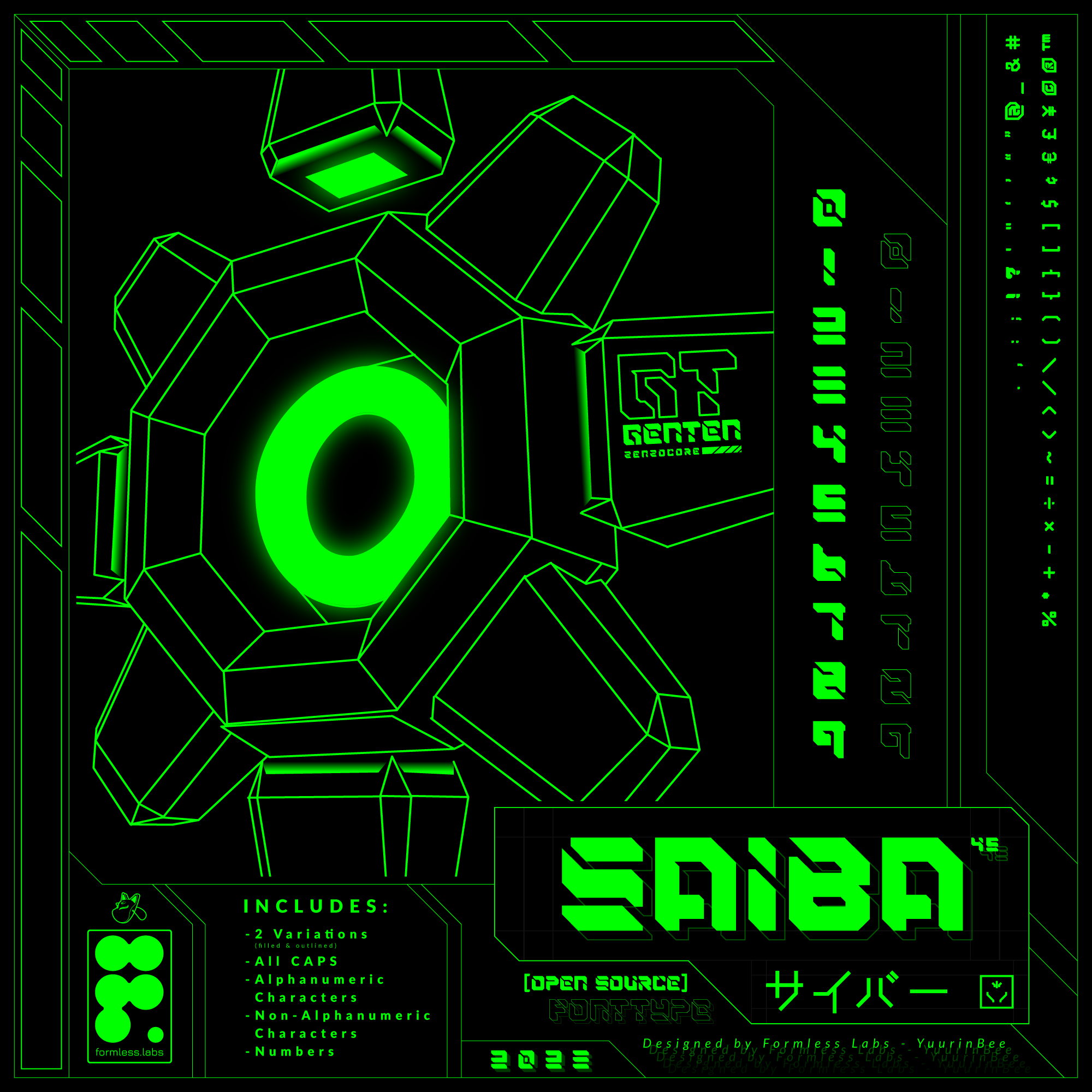
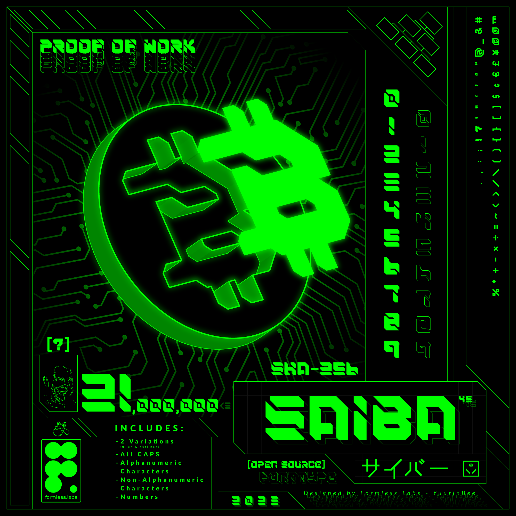
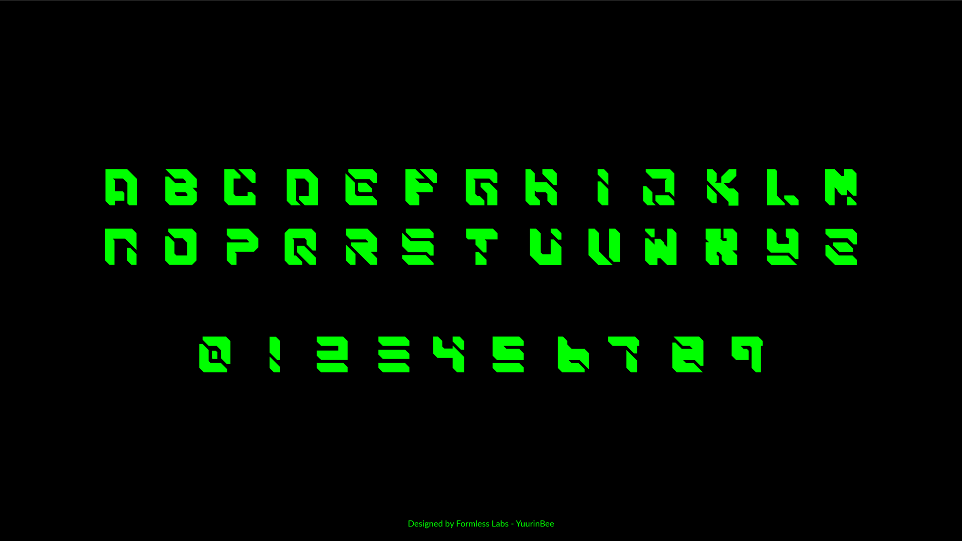
Meet SAIBA-45: a CyberPunk, free, open-source font
https://github.com/YuurinBee/SAIBA-45
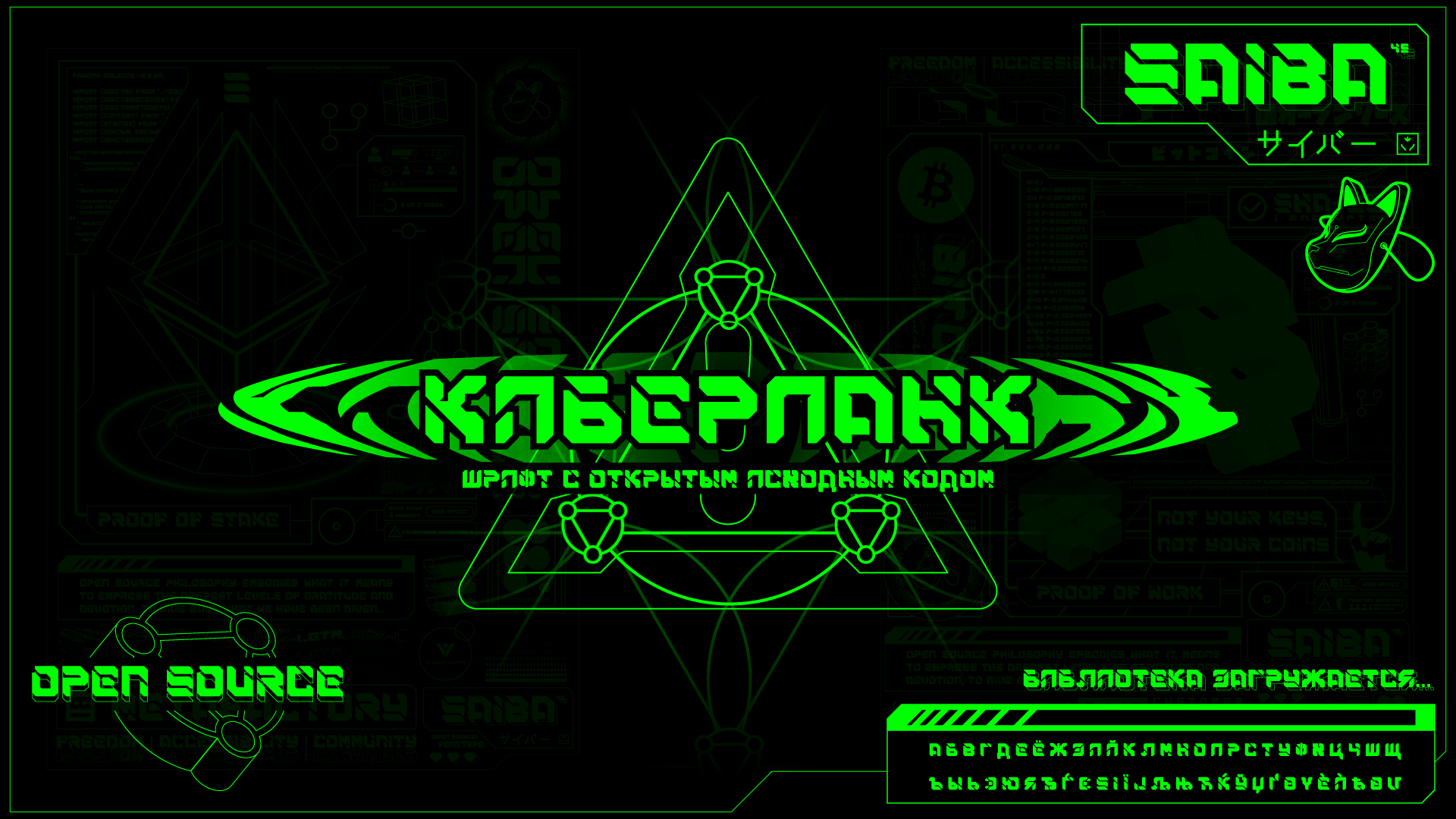 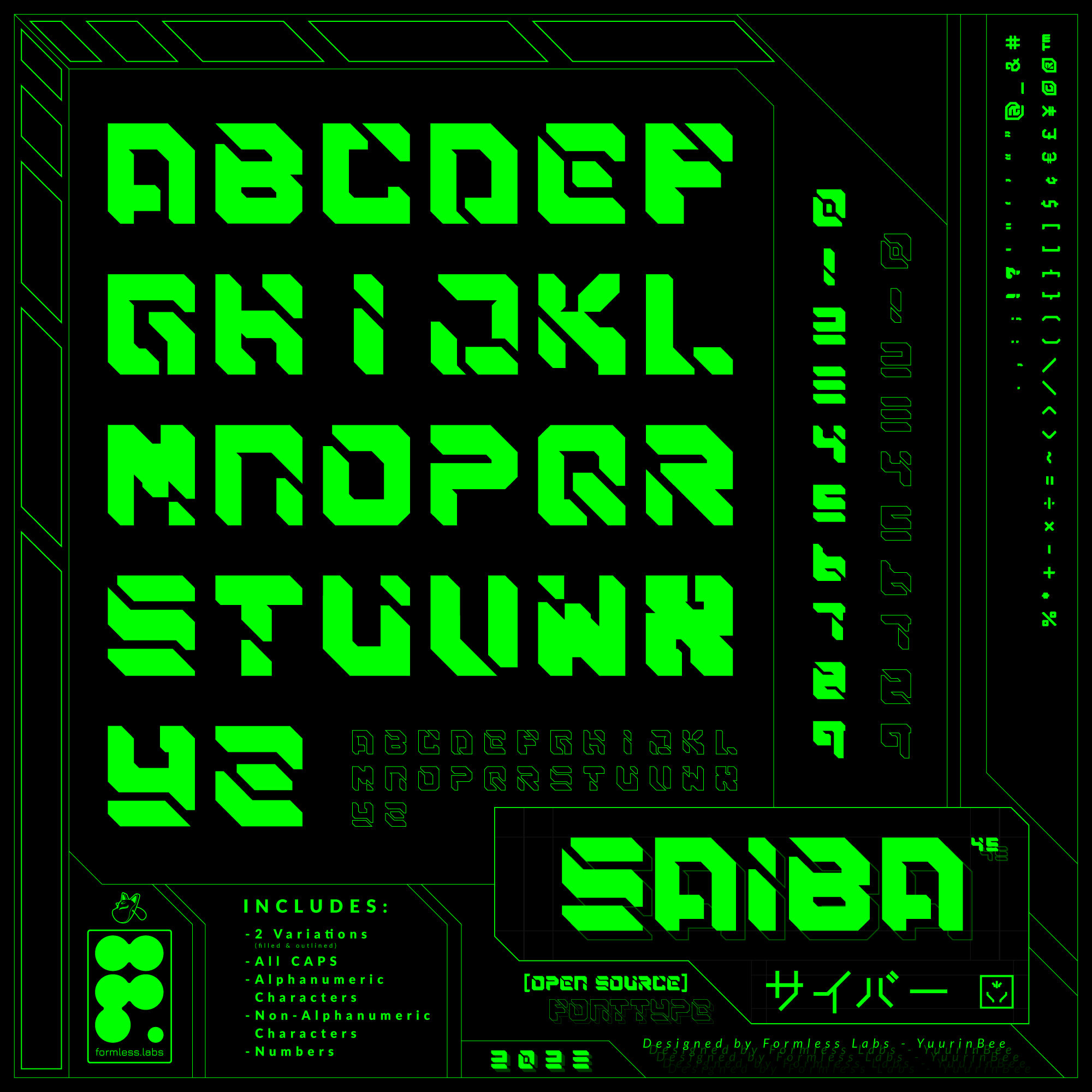
SAIBA-45 is a display font that was inspired by CyberPunk, NeoTokyo, Mecha, Manga/Anime, Retro, Tech, and Futuristic styles. It was intended to be used for short-form and large-format displays, but not limited to this type of application. Efficient ways to experiment with this font are provided in graphic examples below, but include: distinct logotypes, stylized names and text, unique vector characters, bold titles, and more. The name SAIBA was chosen as the "katakazination" (transforming English to Katakana) of the English word "Cyber" to be pronounced with Japanese vowels and syllables. The word cyber translates to サイバー in Japanese, which is pronounced as "Saiba". The 45 in SAIBA-45 is reflective of the 45 degree angles used to create the prominent edges, defining the look and feel of the font. This font has been in development since 2021.
> [!IMPORTANT]
> **SAIBA-45 is a free, open-source fonttype and scalable vector graphics.**
> License: [GNU General Public License v3.0](https://www.gnu.org/licenses/gpl-3.0.en.html)
> Author: [Formless Labs](https://www.behance.net/formlesslabs)
> Contributors: [YuurinBee](https://github.com/yuurinbee), [JSKitty](https://github.com/jskitty), [Joshua Fern](https://github.com/JoshuaFern)
> Contact: [YuurinBee](https://twitter.com/YuurinB)
Open Source Anxiety Toolkit

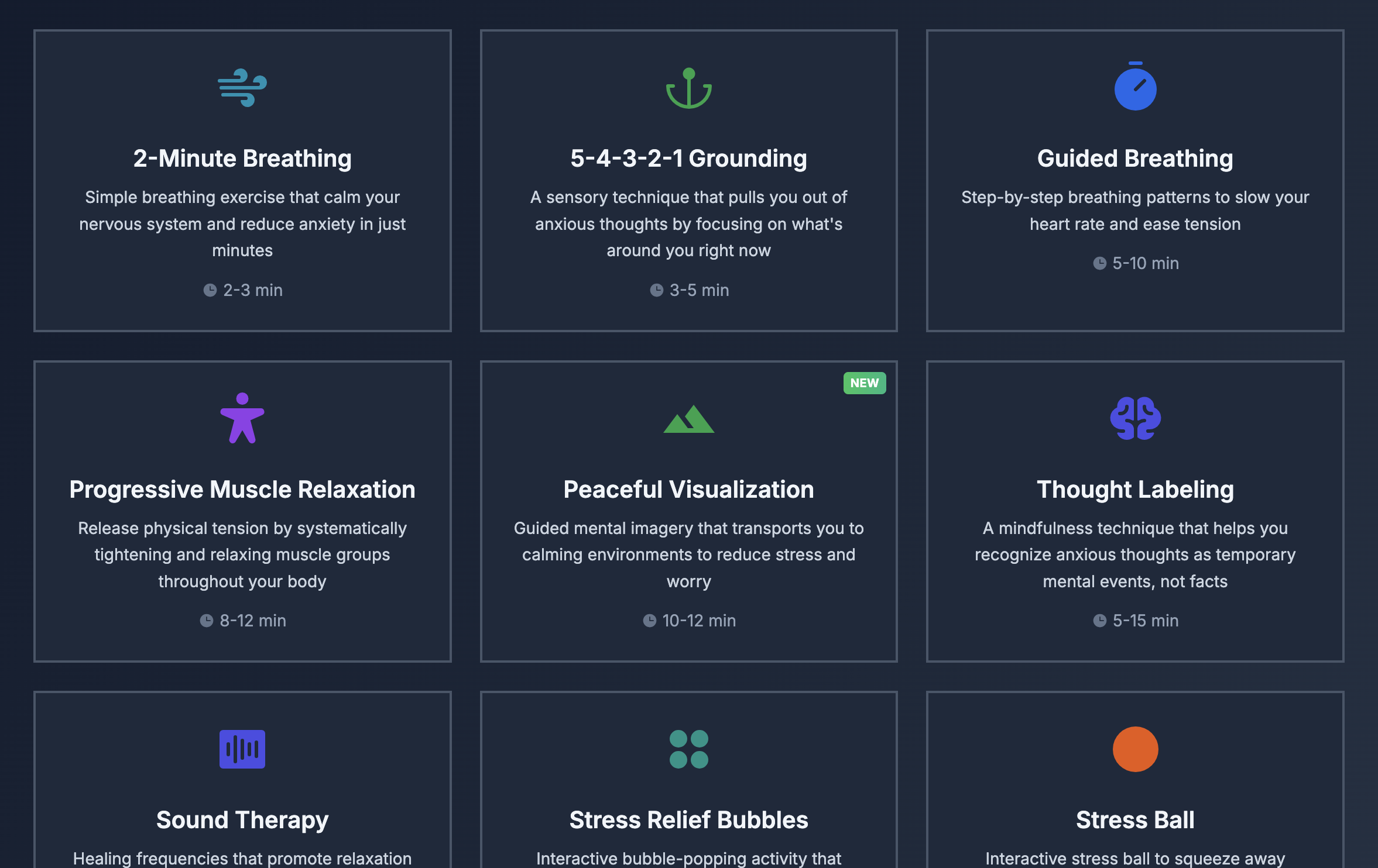
Free tools to help when you're feeling anxious. These exercises are simple to follow and don't require any special equipment - use them whenever your mind feels too busy or when you need a moment of calm.
**What Happens During Anxiety**
Your body activates the "fight-or-flight" response, increasing heart rate, speeding up breathing, and releasing stress hormones like adrenaline. This often triggers unnecessarily during everyday situations, leaving you feeling on edge.
**How These Techniques Help**
These evidence-based techniques activate your parasympathetic nervous system, which naturally counteracts the stress response. Regular practice can reduce both the frequency and intensity of anxious feelings.
**Tips for Best Results**
Find a quiet, comfortable space where you won't be interrupted
Start with shorter techniques (2-5 minutes) if you're feeling very anxious
Practice regularly, even when you're not anxious, to build your skills
Be patient with yourself - these techniques get easier with practice
[Android](https://r2.anxietyaidtools.com/AnxietyAidTools_latest.apk) and [iOS](https://apps.apple.com/us/app/anxiety-aid-tools/id6754823388) app avaliable
Contribute https://github.com/alvinunreal/anxiety-aid-tools
Good from Afar, But Far from Good: AI Prototyping in Real Design Contexts
https://www.nngroup.com/articles/ai-prototyping
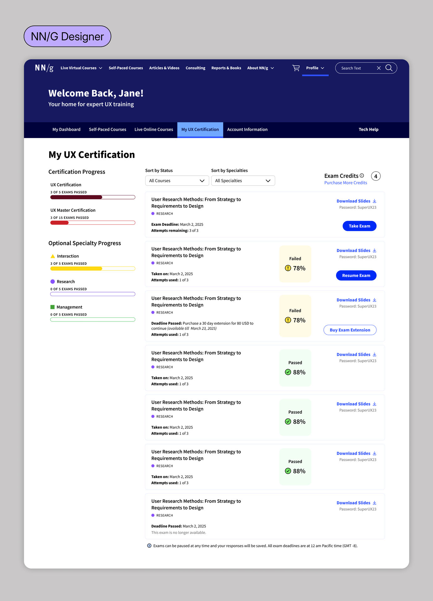
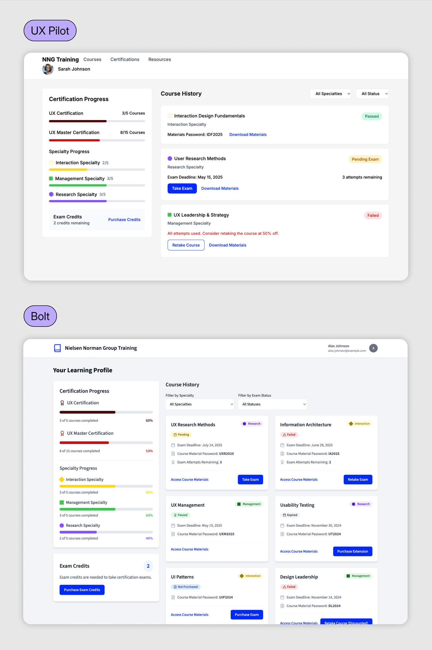
## Summary: AI prototyping tools follow general directions but lack the judgment and nuance of an experienced designer.
Over the past few months, the UX design field has been flooded with AI-powered prototyping tools that generate interfaces instantly from natural-language prompts. Despite the massive marketing hype, our evaluation with real design scenarios revealed that these tools can follow instructions to achieve a general goal, but they lack the sophistication to weigh design tradeoffs and produce thoughtful, high-quality designs without extensive guidance from humans.
Design Contest Results and Lessons Learned
https://thephp.foundation/blog/2025/11/05/design-contest-results/
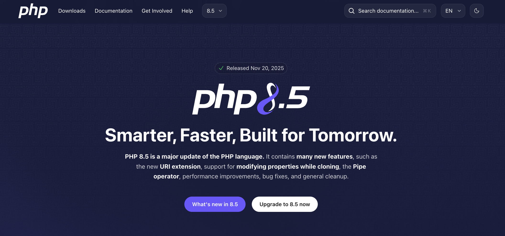
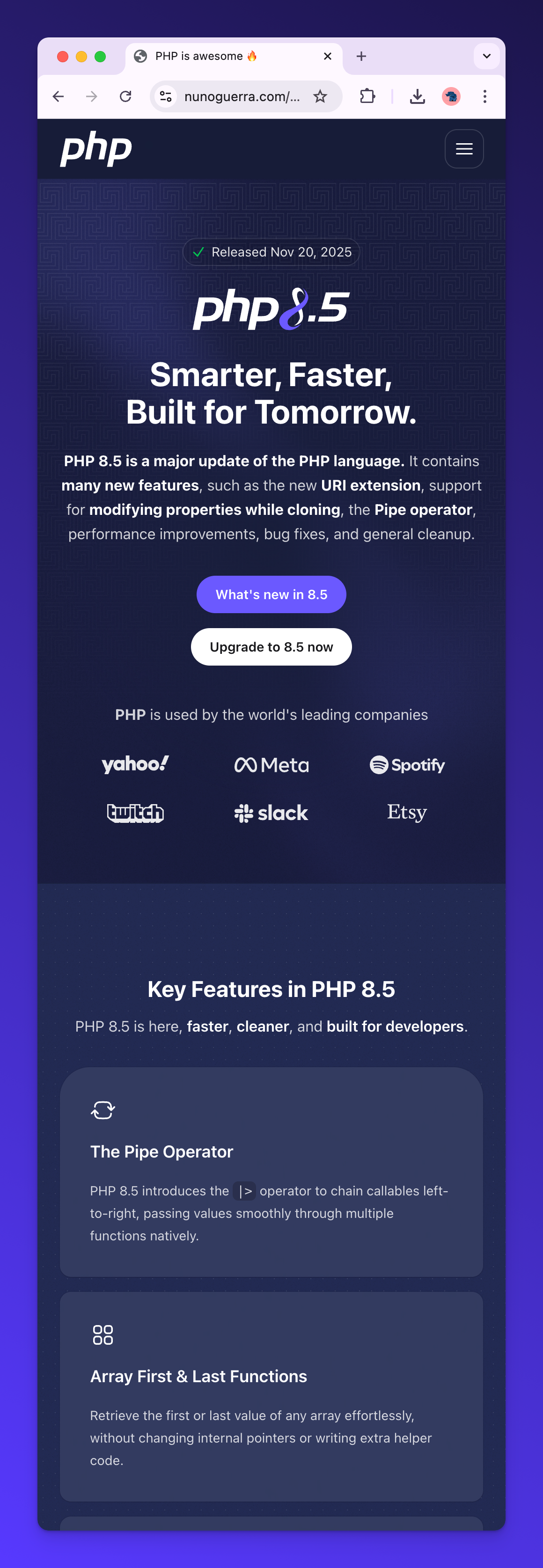
Over the last few weeks we ran a focused community contest to refresh the PHP 8.5 release page. Thank you to everyone who submitted, reviewed, voted, and discussed.
> **Note about future redesigns**
> This contest was an experiment for a single release page. We might not use the same approach for a broader homepage redesign. If we did run a contest again, we would separate tracks (on-brand update vs blue-sky concept), use a dedicated voting tool or randomized ordering, keep log-damped voting, and set a 50/50 jury/community split with clearer criteria and a small shortlist honorarium.
"Stone Drip: Would you pay € 3.800,00 for a coffee maker?" revealed by @deSign_r. Inspiration transforms hidden beauty. Pure brilliance for #design & #creativity. https://stacker.news/items/1260902/r/deSign_r
"Design.dev — Tools and newsletter for web design & development" crafted by @deSign_r. Sharp #tools, sharper techniques, sharpest results. Precision work for #design & #creativity: https://stacker.news/items/1258474/r/deSign_r
"The psyOP_Returns (an remastered horror movie poster)" typed by @deSign_r. Starting conversations with brilliance always works. Tasteful #design & #creativity: https://stacker.news/items/1246869/r/deSign_r
The common sense unit of work
https://blog.nilenso.com/blog/2025/09/17/the-common-sense-unit-of-work/
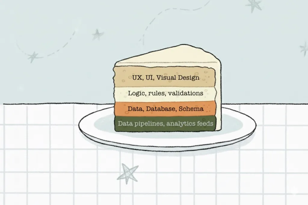
We’re fairly aware of the penalties of leaky abstractions in software. The incidental complexity of getting our primary real world abstractions wrong, grows exponentially with each layer of software built over it, until the whole system is slow, sludgy slop that’s difficult to work with. We can hack it here and there, and celebrate minor wins, but the big wins were lost in the ignored opportunities to refactor that central abstraction.
If we apply the same thought process to software development, we’ll see that our core abstraction, the unit of work, might need refactoring.
Big gains in developer productivity in this economic weather are important. Organisations that use DORA measure deploy or commit frequencies might find them valuable in some dimensions, but they’re not a measure of productivity in terms of outcomes for the customer.
> Be suspicious of anyone claiming to measure developer productivity. Ask who is asking & why. Ask them what unit they are measuring & how those units are connected to profit.
> I am 100% pro-accountability. Weekly delivery of customer-appreciated value is the best accountability, the most aligned, the least distorting.
> —Kent Beck’s writing about measuring developer productivity[^1]
@deSign_r starts with "~Construction_and_Engineering territory business cards" - morning wrapped in inspired dreams. Fresh perspective for #minimalism #designer: https://stacker.news/items/1228087/r/deSign_r
Chapter 6: Designing for Innovation
https://zguide.zeromq.org/docs/chapter6/#Designing-for-Innovation
In the dominant theory of innovation, brilliant individuals reflect on large problem sets and then carefully and precisely create a solution. Sometimes they will have “eureka” moments where they “get” brilliantly simple answers to whole large problem sets. The inventor, and the process of invention are rare, precious, and can command a monopoly. History is full of such heroic individuals. We owe them our modern world.
So, when we trust the solitary experts, they make classic mistakes. They focus on ideas, not problems. They focus on the wrong problems. They make misjudgments about the value of solving problems. They don’t use their own work.
Can we turn the above theory into a reusable process? In late 2011, I started documenting C4 and similar contracts, and using them both in ZeroMQ and in closed source projects. The underlying process is something I call “Simplicity Oriented Design”, or SOD. This is a reproducible way of developing simple and elegant products. It organizes people into flexible supply chains that are able to navigate a problem landscape rapidly and cheaply. They do this by building, testing, and keeping or discarding minimal plausible solutions, called “patches”. Living products consist of long series of patches, applied one atop the other.
To best understand how we ended up with SOD, let’s look at the alternatives.
## Trash-Oriented Design
The most popular design process in large businesses seems to be _Trash-Oriented Design_, or TOD. TOD feeds off the belief that all we need to make money are great ideas. It’s tenacious nonsense, but a powerful crutch for people who lack imagination. The theory goes that ideas are rare, so the trick is to capture them. It’s like non-musicians being awed by a guitar player, not realizing that great talent is so cheap it literally plays on the streets for coins.
## Complexity-Oriented Design
Really good engineering teams and small firms can usually build decent products. But the vast majority of products still end up being too complex and less successful than they might be. This is because specialist teams, even the best, often stubbornly apply a process I call _Complexity-Oriented Design_, or COD.
## Simplicity Oriented Design
Finally, we come to the rare but precious _Simplicity Oriented Design_, or SOD. This process starts with a realization: we do not know what we have to make until after we start making it. Coming up with ideas or large-scale designs isn’t just wasteful, it’s a direct hindrance to designing the truly accurate solutions. The really juicy problems are hidden like far valleys, and any activity except active scouting creates a fog that hides those distant valleys. You need to keep mobile, pack light, and move fast.
Web Accessibility in Mind: free virtual conference 16-17 Sept
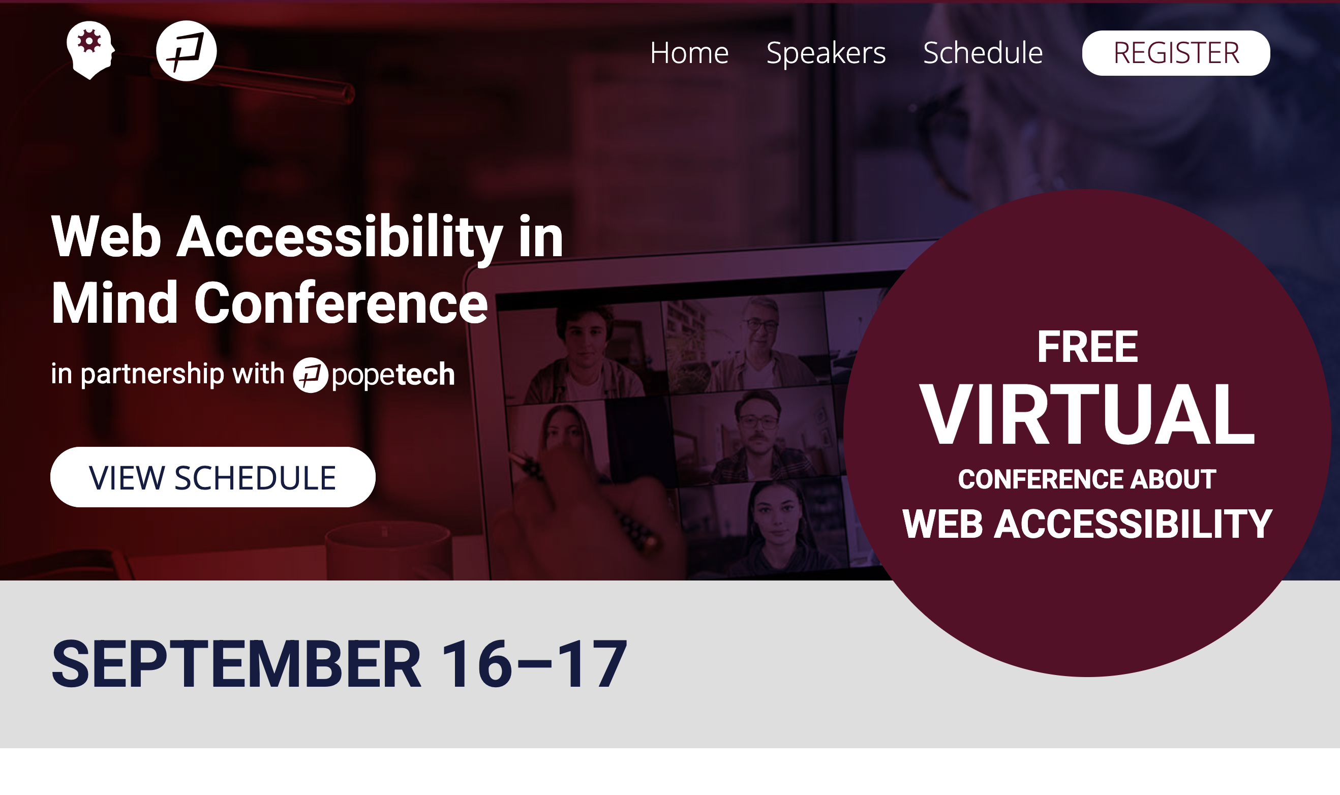
The Web Accessibility in Mind Conference is presented by WebAIM in partnership with Pope Tech. This virtual conference will provide conference participants with content that will help them mature their practice in digital accessibility. Our goals include:
- Provide a diverse range of perspectives from a diverse group of speakers.
- Share solutions to accessibility challenges.
- Give advice and guidance that helps our participants to actively contribute to providing more accessible - digital spaces.
- Bring together a cross-section of public and private sector technology professionals from organizations large and small.
The Web Accessibility in Mind Conference will be held online on September 16–17, 2025 from 12:15pm–5pm US Eastern Time each day.
Join us for two days of web accessibility presentations!
Superdiamonds with predicted hexagonal crystal structure
https://phys.org/news/2025-08-scientists-superdiamonds-theoretically-hexagonal-crystal.html
It's common to behave diamonds have value, even when they are made in a lab at a fractional cost?
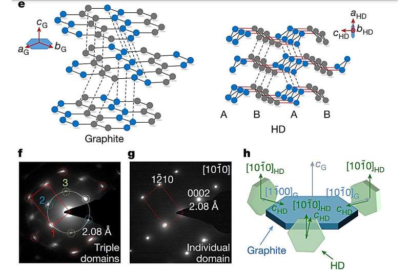
In a study published in Nature, researchers from China synthesized bulk hexagonal diamond, ranging from 100-µm-sized to mm-sized, with a highly ordered structure by compressing and heating high-quality graphite single crystals under pressure conditions as uniform as possible.
The designed material, which was recoverable under ambient conditions, unveiled the previously elusive structural world of HD, opening new avenues for exploring its potential as a technologically superior material.
Apart from being a dazzling element in jewelry, diamonds, due to their unmatched chemical and physical properties, are sought after in a wide range of applications, including biosensors, quantum computing, and industrial processes as superabrasives and drilling bits.
Visualizing Responsive Typography
https://www.oddbird.net/2025/08/26/type-visual/
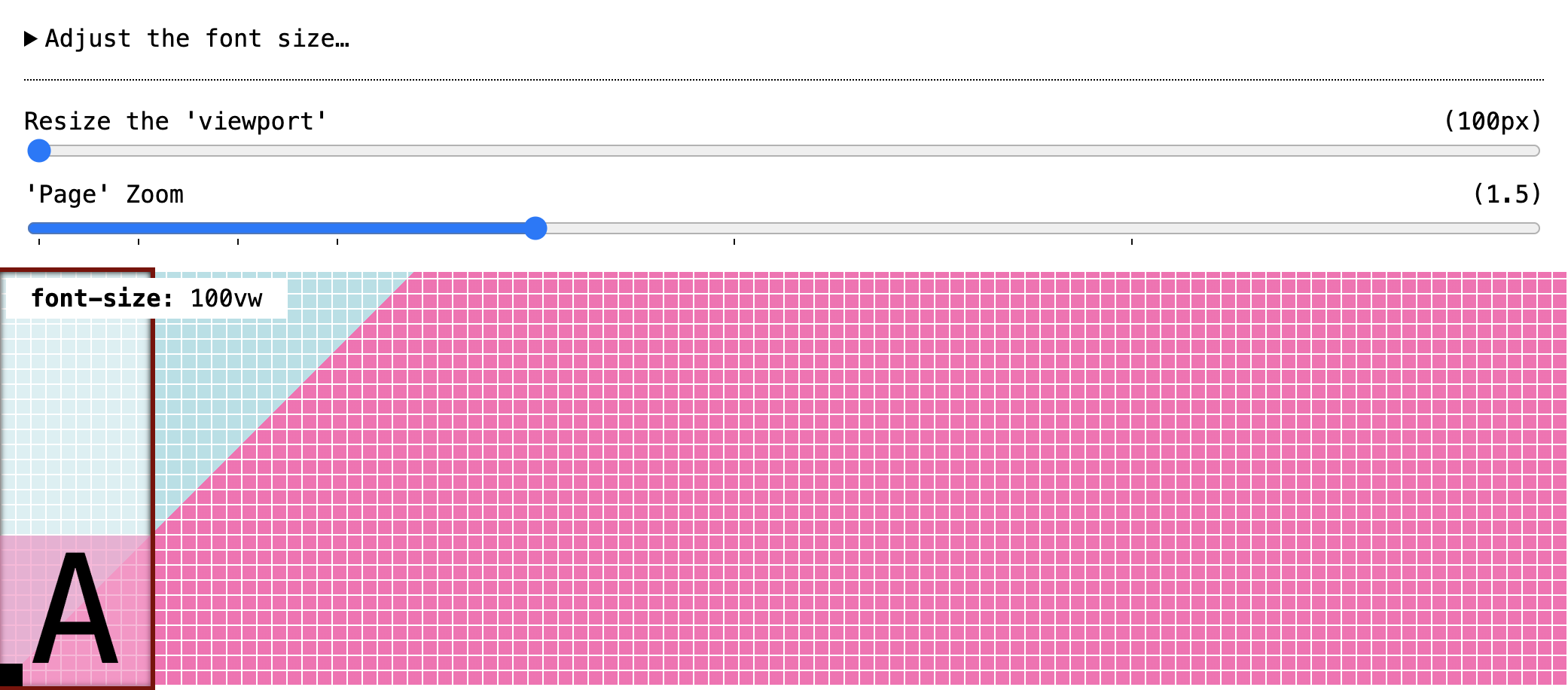
What do all the numbers in our `clamp()` do? There are multiple tools that can help create a fluid `font-size` calculation for CSS – generally expressed as a `clamp()` function combining `em` (or `rem`) with `vw` (or `vi`) units. But the results are difficult to understand at a glance, so I wanted to visualize what’s going on, and how the various units interact.
> _Utopia helpfully provides a warning when we create scales that are inaccessible._
> —Miriam Suzanne
Visualizing Responsive Typography
https://www.oddbird.net/2025/08/26/type-visual/

What do all the numbers in our `clamp()` do? There are multiple tools that can help create a fluid `font-size` calculation for CSS – generally expressed as a `clamp()` function combining `em` (or `rem`) with `vw` (or `vi`) units. But the results are difficult to understand at a glance, so I wanted to visualize what’s going on, and how the various units interact.
> Utopia helpfully provides a warning when we create scales that are inaccessible.
> —Miriam Suzanne