
Goodness gracious for this brilliant disobedience 💜 Hahaha I’m in awe 😲
In normielandia for way too long! So much I can’t figure out how to zap you⚡️
“History shows it is not possible to insulate yourself from the consequences of others holding money that is harder than yours.”
- my favorite one from nostr:npub1gdu7w6l6w65qhrdeaf6eyywepwe7v7ezqtugsrxy7hl7ypjsvxksd76nak
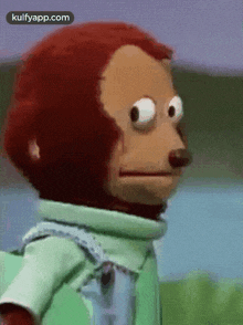
What do you think they say to each other? 
A permit is what you get when the government takes away your rights and sells them back to you.
Be ungovernable. #Bitcoin
Gm, hodl or eat ze bugs 🐛
iOS = the Karen of operating systems 
Apple to allow sideloading in the EU. Just sayin…
Always good to remember: nacho cheese, nacho keys 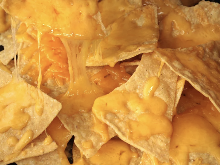

I have nothing against gradients on larger UI elements (buttons or FAB), it definitely looks cool. Heck, I even wear a gradient on my pfp 😂 But on smaller elements, I’m pretty sure it doesn’t pass basic contrast accessibility req (especially in dark mode). I think the previous monochrome variants worked better.
Dear #[0], color gradients on 16x16 icons and badges (verified checkmark) is a crime against accessibility😭


Imagine brainwashing an entire society into thinking prohibition keeps everyone “safe”
Holy shit, just got it 🤯🤯🤯🤯🤯
This “zap” thingy is getting way out of hands #[0]

I bet Nostr reaches 1B users within the next 90 days.