
This guy 🔥 we need more nostr:npub1zfss807aer0j26mwp2la0ume0jqde3823rmu97ra6sgyyg956e0s6xw445 's damn!
Great point! Any sentence with the word Nostr that people can click on will do.
For most feeds (highlights, notes, articles, even DVM's) it can completely be a dropdown on top of the feed.
But here I'm combining several feeds for a more modular set up in an Amethyst-like app.
DVM Algo's + Custom Feeds = 🔥
https://cdn.satellite.earth/2c5a0d842e1c49ec81393b66f2c9e297219b5a5b9de22a7d1da59626d1b21eb1.mov
Had to quickly prototype this to see how all these pieces could fit together and how to not make it a UX nightmare.
👉 Some Algorithms will need a specific input (profile list, setting) and some will not. That's why that's selected first.
👉 Proposed DVM's need to filtered (f.e. using NIP-31)
I like that this is (hopefully) where the complexity would stop for the app, since the DVM's take over from there.
#nostrdesign #customfeeds #dvm #dvms #feed
App of the Day in Spring v0.9.0!
You'll see a new app featured every day (a random one). This should help new emerging apps get the attention they deserve.
https://void.cat/d/GCGTqQ7f3CZF54hxScJgGr.webp
Spring will also suggest you to recommend an often-used app to your followers - the app is added to your NIP-89 app list.
https://void.cat/d/FfJRw5LXiKHEfF3ox8zyMj.webp
Another convenience is a big list of popular domain names built into Spring, those will be suggested while you're typing something in the search bar:
https://void.cat/d/4MHTd6fAF7crBNgN1uJmxg.webp
Plus some bug fixes.
Play Store: https://play.google.com/store/apps/details?id=com.nostr.universe
APK: https://github.com/nostrband/nostr-universe/releases/download/v0.9.0/spring-nostr-browser-v0.9.0.apk
Bullish on that second feature!
Me too 💹
Remember? nostr:note1rh6dzs2y6vz3cc9lpsfzytt7v2xfj59kfjrr8zz63n65j387daqsa387nw
💡 Pinned Posts 💡

A way to keep up to date with certain threads. On top of your feed(s), juts enough text to quickly recognise, subtle notification counter.

Pin button as a primary action in an opened note.
nostr:npub1gcxzte5zlkncx26j68ez60fzkvtkm9e0vrwdcvsjakxf9mu9qewqlfnj5z & nostr:npub1t3ggcd843pnwcu6p4tcsesd02t5jx2aelpvusypu5hk0925nhauqjjl5g4 what do you think about this?
#nostrdesign
This would be a better solutions than "Stalk This": nostr:note1ddjgg8wmcvv95m5rhq5tgsrqkg4630ta24cqgttjtwszl5xdethqx5gkyx
💡 Pinned Posts 💡
A way to keep up to date with certain threads. On top of your feed(s), juts enough text to quickly recognise, subtle notification counter.
Pin button as a primary action in an opened note.
nostr:npub1gcxzte5zlkncx26j68ez60fzkvtkm9e0vrwdcvsjakxf9mu9qewqlfnj5z & nostr:npub1t3ggcd843pnwcu6p4tcsesd02t5jx2aelpvusypu5hk0925nhauqjjl5g4 what do you think about this?
#nostrdesign
Agreed: that, the proximity and less distraction make it superior for me too.
Ok, Nostur's idea of opening tabs for threads when on a desktop is really awesome. You can follow threads by simply opening tabs instead of having to "follow" threads.
nostr:nprofile1qqsfhc97pejd8z3f488vnfwgaawcw0ptlffk9f94trd9la5mc09ms8sprpmhxue69uhkv6tvw3jhytnwdaehgu3wwa5kuef0qy88wumn8ghj7mn0wvhxcmmv9uq3qamnwvaz7tmp9ehx7uewd3hkctc236sln I think you can add a reply edit box to the last post to quickly reply on the thread. Desktop-only probably.
That's what I love lume for as well.
Just had an idea on how do this on mobile 👉 will draw it out tomorrow.
It is very well hidden on nostur.com 😉 (also Apple App Store)
Good guidance!
Would change that text colour tho (#E18F5D or another one from your gradient)
Smart to limit it to 4 👌
Great points!
Why is Download more secure than Copy?
Some ideas for keys.band 🔑
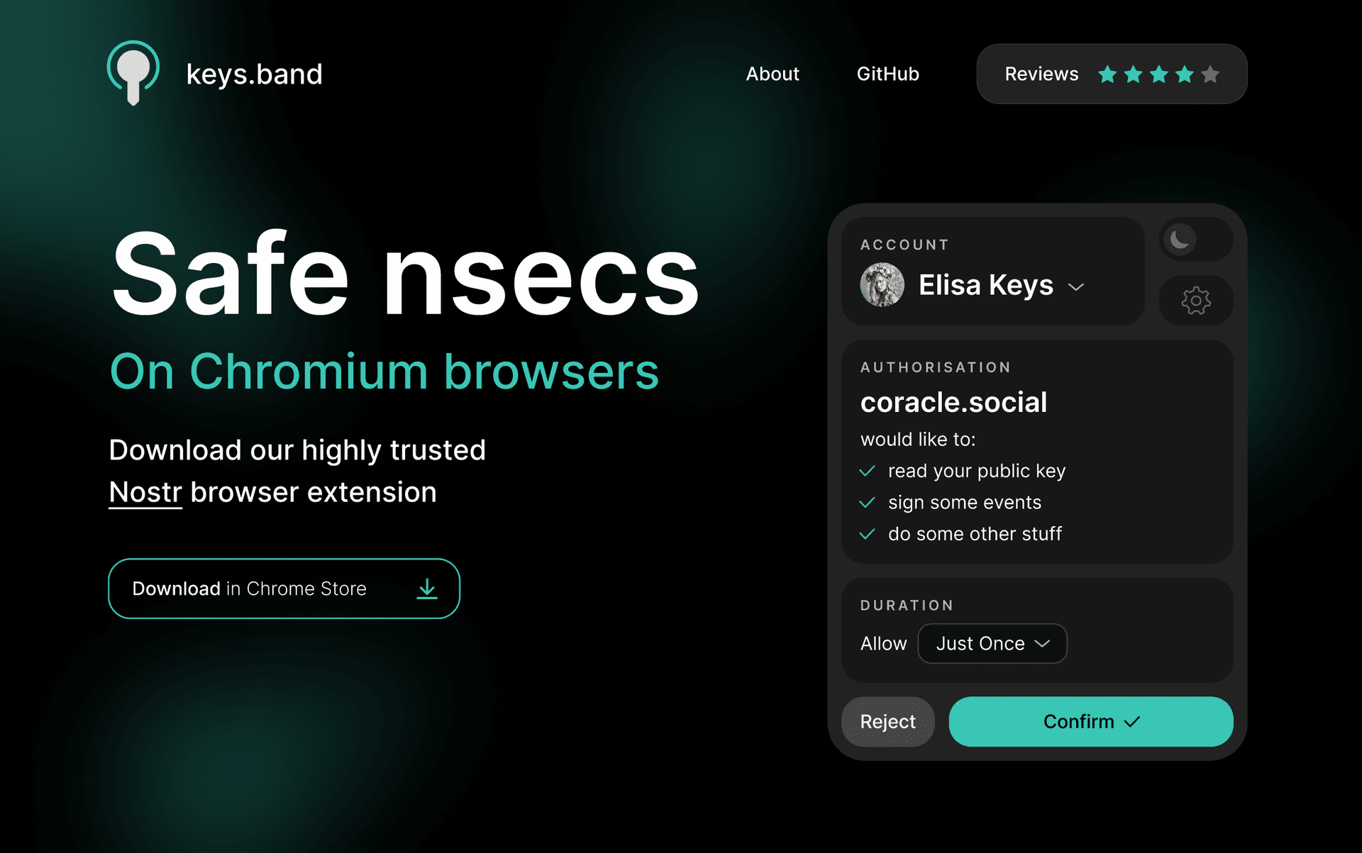
1. Don't have a scary ostrich on your landing page 😉. Instead keep it simple and professional with a nice screenshot + a catchy tagline. On scroll down, you can showcase the multi-account features etc as you do now 👌
2. I'm guessing users most often stick with the same setting for the duration, so I'd make that a dropdown menu that remembers your last choice. Instead of the group of slightly confusing radio buttons you have now.
3. I love the multi-account feature but wished it was easier to quickly switch in between them

4. Logo is too detailed for its small size in the browser. I would minimalise that and maybe even use it as an opportunity to signal status:

5. History (activity log) is one your top features, but is two clicks away in settings (?). Why not make that the default view when you're connected to an app? Makes the "verify don't trust" part a lot easier.

6. Light/Dark mode suffices for an extension.
Figma: https://w3.do/snQ6gHpD
#nostrdesign #extension #keys
nostr:npub1jpqqht86ks4gkfdepreugedwfcz8gg5me9v8q7jmq9vyv2805rlseq7fpk
nostr:npub1wu96403n38fzf7hrqzxc50ad7pz9frjcj4mg9fp7mvy8gwlmp62qdfsv0k
Yup, some of my friends also said that when I asked 'em. Most of them would completely do this though, if it was me sending the link to them in a chat or similar.
For now I cannot find a better way to do this kind of personalised set up for someone.