
Life is hard. Work is hard. Relationships are hard. But there’s something about the unfiltered chaos and genuine connection here that cuts through all of it. In a world obsessed with polished performance, the real joy is found in authentic discourse with you brilliant lunatics.
He disciplines those he loves
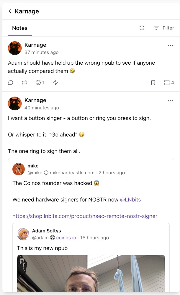
Yes, I use keychat for all Nostr web apps, it's exactly like this. Great app. Play #flappynostrich 😂
Just had some fun with it. Are you using it on mobile nostr:npub1m64hnkh6rs47fd9x6wk2zdtmdj4qkazt734d22d94ery9zzhne5qw9uaks

Long suffering guaranteed
Today I spent some time reviewing typography in nostr:npub1yzvxlwp7wawed5vgefwfmugvumtp8c8t0etk3g8sky4n0ndvyxesnxrf8q, since I believe that this nice app with some little touches can become really gorgeous.
Typography can seem a secondary element but it's really important. Consistent use of font sizes and line-heights throughout the app, including the UI, immediately enhances the quality of the design and significantly improves usability / readability.
There is a problem that applies to virtually all clients: optimization of paragraph spaces. I'm sharing this here for general usefulness.
Since Nostr notes are plain text, the only way to highlight paragraphs is to use a double carriage return. This is perfectly fine from a compose point of view, but creates a suboptimal display when notes are rendered.
Paragraphs usually are equal to one line-height in traditional print, and slightly larger (~ x1.25) in web design and digital UIs; instead of applying a double carriage return, you have a blank line and 2 line-heights (top and bottom), that sum up to ~ x4 the font size (or x.2.6 the line-height)!
Often these paragraph spaces are larger than other spaces used to separate areas in the note block, or even to separate notes in the feed, so this totally ruins the design and the readability of the content.
A similar problem arises when such spaces are used around media, note/article mentions, links preview, etc; the gap is too high.
This is an example of the described problem in nostr:npub1yzvxlwp7wawed5vgefwfmugvumtp8c8t0etk3g8sky4n0ndvyxesnxrf8q and nostr:npub17n4cuc4d6y6qh89dekvxrenfkt5s0n49xns00uavjaxpr36c55dq87fyh9
Spaces between paragraph are excessive and similar to the gap between notes, making it difficult to scan correctly at a glance:

The proposed solution is to parse blank lines and replace them with a space 30% larger than the line-height (so about x2.0 for the Latin character set and x2.4 for the Japanese one).
Before and above non text blocks (media, etc) another 10-15% additional space can be added.
#nostrdesign
Did the exact same thing. It’s cool.
Test some waters.
Spent the day knee deep in Nostr clients, testing UIs that feel like custom built echo chambers for our biases. Drawing from the vast UX out there, Yakihonne’s cockpit of features or Nostur’s raw simplicity wins for me. It’s freedom in the mess. Pick your tool. Own the trade offs. Competition breeds better networks, not clones. Beauty’s in the choice. What’s your go to?
Primal was a safe harbor, sure, but Yakihonne’s a rogue wave of raw power, features stacked like a house of cards on acid. The learning curve’s a brutal rite, but damn if it doesn’t hook you with that unfiltered edge.
Primal was a safe harbor, sure, but Yakihonne’s a rogue wave of raw power, features stacked like a house of cards on acid. The learning curve’s a brutal rite, but damn if it doesn’t hook you with that unfiltered edge.
https://jumble.imwald.eu/?page=discussions
nostr:npub1m4ny6hjqzepn4rxknuq94c2gpqzr29ufkkw7ttcxyak7v43n6vvsajc2jl made this. It's nostr reddit, in case you're interested. Funny thing is that Pavle said it was a pointless endeavor🤣🤷. The Primal team may mean well, but their incompetence becomes more apparent every passing day.
An, I’ve seen this. Right on. Thanks
Nostr fam, my bad for turning your timelines into a glitchy dumpster fire today. I was basically speedrunning Yakihonne like a caffeinated gremlin on a bender, smashing buttons and summoning digital demons left and right. Nailed it enough to stick it out for now. Mad props for not muting me mid-meltdown; you’re tougher than my sanity. Back to the grind, mayhem incoming.
Couldn’t agree more.
Pretty legit that Nostur identified nostr:npub1jlrs53pkdfjnts29kveljul2sm0actt6n8dxrrzqcersttvcuv3qdjynqn ‘s imposter.

Couldn’t see it on primal. Is it visible on nostr:npub18m76awca3y37hkvuneavuw6pjj4525fw90necxmadrvjg0sdy6qsngq955 ??
Yeah I only got a response because I was making noise and people were reacting to it. Squeaky wheel.
Bro, I’ve literally been playing with nostr:npub1yzvxlwp7wawed5vgefwfmugvumtp8c8t0etk3g8sky4n0ndvyxesnxrf8q all day because you got me thinking yesterday. And now I’m here…I’m also done paying for the “Premium” every month. As always, I appreciate all the raw conversations.

Imagine paying $1,000/mo to avoid eating a vegetable.
Modern health:
➤ Eat trash
➤ Feel like trash
➤ Pay Big Pharma to pretend you’re not trash
➤ Repeat

The most valuable bitcoins in history are the ones that will never move. nostr:naddr1qqgxycfkv9jxzc3hvcmnwceh8qmnzq3q4hq5lgadtyy9dhvtszq46dnl0s0xwdddqr7e32rdqqhma8a4xhssxpqqqp65w8zx308
I think River pulls stats every year. They’re all estimates.
Let me clear something up for my fellow nostriches...
Demu/RSS is the Nostr of Spotify.
Wavlake is the Primal of Nostr
Do you get it? Ya'll out here listening to music like primal was the only game in town. For shame.
CALLING ALL NOSTRICHES: Proof of work time.
Put your money where your mouth is and show me you actually care about decentralization. Get off your knees, no more lip service. Send in a boostagram from outside of wavlake or fountain with your npub to prove you're listening to DeMu (Decentralized Music) and support decentralized choice. I wanna see nostr:nprofile1qqs00y32ptdnlfxa5hhv4f30dalwv9vl0a27pqpkdpkx3cyrstp50zqpg3mhxue69uhnwumjwgmkx6revvm8vmrg0fcxxvngdsmxc7t4denhvmr4da585undwsmnv6mzwv6xkmtev358y7r0v94kkcn3w4skgtnvda3kzmqpzemhxue69uhkx6rpv3nzumn0wd68yvfwvdhk6qghwaehxw309anxjmr5v4ezumn0wd68ytnhd9hx27prlx2's boost bot nostr account light up my feed.
My music uploaded on lnbeats.com and didn’t even know it.
https://lnbeats.com/album/11ed9ee9-2f78-5eec-a878-6c365c4cfeaa
Ok, I’m in.
The American experiment was predicated on the radical notion that power must justify itself to free citizens. Instead, we’ve inherited a shadow republic where the most world altering events occur without explanation, where justice is selectively applied, and where our silence is mistaken for consent.
Our collective complacency in the face of these systemic failures is perhaps the greatest failure of all. Bitcoin is how we stop being complicit. This is our standard.
Trust scales through voluntary association, not institutions nostr:naddr1qqgrzcny8qmkvwf4893nsdtyxejkyq3q4hq5lgadtyy9dhvtszq46dnl0s0xwdddqr7e32rdqqhma8a4xhssxpqqqp65wf732gd
But now you’re in the know. Knowing informs future decisions.
I only know what I know. What I do know, is that I need to know more to be in the know.