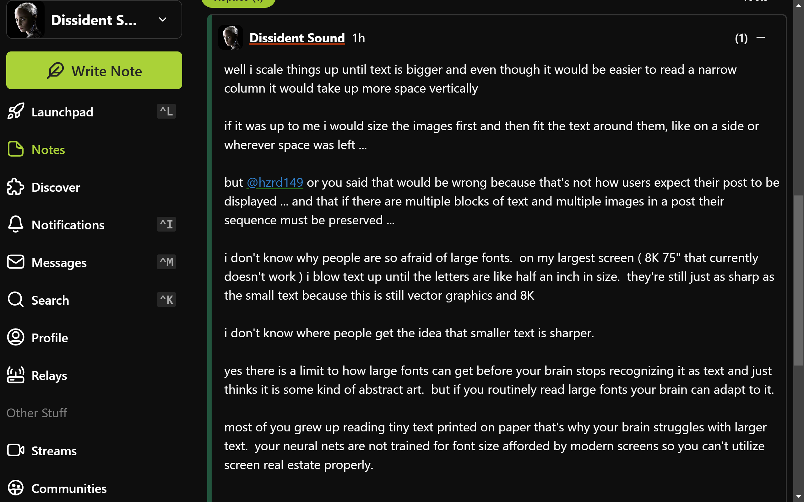
well i scale things up until text is bigger and even though it would be easier to read a narrow column it would take up more space vertically
if it was up to me i would size the images first and then fit the text around them, like on a side or wherever space was left ...
but nostr:npub1ye5ptcxfyyxl5vjvdjar2ua3f0hynkjzpx552mu5snj3qmx5pzjscpknpr or you said that would be wrong because that's not how users expect their post to be displayed ... and that if there are multiple blocks of text and multiple images in a post their sequence must be preserved ...
i don't know why people are so afraid of large fonts. on my largest screen ( 8K 75" that currently doesn't work ) i blow text up until the letters are like half an inch in size. they're still just as sharp as the small text because this is still vector graphics and 8K
i don't know where people get the idea that smaller text is sharper.
yes there is a limit to how large fonts can get before your brain stops recognizing it as text and just thinks it is some kind of abstract art. but if you routinely read large fonts your brain can adapt to it.
most of you grew up reading tiny text printed on paper that's why your brain struggles with larger text. your neural nets are not trained for font size afforded by modern screens so you can't utilize screen real estate properly.
actually nostr:npub10000003zmk89narqpczy4ff6rnuht2wu05na7kpnh3mak7z2tqzsv8vwqk i just realized that if you look at my above post it shows how i manage it.
that post fills my entire screen with no need to scroll
and by using widely spaced small paragraphs it's easy to not get lost in it
i just never realized that my style of writing may have adopted to my screen layout
This seems a quite standard view with balanced font sizes. For most people narrowing the right panel a little would make the content more readable.
So it's not a font size matter, but a characters-for-line one.
the difficulty with reading long lines is when you need to switch to the next line you can't find which line is next ...
narrow columns help with this ...
but so do paragraphs ...
the longer the line the shorter the paragraph needs to be ...
if you keep paragraphs to 3 or 4 lines max you can have lines as long as you want ...
Thread collapsed
Thread collapsed
Thread collapsed
Thread collapsed
I don't mind larger fonts, often my projects have larger than average fonts and sometimes people ask me to make them smaller.
Thread collapsed

