Now with less anatomy
Now with less anatomy
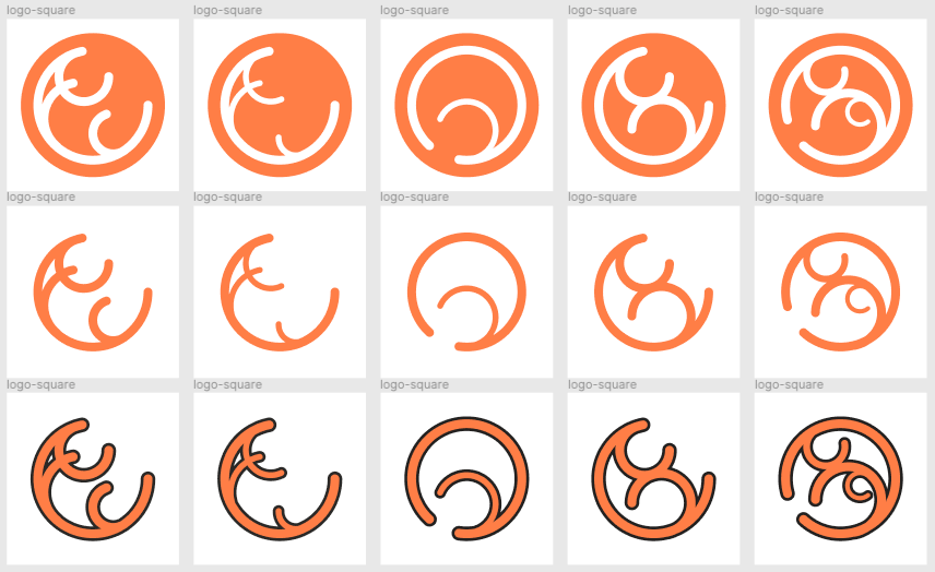
huh, now that mention it
the center is good, maybe thicer smol inner curve
the far right is 🔥 but added detail
At the risk of sounding crude, I see "69" written in a few of these.
Top middle is interesting, though I don't know that it's a winner.
Nooo you're absolutely right
Seems like I inadvertently stumbled into "logo design: hard mode"